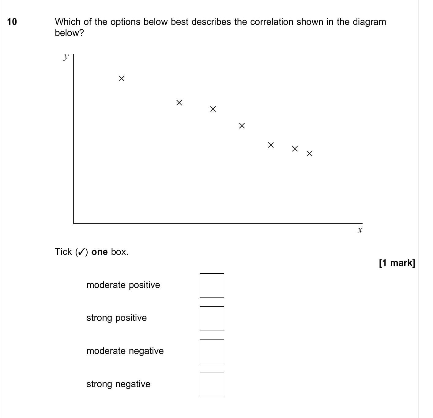
Which of the options below best describes the correlation shown in the diagram below?
Tick (/) one box - AQA - A-Level Maths Pure - Question 10 - 2019 - Paper 3
Question 10
Which of the options below best describes the correlation shown in the diagram below?
Tick (/) one box.
- moderate positive
- strong positive
- moderate negative
-... show full transcript
Worked Solution & Example Answer:Which of the options below best describes the correlation shown in the diagram below?
Tick (/) one box - AQA - A-Level Maths Pure - Question 10 - 2019 - Paper 3
Step 1
Tick (/) one box.
96%
114 rated
Only available for registered users.
Sign up now to view full answer, or log in if you already have an account!
Answer
The correlation shown in the diagram is best described as 'strong negative'. This conclusion is reached because as the values on the x-axis increase, the values on the y-axis decrease significantly, indicating a strong inverse relationship.