Photo AI
The graph shows data about people with HIV and people with AIDS from 1981 to 2011 - Edexcel - GCSE Biology - Question 2 - 2017 - Paper 1
Question 2
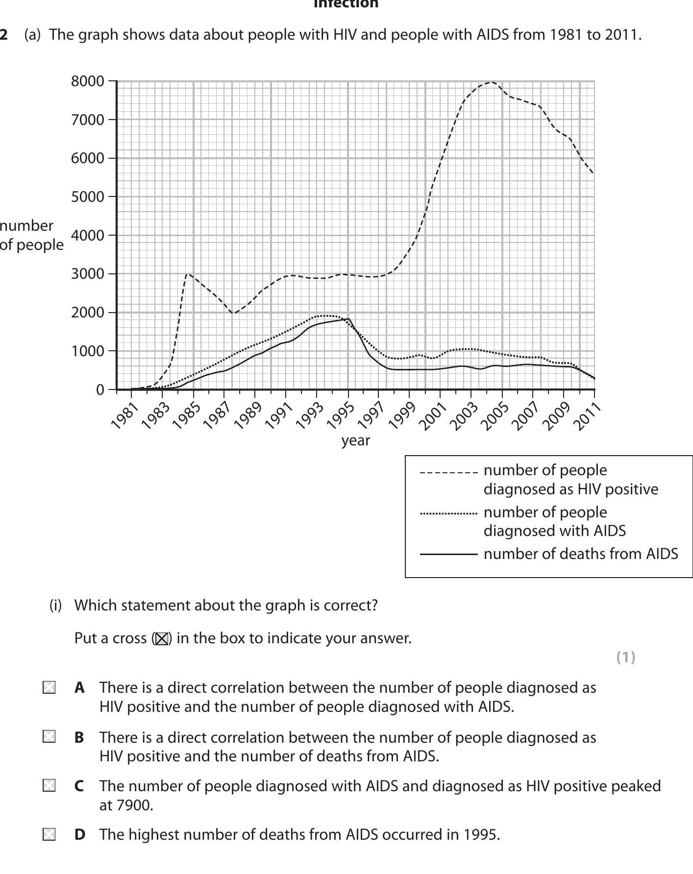
The graph shows data about people with HIV and people with AIDS from 1981 to 2011. (i) Which statement about the graph is correct? Put a cross (✗) in the box to i... show full transcript
Worked Solution & Example Answer:The graph shows data about people with HIV and people with AIDS from 1981 to 2011 - Edexcel - GCSE Biology - Question 2 - 2017 - Paper 1
Step 1
Which statement about the graph is correct?

Answer
To analyze the data provided in the graph effectively, we need to look closely at the trends depicted in it.
-
Statement A suggests a direct correlation between the number of people diagnosed as HIV positive and those diagnosed with AIDS. Observing the graph, we notice that as the number of people diagnosed with HIV increases, the number of those diagnosed with AIDS tends to reflect a similar upward trend, indicating a potential correlation.
-
Statement B presents a correlation between the number of people diagnosed with HIV and deaths from AIDS. However, the graph indicates that while deaths may rise, they do not follow the same trend as HIV diagnoses, suggesting that this statement is likely false.
-
Statement C states that the peak number of people diagnosed with AIDS and diagnosed as HIV positive was at 7900. A careful examination of the graph confirms this peak within the specified timeframe, making this statement accurate.
-
Statement D claims that the highest number of deaths from AIDS occurred in 1995. Reviewing the graph shows that the highest number of deaths does indeed occur around that year, further validating this statement.
After analyzing all options, the correct statements are A and C.