Photo AI
Last Updated Sep 26, 2025
Histograms Simplified Revision Notes for A-Level Edexcel Maths Statistics
Revision notes with simplified explanations to understand Histograms quickly and effectively.
497+ students studying
2.2.3 Histograms
A histogram is a type of bar chart used to represent the distribution of a set of continuous data. It shows the frequency of data points within certain ranges, called bins or intervals.
Key Features of Histograms:
- Bars Represent Frequency: Each bar in a histogram represents the frequency (or count) of data points within a particular range of values.
- No Gaps Between Bars: Unlike bar charts, the bars in a histogram are adjacent to each other without gaps, reflecting the continuous nature of the data.
- Bin Width: The width of each bar represents the interval size. All intervals (or bins) are typically of equal width, but they can be unequal if needed.
Steps to Create a Histogram:
- Collect and Organise Data: Start with a data set of continuous values.
- Divide Data into Bins: Choose appropriate intervals (bins) that cover the entire range of data.
- Count Frequencies: Determine how many data points fall into each bin.
- Draw Bars: Draw a bar for each bin. The height of the bar corresponds to the frequency of data points in that bin.
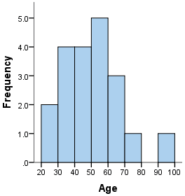
Example: Consider the following data set representing the ages of a group of people:
Step 1: Choose Bins
- Let's divide the ages into bins of width :
- -, -, -, -, -, -, -
Step 2: Count Frequencies
- -: people
- -: people
- -: people
- -: people
- -: people
- -: people
- -: people
Step 3: Draw the Histogram
- For each bin, draw a bar whose height corresponds to the frequency: | Bin | Frequency | |---|---| | | | | | | | | | | | | | | | | | | | | |
Key Points to Remember:
- Area Represents Frequency: The area of each bar is proportional to the frequency of data in that bin. For histograms with equal bin widths, the height of the bar is directly proportional to the frequency.
- Skewness: The shape of the histogram can show whether the data is skewed to the left (negatively skewed), right (positively skewed), or symmetric.
- Modal Class: The bin with the highest bar is called the modal class and represents the range with the highest frequency of data points.
Comparing with Bar Charts:
- Histograms are used for continuous data, while bar charts are used for categorical data.
- In histograms, the bars touch each other, whereas in bar charts, there are gaps between the bars. Histograms are a powerful tool for visualising the distribution of continuous data, allowing you to quickly see patterns such as central tendencies, variability, and skewness in the data set.
Problem Statement:
- A random sample of students was asked how long it took them to complete their homework the previous night. The time was recorded and summarized in the table below.
Given Data:
| Time, (minutes) | Frequency | Class Width | Frequency Density |
|---|---|---|---|
| 25 ≤ < 30 | |||
| 30 ≤ < 35 | |||
| 35 ≤ < 40 | |||
| 40 ≤ < 50 | |||
| 50 ≤ < 80 |
Tasks:
Question a) Draw a histogram to represent the data.
- The histogram is drawn using frequency density against time intervals.
Question b) Estimate how many students took between and minutes to complete their homework.
- The area of the shaded region gives the estimate:
- Region A (35 ≤ ≤ 40):
- Region B (40 ≤ ≤ 45):
- Total Estimate:
Special Cases
- Gaps Between Classes
Example 1 (Time in minutes):
- In this case, it is appropriate to split the difference evenly between classes.
- Proper intervals:
Example 2 (Age in years):
- With ages, you are one age right up until the point that you reach the next age, so the following treatment is appropriate.
- Proper intervals:
- Open-ended Classes
Example:
In such cases, knowing about the data helps you apply an appropriate treatment.
- If the data is class size, is a good upper bound.
- If the age of students is in college, maybe is a good cut-off.
- If no info is known, make the final class double the width of the previous class.

500K+ Students Use These Powerful Tools to Master Histograms For their A-Level Exams.
Enhance your understanding with flashcards, quizzes, and exams—designed to help you grasp key concepts, reinforce learning, and master any topic with confidence!
40 flashcards
Flashcards on Histograms
Revise key concepts with interactive flashcards.
Try Maths Statistics Flashcards4 quizzes
Quizzes on Histograms
Test your knowledge with fun and engaging quizzes.
Try Maths Statistics Quizzes29 questions
Exam questions on Histograms
Boost your confidence with real exam questions.
Try Maths Statistics Questions27 exams created
Exam Builder on Histograms
Create custom exams across topics for better practice!
Try Maths Statistics exam builder26 papers
Past Papers on Histograms
Practice past papers to reinforce exam experience.
Try Maths Statistics Past PapersOther Revision Notes related to Histograms you should explore
Discover More Revision Notes Related to Histograms to Deepen Your Understanding and Improve Your Mastery