Photo AI
Last Updated Sep 13, 2025
Representing, interpreting and analysing data Simplified Revision Notes for NSC Mathematical Literacy
Revision notes with simplified explanations to understand Representing, interpreting and analysing data quickly and effectively.
240+ students studying
Representing, interpreting and analysing data
Purpose of Graphs
Graphs are used in data handling to:
-
Explore relationships in data.
-
Display and report data effectively.
-
Identify patterns and trends, as well as distributions and relationships. Key features every graph should include:
-
Clear and fair representation of the findings.
-
Relationships between variables clearly displayed.
-
Axes labelled:
- Horizontal (x-axis): Dependent variable.
- Vertical (y-axis): Independent variable.
Types of Graphs
- Line graphs
- Bar graphs (including compound/stacked bars)
- Histograms
- Scatter plots
- Pie charts
- Box and whisker plots
Line Graphs
- Used to show relationships between two quantities over time.
- Straight lines connect points on a grid to reveal trends.
Worked Example:
Scenario: Jabu's TV viewing times (minutes per day) over months.
| Month | Jan | Feb | Mar | Apr | May | Jun | Jul | Aug | Sep | Oct | Nov |
|---|---|---|---|---|---|---|---|---|---|---|---|
| Time | 108 | 103 | 108 | 120 | 115 | 122 | 116 | 105 | 110 | 105 | 104 |
Observations:
- Trends: TV viewing increases in April, June, and September (likely due to holidays) and decreases during exam months.
- Line graphs clearly show trends like increases and decreases, which might not be as obvious in other graph types.
Bar Graphs
- Represent data in categories.
- The height of each bar reflects the frequency or quantity.
- Types of bar graphs:
- Single bar graph
- Multiple bar graph
- Compound/stacked bar graph
Worked Example:
Scenario: School tuck shop sales of snacks.
| Item | Hot Dogs | Sandwiches | Salads | Burgers |
|---|---|---|---|---|
| Frequency | 15 | 35 | 10 | 12 |
Solution:
Notes:
- Bars can be vertical or horizontal.
- Spaces between bars are used for clarity.
Worked Example : Household Electronic Usage Survey
1. Scenario
A survey of 1,000 households was conducted in 2001 and 2007 to determine the usage of electronic appliances.
The results were displayed in a bar graph and a table showing the percentage of households using different appliances in both years.
2. Questions & Solutions
a) Percentage Increase in TV Usage (2001 - 2007)?
- TV usage in 2001 = 83.3%
- TV usage in 2007 = 89.5%
- Increase = 89.5% - 83.3% = 6.2% Interpretation: More households adopted TV usage over time.
b) Most Used Appliance in 2001 and 2007?
- *In both years, the most used appliance was the radio.
- Radio usage in 2001 = 96.8%
- Radio usage in 2007 = 93.6% Interpretation: Although radio remained the most common appliance, its usage slightly declined.
c) Appliance That Decreased in Usage from 2001 to 2007?
- Radio usage decreased from 96.8% to 93.6%. Interpretation: The decline suggests a shift to newer technologies like TV and DVD players.
d) Number of Households Using Cellphones in 2007?
- Cellphone usage in 2007 = 65.0%
- Calculation:
Interpretation: 650 out of 1,000 households used cellphones in 2007.
e) Percentage Difference in Usage (TV vs. DVD Players in 2001)?
- TV usage in 2001 = 79.5%
- DVD player usage in 2001 = 50.0%
- Difference = 79.5% - 50.0% = 29.4% Interpretation: TVs were significantly more common than DVD players in 2001.
Compound Bar Graphs
- Compare multiple datasets simultaneously (e.g. different years or groups).
- Example: Enrolment of South African children aged 7-13 in primary school (1996 vs 2007).
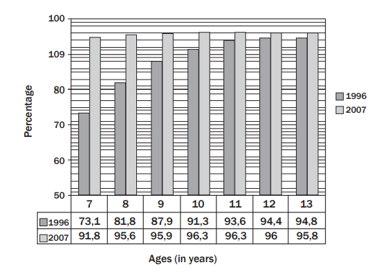
Analysis Example:
| Age Group | 1996 (%) | 2007 (%) |
|---|---|---|
| 7 years | 73.1 | 81.8 |
| 8 years | 87.9 | 97.7 |
| ... | ... | ... |
Key Observations:
- Increased enrolment in most age groups.
- Largest increase was for 8-year-olds.
Histograms
- Definition: A histogram is a type of bar graph that shows data grouped into intervals (bins). The height of the bars represents the frequency of data points in each interval.
- Key features:
- The bars are adjacent (no gaps between them).
- Used for continuous data.
Worked Example:
Scenario: Lengths of school books.
| Length (cm) | Frequency |
|---|---|
| 20 – 23.9 | 4 |
| 24 – 26.9 | 7 |
| 27 – 29.9 | 5 |
| Longer than 30 | 3 |
Solution:
Notes:
- Histograms effectively show data distribution and patterns.
Activity : Working with Histograms
- Mr Smith, an investor from Australia, analyses the salary categories of employees at Raetsiza Company.
- Histogram Analysis:
- Horizontal axis: Salary ranges (in thousands of Rands).
- Vertical axis: Number of employees.
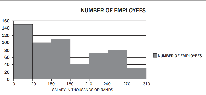
- Questions: 4. Total employees? 5. Number of employees earning the lowest salary? 6. Why do fewer employees earn the highest salary? 7. Reasons for fewer employees in the R180 000–R210 000 category. 8. Calculate the new maximum in the R150 000–R180 000 range after a 6% salary increase. Solutions:
- Add up the frequencies:
- 150 employees earn less than
- Fewer employees earn higher salaries due to fewer high-level positions or requirements for special skills.
- Senior positions or unique skill requirements.
- Increase of
Pie Charts
- Definition: A circular graph divided into sectors representing percentages or proportions.
- Features:
- Shows relative amounts, not absolute values.
- The percentages in a pie chart must add up to 100%.
Worked Example:
The chart below summarises the favourite fruit juice flavours among 120 learners.
- Calculation:
- learners chose fruit cocktail.
- learners chose apple.
- learners chose grape.
- learners chose litchi.
- Advantages of Pie Charts:
- Clearly shows proportions at a glance.
- Comparison to Bar Graphs:
- Bar graphs show specific quantities, while pie charts show percentages.
3. Scatter Plots
- Definition: A scatter plot shows the relationship (correlation) between two variables.
- Features:
- Positive correlation: As increases, also increases.
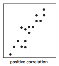
- Negative correlation: As increases, decreases.
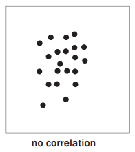
- No correlation: Random spread of data.
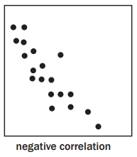
Worked Example:
Plot the relationship between Tourism and Mathematical Literacy marks.
-
Data for 10 learners is plotted. | TOURISM | 55 | 60 | 20 | 70 | 5 | 40 | 50 | 10 | 30 | 55 | |---|---|---|---|---|---|---|---|---|---|---| | MATHS LIT | 70 | 60 | 40 | 75 | 80 | 30 | 70 | 5 | 45 | 50 |
-
Observations:
-
Positive correlation: Higher marks in one subject correlate with higher marks in the other.
-
Outlier: A learner scored high in one subject and low in the other.
4. Box-and-Whisker Plots
- Definition: A box-and-whisker plot graphically represents the five-number summary of a dataset:
- Minimum value
- Lower quartile
- Median
- Upper quartile
- Maximum value
- Usage:
- Identify data spread, symmetry, and outliers.
Worked Example:
The five-number summary is represented below.
Solution:
| Minimum | 70 |
|---|---|
| Lower quartile (Q₁) | 100 |
| Median (Q₂) | 110 |
| Third quartile (Q₃) | 115 |
| Maximum value | 120 |
Activity : Box-and-Whisker Plots
The box-and-whisker plot below represents the batting averages of 160 cricketers who have batted in T20 matches since 1 January 2009.
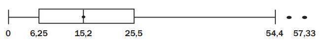
Questions:
-
What is the name given to the two data points with values 57 and 57.33? Answer: Outliers – data points significantly higher or lower than the rest of the data.
-
How many players have a batting average less than 6.25? Answer: About 40 players (this is the lower quartile, , of the data).
-
What must a batsman's average be for him to be in the top quartile? Answer: Greater than 25.5 (this is the upper quartile, ).
-
Jacques Kallis is the South African player with the highest batting average. If his average is 48.4, how does he compare with other batsmen? Answer:
- He is in the top quartile.
- His score is close to the highest batting averages in the dataset, comparing favourably with the best.

500K+ Students Use These Powerful Tools to Master Representing, interpreting and analysing data For their NSC Exams.
Enhance your understanding with flashcards, quizzes, and exams—designed to help you grasp key concepts, reinforce learning, and master any topic with confidence!
40 flashcards
Flashcards on Representing, interpreting and analysing data
Revise key concepts with interactive flashcards.
Try Mathematical Literacy Flashcards4 quizzes
Quizzes on Representing, interpreting and analysing data
Test your knowledge with fun and engaging quizzes.
Try Mathematical Literacy Quizzes29 questions
Exam questions on Representing, interpreting and analysing data
Boost your confidence with real exam questions.
Try Mathematical Literacy Questions27 exams created
Exam Builder on Representing, interpreting and analysing data
Create custom exams across topics for better practice!
Try Mathematical Literacy exam builder64 papers
Past Papers on Representing, interpreting and analysing data
Practice past papers to reinforce exam experience.
Try Mathematical Literacy Past PapersOther Revision Notes related to Representing, interpreting and analysing data you should explore
Discover More Revision Notes Related to Representing, interpreting and analysing data to Deepen Your Understanding and Improve Your Mastery
Load more notes