Inserting a Graph (Grade 10 NSC Matric Computer Application Technology): Revision Notes
Inserting a Graph
Creating graphs in spreadsheets is an essential skill that helps you visualise data and make information easier to understand. Learning how to properly insert and format graphs will make your spreadsheet work more professional and meaningful.
Understanding the basics of graph insertion
When working with spreadsheets, graphs (also called charts) transform your raw data into visual representations that are much easier to read and interpret. The process of inserting a graph involves several key steps, with data selection being the most crucial first step.
The fundamental principle to remember is that proper data selection forms the foundation of any good graph. Without selecting the right data in the correct way, your graph won't display the information you want to show.
Data selection fundamentals
Before you can create any graph, you need to select the data that will be used to build your visualisation. This selection process follows specific rules that ensure your graph displays correctly.
Basic selection principles
Always select your data from top to bottom and left to right. This means starting with your column headings and including all the data you want to display in your graph. The column headings are particularly important because they become the labels in your graph.
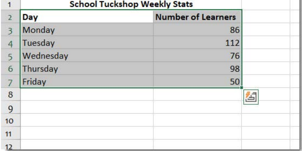
When selecting data, make sure to include both the category labels (like days of the week) and the numerical values you want to graph. In the example above, you would select both the "Day" column and the "Number of Learners" column to create a meaningful graph.
Selecting non-adjacent data
Sometimes you might want to create a graph using data that isn't next to each other in your spreadsheet. For this situation, you can select non-adjacent data by following these steps:
Step-by-Step: Selecting Non-Adjacent Data
- Select the first range of cells you want to include
- Hold down the Ctrl button on your keyboard
- While holding Ctrl, click on the other cells or ranges you want to include
- Release the Ctrl button when you've selected all the data you need
This technique is particularly useful when you want to compare specific columns of data while skipping others that aren't relevant to your graph.
Step-by-step insertion process
Once you have selected your data properly, the actual insertion of a graph follows a straightforward process through Excel's interface.
Using the Insert tab
Navigate to the Insert tab in Excel's ribbon interface. In the Charts group, you'll find various options for creating different types of graphs. The Charts group contains all the tools you need to insert and customise your graphs.
From the Charts group, you can either choose a specific graph type directly or use the Recommended Charts feature, which analyses your selected data and suggests the most appropriate graph types for your information.
Choosing graph types
Excel offers several main categories of graphs, each suited to different types of data presentation:
Graph Types and Their Best Uses:
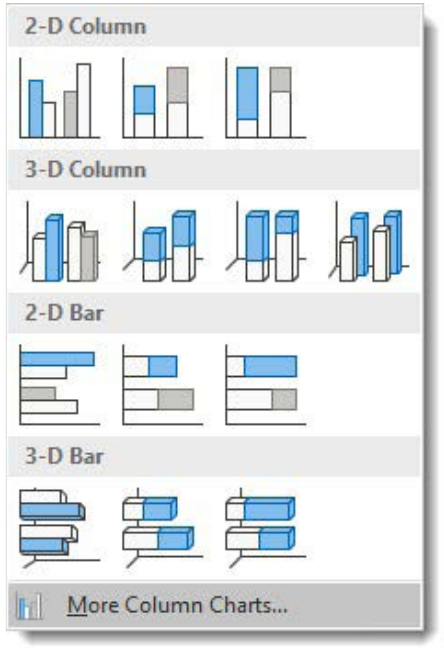
Column graphs display data as vertical bars and work well for comparing values across different categories. You can choose between 2-D column graphs (flat) or 3-D column graphs (with depth and dimension).
Bar graphs are similar to column graphs but display the bars horizontally instead of vertically. These work particularly well when you have long category names that might not fit well under vertical columns.
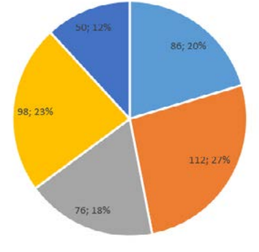
Pie charts show how different parts make up a whole, displaying data as slices of a circular pie. Each slice represents a percentage of the total.
Line graphs are excellent for showing trends over time, connecting data points with lines to show how values change.
Inserting your selected graph
After choosing your graph type, Excel will automatically insert the graph into your worksheet. The graph will appear alongside your data, and you can move it to a different location if needed.
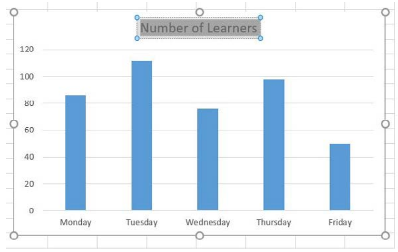
The inserted graph will use your selected data and automatically apply labels based on your column headings. You can see how the days of the week appear along the bottom axis, while the number of learners is represented by the height of each bar.
Working with Chart Elements
Once your graph is inserted, you can enhance it by adding or modifying various chart elements. These elements help make your graph more informative and professional-looking.
Accessing Chart Elements
When you select a graph, Excel provides several ways to modify its elements. You can use the Chart Elements button (the plus sign that appears next to selected charts) or access the Design tab that becomes available when working with charts.
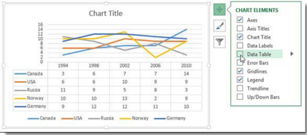
The Chart Elements panel allows you to add or remove various components of your graph by simply checking or unchecking boxes. This makes it easy to customise your graph's appearance and information.
Common Chart Elements
Essential Chart Elements:
Chart Title: Adding a descriptive title helps viewers understand what your graph represents. You can add a title and position it above the graph or in other locations.
Axis Titles: These labels explain what each axis represents. The x-axis title describes the categories, while the y-axis title describes the values being measured.
Legend: This explains what different colours or patterns in your graph represent. It's particularly important when your graph shows multiple data series.
Gridlines: These background lines help viewers read precise values from your graph. You can show or hide them depending on your needs.
Data Labels: These display the actual numerical values on your graph, making it easy for viewers to see exact figures without having to estimate from the axes.
Adding and editing Chart Elements
To add a chart element, select your graph and use either the Chart Elements button or the Add Chart Element command from the Design tab. You can choose from a dropdown menu of available elements.
For editing existing elements, you can double-click on any part of your graph to modify it. For example, double-clicking on a chart title allows you to change the text to something more descriptive.
Graph formatting and styles
Excel provides numerous options for changing the appearance of your graphs to make them more visually appealing and easier to read.
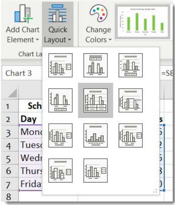
Using Quick Layout
The Quick Layout feature offers pre-designed combinations of chart elements that work well together. Instead of adding elements one by one, you can select a complete layout that includes titles, legends, and other elements in professional arrangements.
Chart Styles
Chart Styles allow you to change the overall visual appearance of your graph, including colours, fonts, and effects. These styles help ensure your graphs look professional and match your document's design.
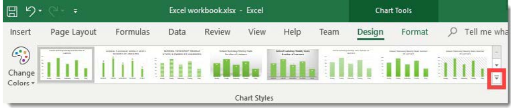
You can browse through different style options and apply them with a single click. Each style maintains the same data and structure while changing the visual presentation.
Creating pie charts
Pie charts work particularly well for showing how different parts contribute to a whole. When creating pie charts, Excel can automatically calculate and display percentages for each slice.
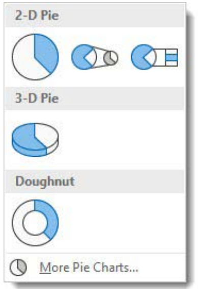
Excel offers various pie chart options, including traditional flat pies, 3-D pies with depth, and doughnut charts with hollow centres. Each type serves different visual purposes while showing the same proportional relationships.
Basic graph interpretation
Understanding how to read and interpret graphs is just as important as knowing how to create them. Good interpretation skills help you extract meaningful insights from visual data.
Reading different graph types
When interpreting any graph, start by examining the title, axes labels, and legend to understand what information is being presented. Look for patterns, trends, and significant values that tell a story about your data.
Bar and column graphs make it easy to compare values across different categories. Look for the highest and lowest values, and notice any patterns or trends in the data.
Line graphs are particularly good for showing changes over time. Pay attention to whether lines are going up (increasing), down (decreasing), or staying flat (stable).
Pie charts show proportional relationships, so focus on which slices are largest and smallest, and how they relate to the whole.
Key interpretation principles
Critical Interpretation Guidelines:
Always consider what the graph is actually measuring and over what time period or categories. Look beyond just the visual impression to understand the real meaning of the data.
Pay attention to the scale of the axes, as this can significantly affect how dramatic changes appear. A small change might look large if the scale is compressed, or a large change might look small if the scale is expanded.
Consider whether the graph type is appropriate for the data being shown. Some relationships are better shown with certain types of graphs than others.
Practical tips for graph creation
When creating graphs, keep these important tips in mind to ensure your visualisations are effective and professional.
Data selection tips
Essential Selection Guidelines:
Always include your column headings when selecting data, as these become the labels in your graph. Double-check that you've selected all the data you want to include before inserting your graph.
For non-adjacent data, remember to hold down Ctrl while clicking on additional ranges. This technique is essential when you want to compare specific columns while excluding others.
Choosing appropriate graph types
Consider what story you want your data to tell. Column and bar graphs work well for comparisons, line graphs show trends over time, and pie charts illustrate how parts make up a whole.
Don't choose a graph type just because it looks interesting - make sure it's the most appropriate way to present your specific data.
Making graphs readable
Ensure your graphs have clear, descriptive titles that explain what the data represents. Add axis labels so viewers understand what's being measured.
Use the Chart Elements features to add necessary information without cluttering the graph. Sometimes less is more when it comes to graph design.
Common pitfalls to avoid
When creating graphs, several common mistakes can make your visualisations less effective or harder to understand.
Selection errors
Most Common Problem: Data Selection
The most common problem is selecting data incorrectly. Make sure you select from top to bottom and left to right, including headers. If your graph doesn't look right, the data selection is often the issue.
Inappropriate graph types
Graph Type Mistakes to Avoid:
- Avoid using pie charts when you have many categories (more than 5-6 slices become hard to read) or when you want to show trends over time
- Don't use line graphs for data that doesn't have a natural sequence or progression
Over-formatting
While Excel offers many formatting options, resist the temptation to use every available effect. Clean, simple graphs are often more effective than heavily decorated ones.
Key Points to Remember:
- Data selection is crucial - Always select from top to bottom, left to right, including column headings
- Choose appropriate graph types - Column/bar for comparisons, line for trends, pie for parts of a whole
- Use Chart Elements wisely - Add titles, labels, and legends to make graphs informative but not cluttered
- Consider your audience - Make graphs clear and easy to interpret for the people who will be viewing them
- Practice with different data sets - The more you work with graphs, the better you'll become at choosing the right type and formatting options