Making Sense of Graphs That Tell a Story (Grade 10 NSC Matric Mathematical Literacy): Revision Notes
Making Sense of Graphs That Tell a Story
What graphs tell us
Graphs are powerful tools that help us understand relationships between different quantities. Think of a graph as a mathematical picture that shows how two things are connected. For example, you might see graphs in newspapers showing how petrol prices change over time, or how banking fees have increased.
The main advantage of using graphs is that you can quickly see and understand patterns in data. Instead of looking at long lists of numbers, a graph gives you the complete picture at a glance. This makes it much easier to spot trends, compare values, and make predictions.
In Mathematical Literacy, almost every problem starts with a story that needs to be analysed. Graphs help us turn these stories into visual representations that we can interpret and solve.
Understanding increasing and decreasing graphs
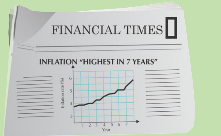
Inflation - the increase in the price of goods in a country
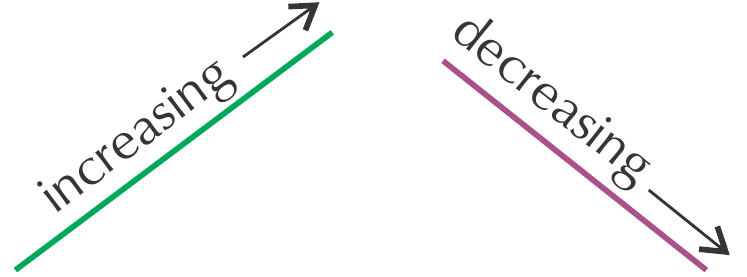
When we look at graphs, we need to understand what it means when a line goes up or down. This is fundamental to interpreting any graph correctly.
If a graph is increasing, the slope goes up from left to right. This means the values are getting larger as we move along the horizontal axis.
If a graph is decreasing, the slope goes down from left to right. This means the values are getting smaller as we move along the horizontal axis.
Slope steepness and rate of change
Not all increases or decreases happen at the same rate. The steepness of a line tells us how quickly changes occur.
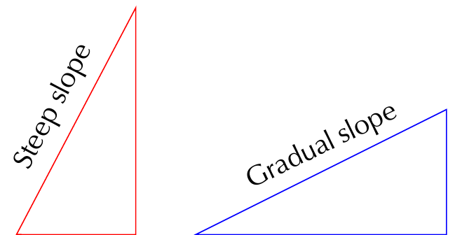
A steep slope indicates rapid change. When you see a very steep line on a graph, it means the quantity is changing quickly over a short period.
A gradual slope indicates slow change. A gentle slope means the quantity is changing slowly over time.
Worked example 1: Reading an inflation graph
Worked Example: Reading Temperature Data from a Graph
Let's examine how to extract information from a newspaper graph:
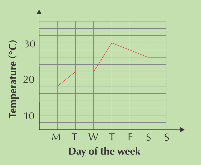
Step 1: Identify what the graph shows
- The graph displays maximum temperature for each day of the week
- The x-axis shows days (Monday to Sunday)
- The y-axis shows temperature in degrees Celsius
Step 2: Find specific information
- Lowest temperature: Monday (approximately 18°C)
- Highest temperature: Thursday (approximately 30°C)
- Temperature stays constant: Tuesday to Wednesday, and Saturday to Sunday
Step 3: Identify trends
- Biggest increase: Wednesday to Thursday (steepest upward slope)
- Decrease shown: Thursday to Saturday (downward slope)
Continuous and discrete graphs
Understanding the difference between continuous and discrete data is crucial for drawing graphs correctly.
Discrete data consists of whole numbers only. You cannot have half a person or 2.5 bus trips. When plotting discrete data, we connect points with dotted lines because the values between the points don't exist.
Continuous data can include decimal values. Measurements like time, distance, and temperature can have any value. We connect these points with solid lines because all values between the plotted points are valid.
Worked example 2: Continuous vs discrete graphs
Worked Example: Comparing Bus Data Types
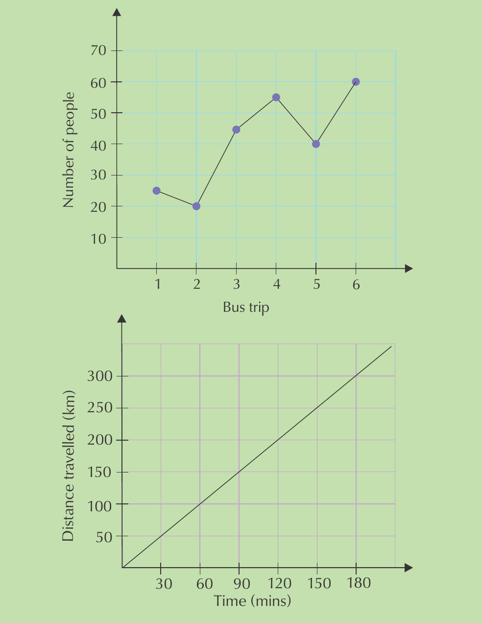
Top graph (Bus passengers):
- Shows discrete data because you cannot have half a passenger
- Uses dotted lines to connect the points
- Only whole number values make sense
Bottom graph (Distance travelled):
- Shows continuous data because distance can be measured to any decimal place
- Uses a solid line showing that all points along the line are valid
- The bus travels continuously along the route
Independent and dependent variables
Variable - the quantity you are measuring or calculating
Understanding variables helps you identify cause-and-effect relationships in graphs.
An independent variable stands alone and is not changed by other variables being measured. For example, a person's age is independent because other factors like what they eat or how much television they watch will not change their age.
A dependent variable depends on other factors and changes based on them. For example, a test score is dependent because it can change based on how much you studied, how much sleep you got, or how hungry you were during the test.
Memory tip: Put the variable names in a sentence to see which makes sense. "Time causes distance travelled" makes sense, but "distance travelled causes time" does not.
When plotting graphs:
- The independent variable goes on the horizontal axis (x-axis)
- The dependent variable goes on the vertical axis (y-axis)
Understanding when graphs touch axes
Touching the vertical axis (y-axis)
When a graph touches the vertical axis, it means the horizontal axis quantity equals zero. This intersection point often represents a starting value or fixed cost.
Worked example 3: Graph touching the vertical axis
Worked Example: Interpreting Y-Axis Intersection
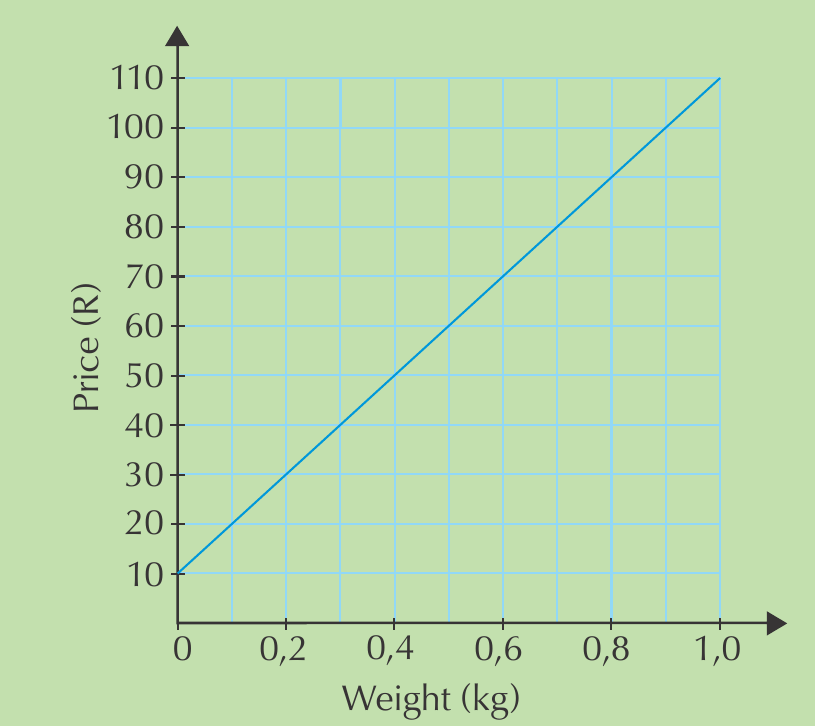
Question: What does it mean when this graph touches the vertical axis at R10?
Solution: When the weight is 0 kg, the price is R10. This represents a fixed starting cost (probably packaging) that you pay regardless of how much biltong you buy. Even if you buy no biltong, you still pay R10.
The independent variable is weight (you choose how much to buy), and the dependent variable is price (this depends on the weight chosen).
Touching the horizontal axis (x-axis)
When a graph touches the horizontal axis, it means the vertical axis quantity equals zero.
Worked example 4: Graph touching the horizontal axis
Worked Example: Understanding X-Axis Intersection
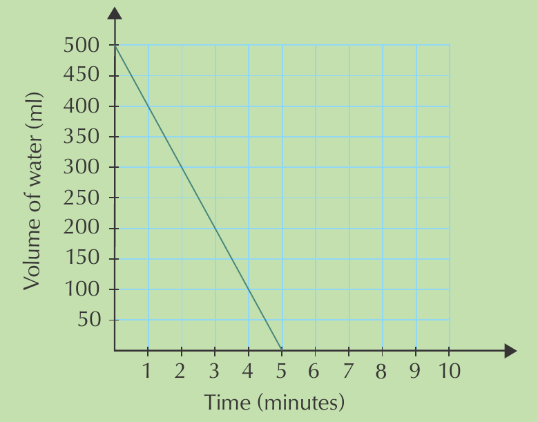
Question: Describe what this graph shows about emptying a water bottle.
Solution: The bottle starts full with 500ml of water. It decreases steadily as water is consumed. At 5 minutes, the graph touches the horizontal axis, meaning the bottle is completely empty (0ml remaining).
Time is the independent variable (it passes regardless of other factors), and volume is the dependent variable (it depends on how much water is consumed over time).
Worked example 5: Complex water consumption pattern
Worked Example: Complex Graph Interpretation
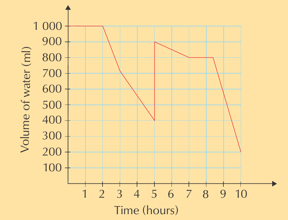
This graph tells a more complex story:
- Starts with 1000ml
- Decreases rapidly (periods of drinking)
- Has flat sections (periods of no consumption)
- Sharp increases (refilling the bottle)
- Final decrease to around 200ml
Each section of the graph represents different activities throughout the day.
Key Points to Remember:
- Always read the axes carefully - check what quantities are being measured and their units
- Look for patterns - increasing, decreasing, constant sections
- Identify the steepest sections - these show the fastest rates of change
- Check where graphs touch axes - these points often have special meaning
- Distinguish between continuous and discrete data - this affects how you should draw connecting lines
- Identify variables correctly - remember that independent variables go on the x-axis
Essential Concepts:
- Graphs are mathematical pictures that show relationships between quantities
- Increasing graphs slope upward from left to right, decreasing graphs slope downward
- Steep slopes indicate rapid change, gradual slopes indicate slow change
- Use dotted lines for discrete data (whole numbers only) and solid lines for continuous data
- Independent variables go on the horizontal axis, dependent variables on the vertical axis
- When graphs touch axes, the intersecting variable equals zero, often revealing important information about the situation