Grouping Data (Grade 10 NSC Matric Mathematics): Revision Notes
Grouping Data
What is grouping data?
Grouping data is a method used to handle large sets of continuous quantitative data by dividing the full range of values into smaller, manageable sub-ranges or classes. This process transforms continuous data into discrete categories, making it easier to analyse and visualise.
When we collect continuous data like heights, weights, or test scores, we often end up with many different values that are difficult to work with directly. Grouping helps us organise this information into meaningful patterns.
The process of grouping is essential when dealing with large datasets where individual values become overwhelming. Instead of trying to work with hundreds of separate measurements, we can group them into 5-8 manageable categories that reveal clear patterns.
Why do we group data?
Grouping data serves several important purposes:
- Makes large datasets easier to manage and understand
- Allows us to see patterns and trends in the data
- Enables us to create visual representations like histograms
- Helps identify the most common ranges of values
- Simplifies calculations for measures of central tendency
The grouping process
Step 1: Define the ranges
The first step in grouping data is to create appropriate class intervals or ranges. These ranges must follow two important rules:
Critical Rules for Class Intervals:
- Non-overlapping: Each range must not overlap with any other range
- Complete coverage: The ranges must cover the entire span of the data set
These rules ensure that every data point belongs to exactly one class interval, preventing confusion and ensuring accurate analysis.
For example, if we have height data ranging from 130cm to 180cm, we might create ranges like:
- 130 ≤ h < 140
- 140 ≤ h < 150
- 150 ≤ h < 160
- 160 ≤ h < 170
- 170 ≤ h < 180
Notice how each range starts exactly where the previous one ended, ensuring no gaps or overlaps.
Step 2: Count the frequencies
Next, we count how many data values fall within each range. This creates a frequency distribution table.
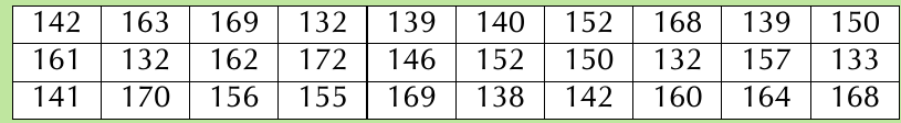
Let's look at a worked example using the height data shown above.
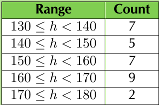
The frequency table shows us clearly how the data is distributed across the different ranges.
Creating a frequency table is like sorting items into labelled boxes. Each box (class interval) collects all the data values that belong to that particular range, making it much easier to see where most of your data falls.
Creating histograms
A histogram is a visual representation of grouped data. It consists of a collection of rectangles where:
- The base of each rectangle represents a class interval on the x-axis
- The height of each rectangle represents the frequency (count) for that interval
- The rectangles touch each other (no gaps between them)
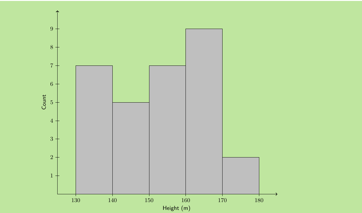
This histogram makes it easy to see patterns in the data. We can quickly identify which height ranges are most common and get an overview of the overall distribution.
Interpreting histograms
When reading a histogram, look for:
- The modal class: The range with the highest frequency (tallest bar)
- The shape: Is the distribution symmetrical, skewed, or uniform?
- The spread: How widely distributed are the values?
- Any unusual patterns: Are there gaps or unexpected peaks?
Think of a histogram as a visual story of your data. The tallest bars show you where most of your data "lives," while the overall shape tells you about the distribution pattern. A symmetrical shape suggests balanced data, while a skewed shape indicates data clustering towards one end.
Measures of central tendency for grouped data
When we group data, we lose some precision because we no longer know the exact original values. However, we can still calculate estimates of the mean, median, and mode.
Modal group
The modal group is simply the class interval with the highest frequency. This is the range that contains the most data values.
Median group
The median group is the class interval that contains the middle value when all the data is arranged in order. To find this, we locate the central group among all the class intervals.
Estimating the mean
For grouped data, we estimate the mean by assuming that all values in each class interval are located at the centre of that interval. We then calculate a weighted average using the frequencies.
Key Impact of Grouping: When we group continuous data, we trade precision for clarity. While we lose the ability to know exact individual values, we gain the ability to see overall patterns and trends that might be hidden in a large, ungrouped dataset.
Worked example: Complete grouping process
Worked Example: Grouping Height Data
Given data: Heights of 30 learners (in cm)
Step 1: Define appropriate ranges
- 130 ≤ h < 140
- 140 ≤ h < 150
- 150 ≤ h < 160
- 160 ≤ h < 170
- 170 ≤ h < 180
Step 2: Count frequencies for each range
Step 3: Draw the histogram
Step 4: Interpret the results
- Modal group: 160 ≤ h < 170 (frequency = 9)
- The distribution appears roughly normal with most values in the middle ranges
- Very few learners are in the tallest height range
Practical applications
Grouping data is essential in many real-world situations:
- Academic performance: Grouping test scores into grade ranges
- Business analysis: Grouping sales data by value ranges
- Health statistics: Grouping patient data by age ranges or measurement ranges
- Quality control: Grouping product measurements to identify patterns
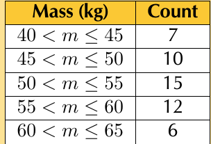
This table shows how mass measurements might be grouped for analysis.
Real-world applications of data grouping are everywhere around us. From determining insurance premiums based on age groups to organising inventory by price ranges, grouping helps make sense of complex datasets in practical, actionable ways.
Common mistakes to avoid
Critical Mistakes to Watch Out For:
- Overlapping ranges: Make sure ranges like 10-20 and 20-30 don't both include 20
- Gaps in coverage: Ensure your ranges cover all possible values in your dataset
- Unequal interval widths: Try to keep all intervals the same width when possible
- Too few or too many groups: Aim for 5-8 groups for most datasets
These errors can lead to inaccurate analysis and misleading conclusions, so always double-check your class intervals before proceeding with your analysis.
Exam tips
For NSC Mathematics exams, remember:
- Always check that your ranges don't overlap and cover all data
- Label your histogram axes clearly with appropriate units
- Show your frequency counting work step by step
- When finding modal and median groups, work systematically through the frequency table
- Practice reading histograms to extract key information quickly
Key Points to Remember:
- Grouping data transforms continuous data into discrete categories by creating non-overlapping ranges
- Frequency tables show how many values fall in each range, making patterns easier to see
- Histograms are visual representations where rectangle heights show frequencies for each class interval
- Modal group is the class with the highest frequency, while median group contains the middle values
- Grouping makes large datasets manageable but reduces precision in calculations of central tendency measures
- Always ensure class intervals are non-overlapping and provide complete coverage of your data