Conducting a Regression Analysis Using Data (VCE SSCE General Mathematics): Revision Notes
Conducting a Regression Analysis Using Data
Introduction
A regression analysis allows us to investigate the association between two numerical variables and make predictions. In your statistical investigation project, you will need to conduct a complete regression analysis from start to finish. This note will guide you through the essential steps and help you understand what each part of the analysis tells us.
A full regression analysis is a required component of statistical investigation projects. Mastering this process will enable you to draw meaningful conclusions from bivariate data.
Understanding variables
Before starting any regression analysis, you must identify two key variables:
Explanatory Variable (EV): This is the variable we use to make predictions. It is plotted on the horizontal axis (x-axis) of a scatterplot.
Response Variable (RV): This is the variable we are trying to predict. It is plotted on the vertical axis (y-axis) of a scatterplot.
The choice of which variable is explanatory and which is response depends on the research question. We are investigating whether the explanatory variable can be used to predict the response variable.
Remember: The explanatory variable (EV) predicts the response variable (RV). Think of it as: "Does EV help us predict RV?"
The worked example
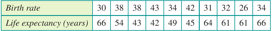
Throughout this note, we'll use a real example investigating the association between birth rate (births per 1000 people) and life expectancy (in years) across 10 countries. Let's identify our variables:
- Explanatory Variable (EV): birth rate
- Response Variable (RV): life expectancy
Here is the data we'll be working with:
Step-by-step regression analysis
Step 1: Identify your variables
Clearly state which variable is the explanatory variable and which is the response variable. This decision should be based on your research question.
For our example:
- EV: birth
- RV: life
Step 2: Enter the data
Input your bivariate data into your calculator, using meaningful variable names. Each pair of values should be entered as a row, with the explanatory variable in one column and the response variable in another.
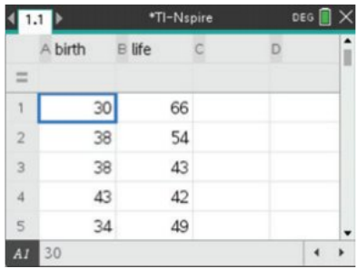
Using clear variable names (like "birth" and "life") rather than generic names (like "x" and "y") makes it much easier to interpret your results later.
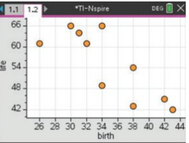
Step 3: Construct a scatterplot
Create a scatterplot with the explanatory variable on the horizontal axis and the response variable on the vertical axis. This visual representation helps you assess the nature of the relationship between the variables.
Step 4: Describe the association
When describing the association shown in a scatterplot, you must comment on four features. A useful way to remember these is the acronym DFSO:
- D - Direction: Is the association positive (upward trend) or negative (downward trend)?
- F - Form: Is the relationship linear (straight line pattern) or non-linear (curved pattern)?
- S - Strength: How closely do the points follow the pattern? Strength can be described as weak, moderate, or strong.
- O - Outliers: Are there any points that don't fit the general pattern?
Always use the DFSO framework when describing scatterplots in your statistical investigation. A complete description must address all four components: Direction, Form, Strength, and Outliers.
Worked Example: Describing the Scatterplot
For our birth rate and life expectancy data:
There is a strong, negative, linear relationship between life expectancy and birth rate. There are no obvious outliers.
Breaking it down:
- Direction: Negative (as birth rate increases, life expectancy decreases)
- Form: Linear (points follow a straight line pattern)
- Strength: Strong (points are close to the line pattern)
- Outliers: None (all points fit the general pattern)
Step 5: Find the regression equation
Calculate the least squares regression line. This is the straight line that best fits the data by minimising the sum of squared residuals. Your calculator will provide:
- The regression equation in the form
- The correlation coefficient ()
- The coefficient of determination ()
Worked Example: Regression Output
For our birth rate and life expectancy data:
Regression equation:
Correlation coefficient:
Coefficient of determination:
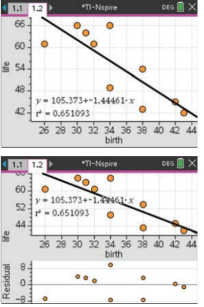
Step 6: Generate a residual plot
A residual plot helps us check whether a linear model is appropriate for our data. The residual is the difference between the actual -value and the predicted -value for each data point.
To create a residual plot, plot the residuals on the vertical axis against the explanatory variable on the horizontal axis.
What to look for: If the linear model is appropriate, the residual plot should show a random scatter of points around zero, with no clear pattern.
Worked Example: Interpreting the Residual Plot
For our birth rate and life expectancy data:
The random residual plot suggests linearity.
This means our linear model is appropriate for this data. The points are scattered randomly around zero with no obvious pattern or trend.
Step 7: Interpret the results
Once you have all the output from your regression analysis, you need to interpret what it means. The following sections explain how to interpret each component.
Interpreting regression output
The regression equation
The regression equation has the form:
Where:
- is the intercept (the predicted response value when the explanatory variable equals zero)
- is the slope (the average change in the response variable for each one-unit increase in the explanatory variable)
Worked Example: Interpreting the Regression Equation
For our example:
Interpretation of the slope: For each additional birth per 1000 people, life expectancy decreases by approximately 1.445 years on average.
Interpretation of the intercept: When birth rate is zero, the predicted life expectancy would be 105.4 years.
The intercept often doesn't make practical sense, as it involves extrapolation beyond our data range. In this example, a birth rate of zero is not realistic for any country.
The correlation coefficient (r)
The correlation coefficient measures the strength and direction of the linear relationship between the two variables.
- Values range from to
- The sign (positive or negative) indicates direction
- The magnitude (size) indicates strength:
- to suggests a strong correlation
- to suggests a moderate correlation
- to suggests a weak correlation
Worked Example: Interpreting the Correlation Coefficient
For our example:
This indicates a strong negative correlation. The negative sign tells us that as birth rate increases, life expectancy tends to decrease. The magnitude of approximately 0.81 indicates a strong relationship.
The coefficient of determination (r²)
The coefficient of determination tells us the proportion of variation in the response variable that can be explained by the explanatory variable.
- Values range from to
- Often expressed as a percentage by multiplying by 100
Worked Example: Interpreting the Coefficient of Determination
For our example:
Interpretation: Approximately 65.1% of the variation in life expectancy can be explained by the variation in birth rate.
The remaining 34.9% of variation is due to other factors not included in our model.
To convert to a percentage, simply multiply by 100. For example:
Using the regression equation for predictions
Once you have a regression equation, you can use it to make predictions. Simply substitute a value for the explanatory variable and calculate the predicted response value.
Worked Example: Making a Prediction
Using our equation , what is the predicted life expectancy for a country with a birth rate of 35 per 1000?
Answer: The predicted life expectancy is approximately 54.8 years.
Beware of extrapolation! Be cautious about making predictions outside the range of your data. The relationship may not continue in the same way beyond the data values you observed.
Checking the linearity assumption
The residual plot is crucial for checking whether a linear model is appropriate:
- Random scatter: Points scattered randomly around zero with no pattern → Linear model is appropriate
- Curved pattern: Points form a curve → Non-linear relationship, linear model not appropriate
- Fan shape: Spread of points increases or decreases → Variation is not constant, may need different approach
Always examine your residual plot before relying on your regression equation for predictions. If the residual plot shows a pattern, a linear model may not be appropriate for your data.
Key Points to Remember:
-
Identify variables first: Clearly determine which is the explanatory variable (EV) and which is the response variable (RV) based on your research question.
-
Use DFSO to describe scatterplots: Always comment on Direction, Form, Strength, and Outliers when describing an association.
-
Interpret the slope carefully: The slope tells you the average change in the response variable for each one-unit increase in the explanatory variable.
-
Understand r²: The coefficient of determination () tells you what percentage of variation in the response variable is explained by the explanatory variable. Multiply by 100 to convert to a percentage.
-
Check linearity: Always generate and examine a residual plot to confirm that a linear model is appropriate before making predictions. Look for random scatter around zero.
-
Watch for extrapolation: Only make predictions within the range of your original data to ensure reliability.