Graphical skills 1 (Edexcel GCSE Geography A): Revision Notes
Graphical skills 1
Introduction to graphical skills
In geography, you'll encounter various types of graphs and charts that help us visualise and interpret data. Understanding which type of graph to use for different kinds of data is essential for both interpreting existing information and presenting your own findings clearly. Each type of graph has specific strengths and is suited to particular types of data.
Types of graphs and charts
Line charts
Line charts are your go-to choice when working with continuous data that changes over time. They excel at showing trends, patterns, and changes in data across time periods. When creating a line chart, it's crucial to plot your data points accurately and connect them with a smooth, continuous line to show the flow of change.
Line charts are particularly powerful because the continuous line helps viewers easily spot trends, whether values are increasing, decreasing, or remaining stable across time periods.
These charts are particularly useful in geography for showing things like population growth, temperature changes throughout the year, or economic indicators over time. The continuous line helps viewers easily spot trends, whether values are increasing, decreasing, or remaining stable.
Bar charts
Bar charts work best when you're dealing with discontinuous or categorical data - information that falls into separate, distinct groups. Unlike line charts, bar charts use individual bars to represent different categories, making it easy to compare values between these separate groups.
When drawing bar charts, always use a ruler to ensure your bars are straight and properly aligned. The height of each bar corresponds to the value it represents, making comparisons between categories straightforward. Bar charts are excellent for showing data like population by country, rainfall by month, or employment by industry sector.
Key Difference: Unlike line charts that show continuous data, bar charts represent discrete categories with gaps between bars to emphasise that the data is not continuous.
Pie charts
Pie charts are perfect for displaying proportions and showing how different parts make up a complete whole. Before creating a pie chart, you'll need to convert your raw data into percentages, then transform these percentages into degrees (since a complete circle contains 360 degrees).
Converting to Degrees: To convert percentages to degrees for pie charts, multiply the percentage by 3.6. For example, 25% becomes 25 × 3.6 = 90 degrees.
The beauty of pie charts lies in their simplicity - they provide an immediate visual understanding of how different components contribute to the total. They're particularly effective when you want to show the relative size of different categories, such as land use types in a region or the composition of a country's exports.
Scatter plots
Scatter plots are powerful tools for examining relationships between two different variables. Each point on the graph represents one observation, with its position determined by the values of both variables being studied. The overall pattern formed by these points reveals the type of relationship present.
When the points generally form an upward trend (with a line of best fit sloping upwards), this indicates a positive correlation - as one variable increases, so does the other. A downward trend suggests a negative correlation, where one variable decreases as the other increases. Sometimes, the points show no clear pattern, indicating no significant relationship between the variables.
Reading Correlations: The closer the points are to forming a straight line, the stronger the correlation. Scattered points with no clear pattern indicate little to no correlation between the variables.
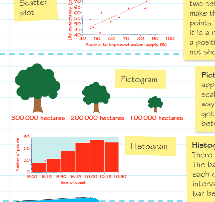
Pictograms
Pictograms use symbols or pictures to represent data, making information more visually appealing and easier to understand at a glance. The key to successful pictograms is ensuring your symbols are drawn to scale - larger quantities should be represented by proportionally larger symbols.
While pictograms excel at presenting data in a clear, engaging way, they can sometimes lose precision. The visual impact often makes up for this limitation, especially when communicating with general audiences who might find traditional graphs intimidating.
Histograms
Histograms are specifically designed for continuous data and differ from bar charts in several important ways. The bars in a histogram touch each other because they represent continuous data with no gaps between categories. Additionally, all bars should have equal width, representing equal class intervals.
Critical Distinction: Histogram bars touch each other (continuous data), while bar chart bars have gaps between them (categorical data). This visual difference immediately tells you about the nature of the data being displayed.
The continuous nature of the data means that histograms are ideal for showing distributions - how frequently different values occur within your dataset. They're commonly used in geography for displaying data like population age structures, income distributions, or measurement frequencies.
Choosing the right graph type
The type of data you're working with largely determines which graph or chart will be most effective:
- Time-based continuous data: Use line charts to show changes and trends over time
- Categorical comparisons: Choose bar charts when comparing distinct groups or categories
- Parts of a whole: Select pie charts when showing how components make up a complete total
- Relationships between variables: Use scatter plots to explore correlations between two different measurements
- Visual representation: Consider pictograms when you want to make data more accessible and engaging
- Frequency distributions: Apply histograms when showing how continuous data is distributed across different ranges
Practice application
Consider these scenarios and think about which type of graph would be most appropriate:
Worked Example: Population Growth in China from 1950 to 2020
This involves continuous data over time, making a line chart the ideal choice to show trends and changes across the decades. The continuous nature of population growth and the extended time period make line charts perfect for revealing long-term patterns.
Worked Example: Relationship Between Settlement Size and Number of Services
This requires examining the connection between two variables, so a scatter plot would effectively reveal any correlation between these factors. Each settlement would be plotted as a point, allowing you to see if larger settlements tend to have more services.
Worked Example: Proportion of Different Ethnic Groups in an Inner City Area
Since this shows parts making up a whole population, a pie chart would clearly display the relative sizes of each group. Convert population numbers to percentages first, then to degrees for accurate representation.
Key Points to Remember:
- Line charts are perfect for showing how continuous data changes over time - think trends and patterns
- Bar charts work best for comparing separate categories or groups of discontinuous data
- Pie charts excel at showing proportions and parts of a whole - always convert to percentages first
- Scatter plots reveal relationships between two variables through correlation patterns
- Pictograms make data visually engaging but require careful scaling of symbols
- Histograms display continuous data distributions with touching bars of equal width