Graphical skills 3 (Edexcel GCSE Geography A): Revision Notes
Graphical skills 3
Understanding how to read and interpret different types of geographical data presentation is essential for analysing patterns and trends. This section focuses on three key graphical techniques: population pyramids, choropleth maps, and flow-line maps. Each serves a specific purpose in displaying geographical information clearly and effectively.
Population pyramids
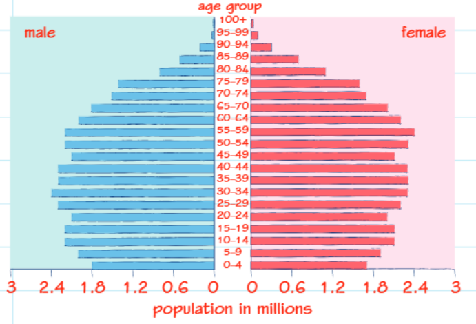
Population pyramids provide a visual snapshot of a country's demographic structure by showing how people are distributed across different age groups and between genders. These specialised bar charts help geographers understand population characteristics and predict future demographic trends.
Population pyramids are one of the most effective tools for demographic analysis, allowing researchers to quickly assess a country's development stage and predict future population challenges such as ageing societies or rapid growth.
Structure and components
Population pyramids display demographic data through a distinctive format where horizontal bars extend from a central vertical axis. The left side typically represents male populations using one colour, while the right side shows female populations in a contrasting colour. The vertical axis displays age categories, usually grouped in five-year intervals from youngest at the bottom to oldest at the top. The horizontal axis measures population numbers, often in thousands or millions.
Interpreting demographic patterns
Different population pyramid shapes reveal important information about a country's development stage and demographic characteristics. Countries with high birth rates and shorter life expectancies often display classic pyramid shapes, with wide bases representing large numbers of young people and narrow tops indicating fewer elderly citizens. This pattern suggests a rapidly growing population with high fertility rates.
Understanding Pyramid Shapes:
- Classic pyramid shape = Young, rapidly growing population
- Rectangular shape = Stable, developed population
- Inverted pyramid = Ageing population with declining birth rates
As countries develop economically and socially, their population pyramids begin to change shape. The sides become straighter as birth rates decline and life expectancy increases, creating more rectangular profiles. Advanced developed nations may even show inverted or top-heavy pyramids, where there are more elderly people than young people, indicating declining birth rates and ageing populations.
Choropleth maps
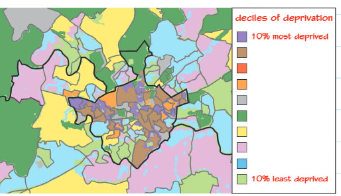
Choropleth maps use different shades or colours to represent varying intensities of data across geographical areas. This mapping technique makes it easy to identify spatial patterns and compare values between different regions at a glance.
Construction and design principles
These maps work by dividing geographical areas into distinct zones, often based on administrative boundaries such as countries, states, or local government districts. Each zone receives a specific shade or colour that corresponds to its data value according to a predetermined classification system. The legend typically shows these classifications as ranges, such as "most deprived" to "least deprived" areas.
Design Best Practices: The effectiveness of choropleth maps depends heavily on thoughtful design choices. Colours should progress logically and intuitively, while the number of categories must balance detail with clarity.
The effectiveness of choropleth maps depends on choosing appropriate colour schemes and classification methods. Colours should progress logically from light to dark or through a spectrum that intuitively represents the data being shown. The number of categories must balance detail with clarity - too many categories can confuse readers, while too few may oversimplify complex patterns.
Advantages and limitations
Choropleth maps excel at revealing geographical patterns and making regional comparisons straightforward. They can effectively highlight areas of concern, such as regions with high unemployment or low educational attainment, making them valuable tools for policy makers and researchers.
Critical Limitation to Remember: Choropleth maps can create misleading impressions by suggesting abrupt transitions between areas when changes are often gradual in reality. Always consider the actual nature of geographical transitions when interpreting these maps.
However, these maps can create misleading impressions about the nature of geographical change. The distinct colour boundaries between areas suggest abrupt transitions that may not reflect reality, where changes are often more gradual. Additionally, the visual impact of larger areas can dominate the map even if they contain fewer people than smaller, densely populated regions.
Flow-line maps
Flow-line maps specialise in showing movement and connections between different locations. They use arrows of varying thickness to represent both the direction and magnitude of flows, making them ideal for displaying migration patterns, trade relationships, or resource movements.
Design features and representation
The key feature of flow-line maps is the use of arrows whose thickness corresponds directly to the volume or intensity of the flow being represented. Thicker arrows indicate larger flows, while thinner arrows represent smaller movements. This proportional relationship allows readers to quickly assess the relative importance of different flows across the mapped area.
The direction of arrows clearly indicates the path of movement, whether showing people migrating between cities, goods flowing along trade routes, or rivers carrying different volumes of water. Some flow-line maps incorporate double-headed arrows to show bidirectional flows, such as commuting patterns where people travel in both directions between locations.
Flow-line maps are particularly effective for understanding connectivity patterns and can reveal dominant corridors of movement that might not be obvious from other types of data presentation.
Applications and considerations
Flow-line maps prove particularly useful for understanding connectivity and interaction patterns between places. They can reveal dominant flow corridors, identify isolated areas with limited connections, and highlight the most significant relationships within a network.
However, when mapping areas with numerous flows, these maps can become visually complex and difficult to interpret. Overlapping arrows and congested areas may obscure important patterns, requiring careful design decisions about which flows to include and how to present them clearly.
Key Points to Remember:
-
Population pyramids reveal demographic structure through age and gender distribution, with pyramid shapes indicating young populations and rectangular or inverted shapes showing developed or ageing societies
-
Choropleth maps use colour coding to display geographical patterns effectively, but can suggest abrupt boundaries where changes are actually gradual
-
Flow-line maps show movement and connections using arrows of proportional thickness, making it easy to identify major flows and connectivity patterns
-
Each graphical technique serves specific purposes - choose the right type based on whether you need to show structure, distribution, or movement patterns
-
Always examine legends and scales carefully to understand exactly what the graphics are representing and avoid misinterpretation