Presenting Data (OCR GCSE Geography B (Geography for Enquiring Minds)): Revision Notes
Presenting Data
Introduction
After collecting data during geographical fieldwork, it is essential to present it clearly and effectively. Data presentation transforms raw fieldwork measurements into organised formats that make patterns and relationships visible. This process is fundamental to geographical investigation because it supports analysis and helps you communicate your findings.
When data is presented well, it becomes much easier to:
- Spot patterns and trends in your results
- Make comparisons between different locations or variables
- Communicate your findings in a visual way that others can understand quickly
- Back up your conclusions with clear evidence
Raw fieldwork data, such as measurements written in a notebook, can be confusing and difficult to interpret. By presenting this information in structured formats like tables, graphs, charts, or maps, you transform it into something meaningful that supports the next stages of your geographical investigation.
Tables
Tables are usually the first method you will use when presenting fieldwork data. They provide a systematic way to record and display measurements collected at different sites or times.
A table organises information into rows and columns, creating a clear structure where each row typically represents a different site or time period, and each column shows a different variable being measured. This format makes it straightforward to record fieldwork measurements and later refer back to them during analysis.
Example of a data table
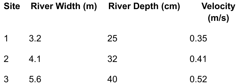
Worked Example: River Measurements Table
This table demonstrates how river measurements can be recorded across three different field sites, showing how width, depth, and velocity change downstream.
The table includes:
- Clear column headings with units (metres for width and depth, m/s for velocity)
- Consistent decimal places for precision
- Organized rows for each field site
- Easy comparison of how variables change downstream
Benefits of using tables
Tables offer several important advantages for presenting geographical data:
- They keep all your data organised in one place, making it easy to find specific measurements when needed
- Tables allow quick comparisons between different sites or time periods because you can simply scan down a column to see how a variable changes
- They provide a clear and accurate record of your raw data, which is essential if you need to check your work or if someone else wants to verify your findings
When creating tables for your fieldwork, remember to:
- Include clear column headings with units (such as metres or degrees Celsius)
- Use consistent decimal places for measurements
- Ensure rows are clearly separated so the data is easy to read
Graphs
Graphs transform numerical data into visual formats that reveal relationships between variables. They are particularly useful in geography because they help you identify trends and patterns that might not be obvious from looking at raw numbers in a table.
Line graphs
Line graphs are excellent for showing how something changes over distance or time. They work by plotting points on a grid and connecting them with a line, which allows you to see trends clearly.
In geographical fieldwork, line graphs are commonly used to show:
- How river depth changes as you move downstream
- Temperature variations during the day
- Changes in vegetation height along a transect
When constructing a line graph, the x-axis (horizontal) typically shows the independent variable – this is the factor you control or measure along, such as distance downstream or time of day. The y-axis (vertical) shows the dependent variable – this is what you measure, such as river depth or temperature.
Climate graphs
A special type of graph commonly used in geography is the climate graph, which combines both line and bar chart elements to show temperature and rainfall patterns throughout the year.
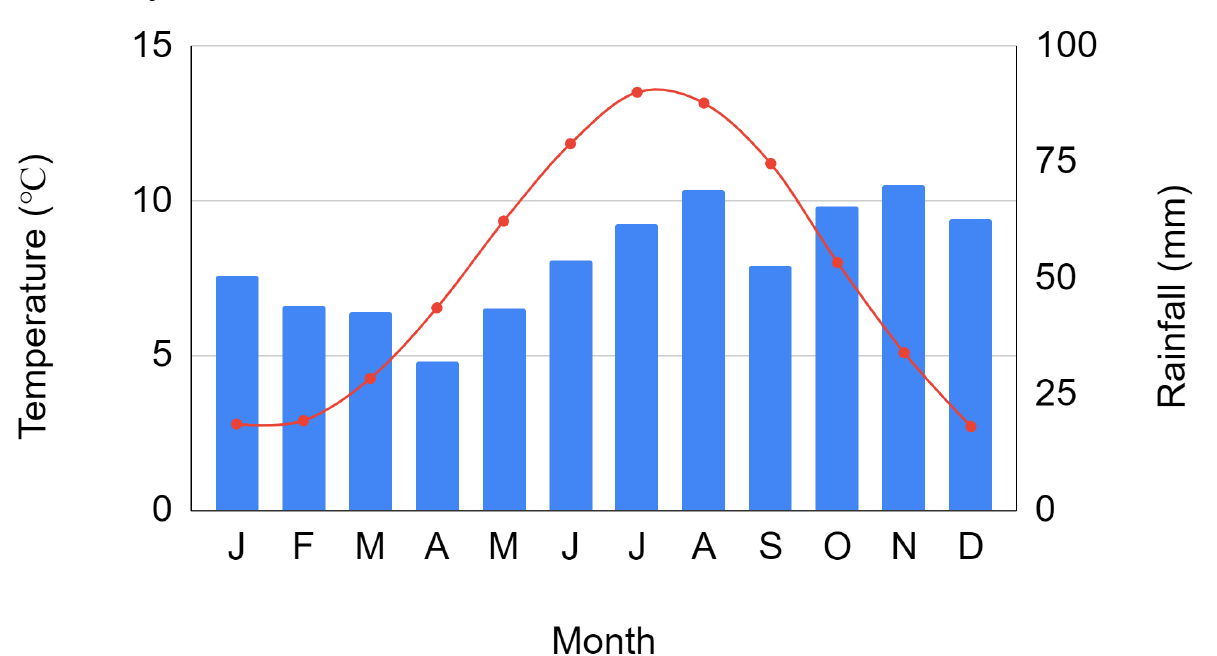
Worked Example: Reading a Climate Graph
This example demonstrates how a climate graph presents two different types of data simultaneously:
Step 1: Identify the bar elements
- The blue bars represent temperature measurements (shown on the left y-axis in degrees Celsius)
Step 2: Identify the line element
- The red line with markers shows rainfall amounts (shown on the right y-axis in millimetres)
Step 3: Read the x-axis
- The x-axis displays months from January to December
Result: This dual-axis approach allows you to compare temperature and rainfall patterns and identify seasonal variations in climate.
Bar charts
Bar charts are designed for comparing different categories of data rather than showing continuous change. Each bar represents a distinct category, and the height of the bar shows the value for that category.
In geographical fieldwork, you might use bar charts to display:
- The number of pedestrians counted at different locations in a town centre
- Different types of land use in an urban area
- Frequency of different building types along a street
When drawing bar charts, it is important that:
- Bars are separate from each other (unlike in a histogram where bars touch)
- Each bar should be clearly labelled so readers know what category it represents
- Bars should be of equal width to avoid misleading comparisons
Pie charts
Pie charts display proportions or percentages by dividing a circle into segments. The size of each segment corresponds to its percentage of the whole, making pie charts ideal for showing how something is divided into parts.
Geographical uses of pie charts include:
- Showing the proportion of different land use types in a city centre (residential, commercial, industrial, recreational)
- Displaying the breakdown of survey responses from questionnaires
- Illustrating the composition of beach sediment types
Each segment of a pie chart represents a percentage of the total, and all segments must add up to 100%. When creating pie charts, ensure each segment is clearly labelled and consider using different colours or patterns to distinguish between categories. Pie charts work best when you have between three and seven categories; too many segments can make the chart confusing.
Maps
Maps are a fundamental geographical tool for presenting spatial data – information that relates to specific locations or areas. They help you understand how data varies across different places and identify geographical patterns.
Choropleth maps
Choropleth maps use different shades or colours to represent varying levels of data across different areas. For example, you might use light to dark shading to show population density across different wards in a city, with darker shades representing higher density areas.
These maps are particularly effective for showing how something varies across regions, such as:
- Unemployment rates in different areas
- Average rainfall across counties
- Population density across wards
When creating choropleth maps, it is crucial to include a clear key that explains what each shade or colour represents.
Proportional symbol maps
Proportional symbol maps use symbols (often circles or squares) of different sizes to represent different values at specific locations. The larger the symbol, the greater the value it represents.
For instance, you might use circles of varying sizes on a map to show the population of different cities, or squares of different sizes to represent the amount of traffic at different road junctions. This technique is effective because the human eye can easily compare different sized symbols and understand the pattern of variation across an area.
Annotated maps
Annotated maps are regular maps that include additional notes, labels, and observations made during fieldwork. These annotations highlight key features, explain patterns, or record qualitative observations.
Example: Creating an Annotated Map
During fieldwork, you might annotate a map with:
- Notes about land use types and their locations
- Labels indicating the direction of river flow
- Markers showing where photographs were taken
- Observations about environmental features
- Notes about human activity patterns
Result: Annotated maps combine spatial information with your own observations and interpretations, creating a comprehensive record of fieldwork findings.
Maps help geographers understand how data varies across different locations and identify spatial patterns that might not be apparent from graphs or charts alone.
Good presentation practice
Regardless of which presentation method you use, following good practice guidelines ensures your data is accurate, professional, and easy for others to understand.
Essential elements
Every data presentation should include a clear, descriptive title that explains what the data shows. For example, instead of just "Graph", use "Changes in river depth downstream along the River Test, Hampshire".
Critical Requirements for All Data Presentations:
All axes on graphs must be labelled with both the variable name and the unit of measurement (such as "Temperature (°C)" or "Distance (km)"). This prevents confusion and ensures others can correctly interpret your data.
Using appropriate scales is crucial. The scale you choose should allow all your data to fit on the graph or chart while making differences visible. Avoid scales that are too compressed (making differences hard to see) or too spread out (wasting space).
Keys and legends
Whenever you use colours, symbols, or different shading in your presentation, include a key or legend that explains what each one represents. This is especially important for maps and charts where multiple categories are shown.
Presentation quality
Ensure all diagrams are neat and easy to read. Use a ruler for straight lines, make text clear and legible, and avoid crossing lines or cluttered layouts. If drawing by hand, use pencil first so you can correct mistakes, then go over in pen once you are satisfied.
These good practice steps ensure that your data presentation is both accurate and understandable, allowing you to communicate your geographical findings effectively.
Remember!
Key Points to Remember:
-
Data presentation transforms raw fieldwork measurements into organised formats (tables, graphs, charts, maps) that reveal patterns and support analysis.
-
Different presentation methods serve different purposes: tables organise raw data, line graphs show trends over time or distance, bar charts compare categories, pie charts display proportions, and maps reveal spatial patterns.
-
Always follow good practice guidelines: include clear titles, label axes and units, use appropriate scales, add keys or legends, and ensure your work is neat and accurate.
-
Effective data presentation is essential for geographical investigation because it helps you identify patterns, make comparisons, and communicate findings clearly to support your conclusions.
-
Choose the most appropriate presentation method for your data type: use line graphs for continuous change, bar charts for comparing categories, pie charts for showing proportions, and maps for spatial data.