Mapping Techniques (OCR GCSE Geography B (Geography for Enquiring Minds)): Revision Notes
Mapping techniques
Why use maps for geographical data?
Maps are powerful visual tools that help geographers understand and communicate spatial information. When data relates to location, distribution, or patterns across space, presenting it on a map makes it far easier to interpret than using tables or text alone. Different mapping techniques are designed to display specific types of geographical data effectively.
Maps are most effective when you need to:
- Show how data varies across different locations
- Identify spatial patterns and relationships
- Communicate geographical information to a wide audience
- Compare values between different areas
Choropleth maps
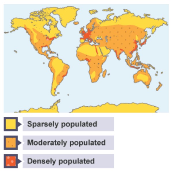
Choropleth maps use colour shading to display interval data across different areas. Interval data refers to information that follows a continuous scale, rather than separate categories.
These maps work by using a single colour in varying intensities. Darker shades indicate higher values, while lighter shades represent lower values. A key (or legend) is essential to explain what each shade represents, allowing readers to interpret the data accurately.
Common uses: Choropleth maps are particularly useful for showing population density, income levels, literacy rates, or any data that varies continuously across regions.
Common mistake to avoid: Students often confuse choropleth maps with other map types. Remember - choropleth maps always use colour intensity within defined boundaries (like countries or regions), not dots, lines, or symbols.
Exam tip: When describing a choropleth map, always reference the key and identify patterns using compass directions (e.g., "Population density is highest in the south-east").
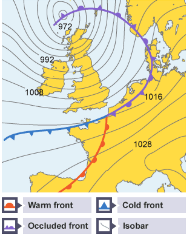
Isoline maps
Isoline maps use lines to connect points of equal value across a map. These lines are called isolines, and different types have specific names depending on what they represent (such as isobars for pressure or contours for height).
The technique works by drawing continuous lines through all locations that share the same value. This creates a pattern that helps identify high and low areas, as well as gradients (how quickly values change across space).
Specific types of isolines:
- Isobars - lines connecting points of equal atmospheric pressure
- Isotherms - lines connecting points of equal temperature
- Contours - lines connecting points of equal height/elevation
- Isohyets - lines connecting points of equal rainfall
Common uses: Isoline maps are widely used in weather forecasting to show atmospheric pressure (using isobars), temperature (using isotherms), or rainfall patterns. They also appear on Ordnance Survey maps as contour lines showing elevation.
Worked Example: Reading an Isoline Map
When looking at a weather map with isobars:
- Step 1: Identify the values on the lines (e.g., 1000mb, 1004mb, 1008mb)
- Step 2: Note where lines are close together - this indicates rapid pressure change (strong winds)
- Step 3: Note where lines are far apart - this indicates gradual pressure change (calm conditions)
- Step 4: Find the highest and lowest pressure areas - often marked as H (High) and L (Low)
Exam tip: When interpreting isoline maps, look for where lines are close together (indicating rapid change) or far apart (indicating gradual change). Also identify the location of maximum and minimum values.
Dot maps
Dot maps display data by placing individual dots on a map, where each dot represents a specific quantity. For example, one dot might represent 100,000 people or 50 factories.
The distribution of dots across the map reveals patterns in the data. Areas with many dots clustered together show high concentrations, while areas with few or no dots indicate low values or absence of the feature being mapped.
Common uses: Dot maps are frequently used to show population distribution, the location of facilities (such as schools or hospitals), or the spread of diseases.
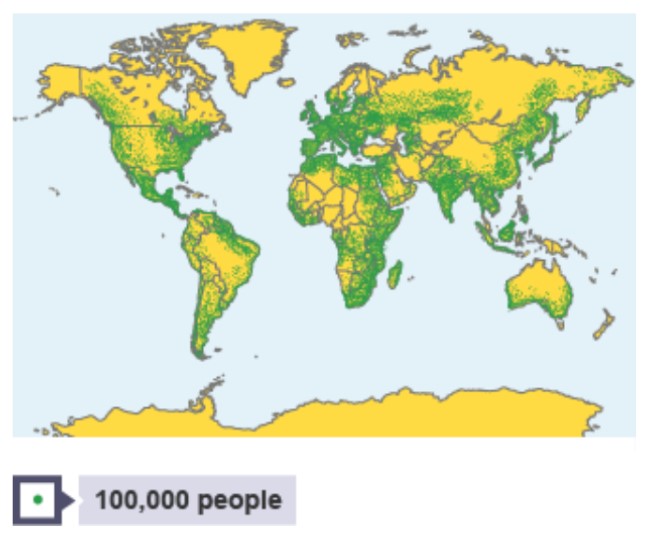
When creating or interpreting dot maps, the key question is: "What does each dot represent?" This dot value determines how you read the entire map. A map showing one dot = 1,000 people will look very different from one showing one dot = 10,000 people, even for the same area.
Exam tip: When describing patterns on dot maps, identify clusters, gaps, and overall distribution patterns (e.g., "Settlement is concentrated along the coast with sparse population inland").
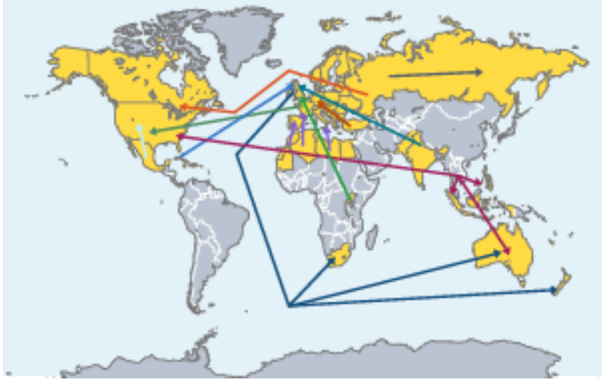
Desire lines and flow lines
These mapping techniques show movement or connections between different locations. While they appear similar, they serve slightly different purposes.
Flow lines show the actual route taken during movement. They follow real paths such as roads, railways, or shipping routes. The width of the line indicates the volume of movement – thicker lines represent greater amounts.
Desire lines show the general direction of movement between origin and destination points, without following actual routes. These are typically drawn as straight lines connecting two places, with line thickness again indicating volume.
Key difference to remember:
- Flow lines = actual paths taken (follow real routes)
- Desire lines = straight lines showing direction only (origin to destination)
Both use line thickness to represent volume of movement.
Common uses: Both techniques are valuable for displaying trade patterns between countries, migration flows, commuter movements, or tourist travel patterns. They help geographers understand connections and relationships between places.
Exam tip: When analysing these maps, identify the main flows (thickest lines), dominant directions, and any notable patterns or concentrations.
Proportional symbols
Proportional symbol maps use shapes (such as circles, squares, or triangles) that vary in size to show differences in values across locations. The same symbol type is used throughout, but its size changes proportionally to represent the data.
Larger symbols indicate higher values, while smaller symbols show lower values. A key is essential to show what size symbols represent which values, allowing accurate interpretation.
Choosing symbols: Circles are the most commonly used proportional symbols because they're easy to compare visually and don't suggest direction. However, other shapes can be used when appropriate to the data (e.g., factory symbols for industrial data).
Common uses: Proportional symbols can effectively display data such as the number of wind farms in different regions, city populations, industrial output, or carbon emissions by country.
Exam tip: When describing proportional symbol maps, compare symbol sizes between locations and identify any spatial patterns in the distribution of large versus small symbols.
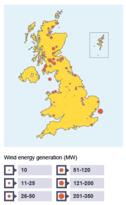
The legend for this map shows wind energy generation in megawatts (MW):
| Symbol Size | Wind Energy (MW) |
|---|---|
| Smallest | 10 |
| Small | 11-25 |
| Medium | 26-50 |
| Medium-large | 51-120 |
| Large | 121-200 |
| Largest | 201-350 |
Remember!
Key Points to Remember:
- Choropleth maps use colour intensity to show interval data – darker colours represent higher values
- Isoline maps connect points of equal value with lines (e.g., isobars for atmospheric pressure)
- Dot maps use individual dots to show distribution, with each dot representing a specific quantity
- Flow lines show actual movement paths, while desire lines show general direction of movement
- Proportional symbols vary in size to represent different values at specific locations
- All mapping techniques require clear keys or legends for accurate interpretation
- Choose the mapping technique based on the type of data and what pattern or relationship you want to show