Photo AI
Last Updated Sep 26, 2025
Line Plots Simplified Revision Notes for Junior Cycle Mathematics
Revision notes with simplified explanations to understand Line Plots quickly and effectively.
200+ students studying
Line Plots
What is a Line Plot?
A line plot (also known as a dot plot) is a simple way to display data along a number line. It shows the frequency of data points along a number line, using symbols like "" or dots to represent how many times each value occurs.
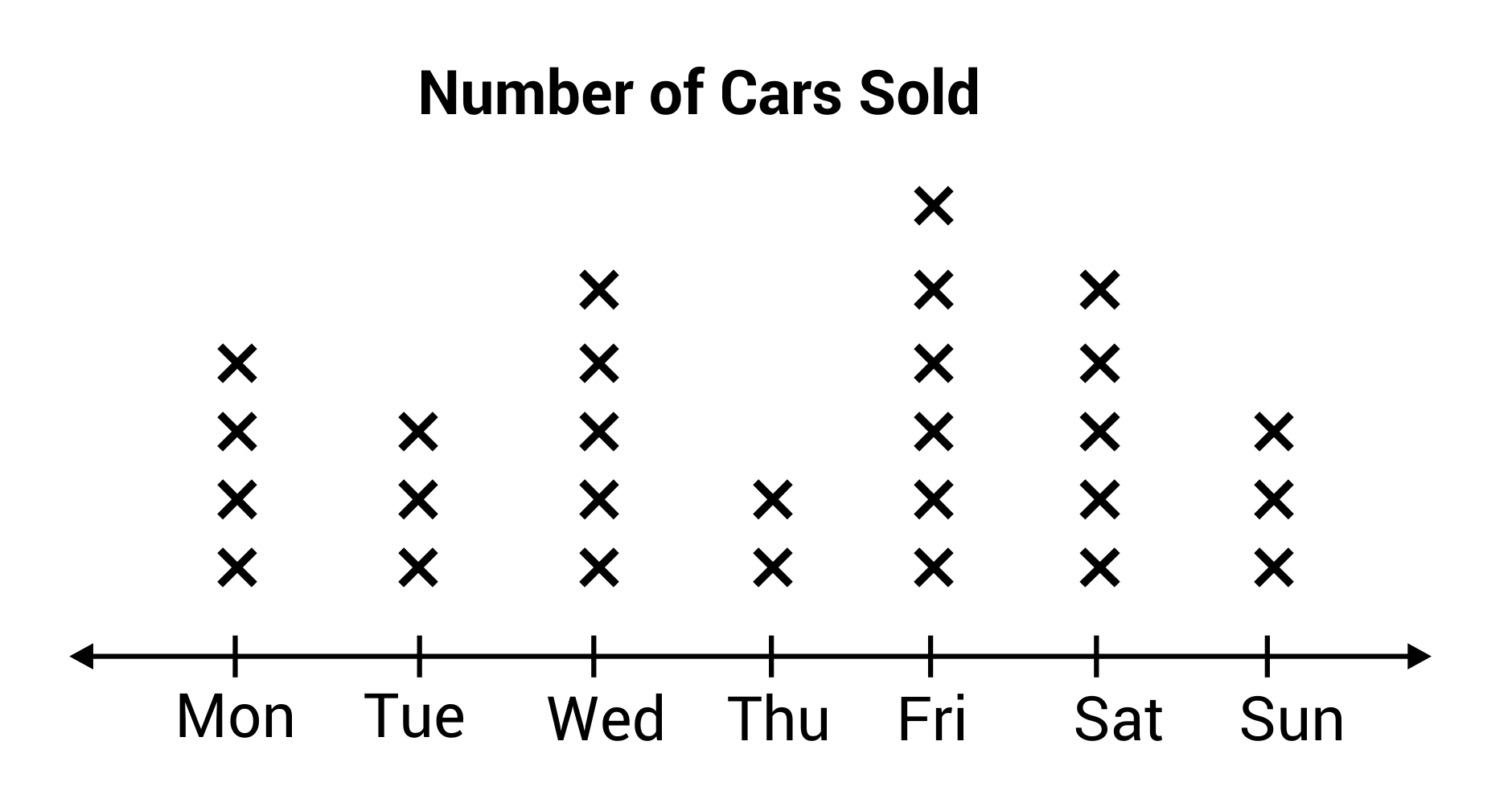
Below is a line plot showing the number of cars sold by a dealership on each day of the week:
Parts of a Line Plot
Let's break down what you see on a line plot:
- Number Line: The horizontal line that shows the different values (e.g., scores, measurements).
- Marks ( or ): These are placed above each value on the number line to show how many times each value occurs.
- Labels: The line should be labeled to show what the values represent (e.g., scores, types of shoes).
How to Read a Line Plot
Reading a line plot is like counting the ""s or dots above each number:
- Look at the Number Line: See what each value on the line represents.
- Count the Marks: Count how many ""s or dots are above each value. This tells you how many times that value occurs.
- Compare Frequencies: See which values occur most often by checking where the most ""s or dots are.
Why Use Line Plots?
Line plots are useful because:
- They Show Frequency Clearly: You can quickly see which values are most common and how often they occur.
- They're Easy to Create and Read: Line plots are simple and straightforward, making them perfect for showing data like test scores, measurements, or counts.
Making a Line Plot
When you make a line plot, here's what you need to do:
- Collect Your Data: Determine the values you're plotting (e.g., scores, sizes, counts).
- Draw the Number Line: Draw a horizontal line and mark the values you're comparing along the line.
- Plot the Marks: For each value, place an "" or dot above it for each time that value occurs.
- Label Everything: Make sure your plot is clearly labeled so it's easy to understand.
Worked Example: Student Scores in a Maths Exam
Let's go through an example where we analyse a line plot showing the scores of students in a Maths exam.
The Problem:
The line plot shows the scores (out of ) for a group of students in a Maths exam. We need to answer the following questions:
- Which score was the most common?
- How many students scored ?
- How many students scored or more?
Step 1: Analyse the Line Plot
First, look at the line plot to understand the data:
- The horizontal axis (number line) shows the possible scores ( to ).
- The dots above each score show how many students achieved that score.
Step 2: Answer Each Question
- Which score was the most common?
- Look for the score with the most dots above it. The score with the highest number of dots is the most common.
- For example, if has the most dots, then is the most common score.
- How many students scored ?
- Count the number of dots above on the line plot.
- For example, if there are dots above , then students scored .
- How many students scored or more?
- Look at the dots above , and , and count them all.
- For example, if there are dots above , dots above , and dot above , you would add them up: students scored or more.
Conclusion
Line plots are a great way to display data when you want to show how often different values occur. They're simple to create and easy to read, making them useful for a variety of data sets, such as test scores, measurements, or counts. By practicing reading and making line plots, you'll become more comfortable with this type of data visualisation.

500K+ Students Use These Powerful Tools to Master Line Plots For their Junior Cycle Exams.
Enhance your understanding with flashcards, quizzes, and exams—designed to help you grasp key concepts, reinforce learning, and master any topic with confidence!
200 flashcards
Flashcards on Line Plots
Revise key concepts with interactive flashcards.
Try Mathematics Flashcards17 quizzes
Quizzes on Line Plots
Test your knowledge with fun and engaging quizzes.
Try Mathematics Quizzes29 questions
Exam questions on Line Plots
Boost your confidence with real exam questions.
Try Mathematics Questions27 exams created
Exam Builder on Line Plots
Create custom exams across topics for better practice!
Try Mathematics exam builder80 papers
Past Papers on Line Plots
Practice past papers to reinforce exam experience.
Try Mathematics Past PapersOther Revision Notes related to Line Plots you should explore
Discover More Revision Notes Related to Line Plots to Deepen Your Understanding and Improve Your Mastery