Photo AI
Last Updated Sep 26, 2025
Pie Charts Simplified Revision Notes for Junior Cycle Mathematics
Revision notes with simplified explanations to understand Pie Charts quickly and effectively.
329+ students studying
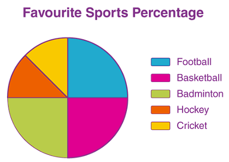
Pie Charts
A pie chart is a circular chart divided into slices to show how different parts of a whole compare to each other. Each slice of the pie represents a category, and the size of each slice shows how large or small that category is compared to the whole.
Think of it like this: Imagine you have a pizza, and you want to share it with your friends. You cut the pizza into slices, with each slice representing a portion of the pizza. A pie chart works the same way—it shows how a whole is divided into parts.
Why Use Pie Charts?
Pie charts are useful because:
- They Show Parts of a Whole: You can easily see how each category compares to the total.
- They're Visually Appealing: Pie charts are simple and clear, making them easy to understand at a glance.
Parts of a Pie Chart
Let's break down what you see on a pie chart:
- The Circle (Pie): The whole circle represents the entire data set.
- Slices: Each slice of the pie represents a category. The size of the slice shows the proportion of that category compared to the whole.
- Labels: Each slice should be labeled to show what it represents (e.g., types of heating in homes).
How to Read a Pie Chart
Reading a pie chart is like looking at a pie and figuring out how it's been divided:
- Look at the Slices: Each slice shows the size of a category. Larger slices mean larger values.
- Check the Labels: The labels tell you what each slice represents.
- Compare the Slices: See which slices are bigger or smaller to understand how the categories compare.
Making a Pie Chart
When you make a pie chart, here's what you need to do:
- Collect Your Data: Determine the categories and how much of the total each category represents.
- Calculate the Angles: Since the whole pie is 360°, each slice's angle should represent its proportion of the total. Use the formula:
- Draw the Circle: Use a compass to draw a perfect circle, which will represent your entire data set.
- Divide the Circle into Slices:
- Use a protractor to measure the angles you calculated in step 2.
- Start by drawing one slice at a time, measuring from the center of the circle. Draw a line from the center to the edge of the circle at the correct angle for each slice.
- Label Each Slice: Make sure to label each slice with its category.
Worked Example: Types of Heating in Homes
Let's go through an example where we create a pie chart showing the types of heating used in different homes.
The Problem:
In a survey, 72 people were asked what type of heating they had in their homes. The results are shown in the table below. We need to draw a pie chart to illustrate this information.
| Type of Heating | Number of Households |
|---|---|
| Oil | 30 |
| Gas | 24 |
| Electricity | 12 |
| Solid Fuel | 6 |
Step 1: Calculate the Angles for Each Slice
First, calculate the angle for each type of heating. Remember, the full circle is 360°.
- Oil:
- Gas:
- Electricity:
- Solid Fuel:
Step 2: Draw the Circle and Slices
- Draw a circle: Use a compass to draw the circle. This circle represents the total data set.
- Draw each slice:
- Use a protractor to measure and draw each slice based on the angles calculated:
- Start by drawing a slice with a 150° angle for Oil.
- Next, draw a 120° slice for Gas.
- Then, draw a 60° slice for Electricity.
- Finally, draw the remaining 30° slice for Solid Fuel.
Step 3: Label Each Slice
- Label the slices with the type of heating they represent: , , , and
Conclusion
Pie charts are an excellent way to visually represent how different categories make up a whole. They're especially useful when you want to show the proportions of different parts compared to the total. By practicing creating and reading pie charts, you'll get better at quickly understanding and communicating data.
Remember: Always calculate your angles carefully, and make sure each slice is labeled clearly!

500K+ Students Use These Powerful Tools to Master Pie Charts For their Junior Cycle Exams.
Enhance your understanding with flashcards, quizzes, and exams—designed to help you grasp key concepts, reinforce learning, and master any topic with confidence!
200 flashcards
Flashcards on Pie Charts
Revise key concepts with interactive flashcards.
Try Mathematics Flashcards17 quizzes
Quizzes on Pie Charts
Test your knowledge with fun and engaging quizzes.
Try Mathematics Quizzes29 questions
Exam questions on Pie Charts
Boost your confidence with real exam questions.
Try Mathematics Questions27 exams created
Exam Builder on Pie Charts
Create custom exams across topics for better practice!
Try Mathematics exam builder80 papers
Past Papers on Pie Charts
Practice past papers to reinforce exam experience.
Try Mathematics Past PapersOther Revision Notes related to Pie Charts you should explore
Discover More Revision Notes Related to Pie Charts to Deepen Your Understanding and Improve Your Mastery