Types of Graphs (Grade 10 NSC Matric Computer Application Technology): Revision Notes
Types of Graphs
Understanding different types of graphs is essential when working with spreadsheets, as each graph type serves a specific purpose in presenting data effectively. When you're working with data in a spreadsheet application, you need to choose the right type of graph that best suits your information and what you want to communicate to your audience.
The four main types of graphs
There are four primary types of graphs commonly used in spreadsheet applications, each with distinct characteristics and ideal use cases.
Each graph type has been specifically designed to highlight different aspects of your data. Understanding when to use each type will dramatically improve how effectively you communicate information to your audience.
Column graphs
Column charts display information using upright bars that extend vertically from the bottom of the chart. These vertical bars make it easy to compare different categories of data side by side. Column graphs work particularly well when you want to show differences between various groups or categories.
The main strength of column charts lies in their ability to make comparisons obvious at a glance. When you look at the heights of different columns, you can immediately see which categories have higher or lower values. This makes them perfect for situations like comparing sales figures across different months, test scores between different classes, or performance metrics across various teams.
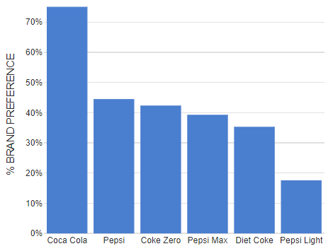
Column graphs are your best choice when you need to compare discrete categories or groups. If your data involves comparing "this vs that" rather than showing changes over time, column graphs will make those comparisons crystal clear.
Line graphs
Line charts connect individual data points with lines, creating a continuous path that shows how values change over time. This connection between points makes it much easier to identify patterns, trends, and changes in your data. The smooth flow of the line helps viewers understand whether values are generally increasing, decreasing, or remaining stable.
Line graphs excel at revealing trends and patterns that might not be obvious in other chart types. They're particularly valuable when you need to show how something has changed over a period of time, such as temperature changes throughout a day, company profits over several years, or student progress over multiple terms.

Pie graphs
Pie charts represent data as slices of a circular "pie", where each slice corresponds to a different category or value in your dataset. The size of each slice is proportional to the percentage it represents of the total whole. This visual approach makes it immediately clear how each part contributes to the complete picture.
Pie graphs are most effective when you want to show how different parts make up a complete whole. They're perfect for displaying information like budget allocations, survey results showing different response options, or demographic breakdowns. The circular format naturally emphasises that all the pieces together form 100% of whatever you're measuring.
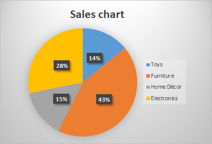
Pie graphs work best when you have between 2-7 categories. Too many slices can make the chart difficult to read and interpret effectively.
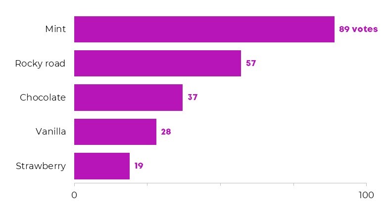
Bar graphs
Bar charts function similarly to column graphs but display information using horizontal bars instead of vertical ones. These bars extend from left to right across the chart, making them particularly useful when you have category names that are long or when you want to emphasise the comparison in a different visual orientation.
Bar graphs share many of the same strengths as column charts in terms of making comparisons clear and obvious. However, the horizontal orientation can sometimes make them easier to read, especially when dealing with lengthy category labels or when you want to create a different visual emphasis in your presentation.
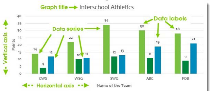
Understanding graph components
Every well-constructed graph contains several important elements that help viewers understand and interpret the information being presented. Learning to identify and understand these components will help you both create better graphs and read existing ones more effectively.
A graph without proper components is like a story without context. No matter how accurate your data is, viewers won't be able to understand or trust your information if these essential elements are missing.
Essential graph elements
The graph title serves as the headline for your chart, clearly explaining what information is being displayed. A good title should be descriptive enough that viewers immediately understand the subject matter and context of the data.
The vertical axis (also called the y-axis) typically shows the scale of values being measured. In most charts, this axis displays numerical values that correspond to the height or position of your data elements. Understanding this scale is crucial for interpreting the actual meaning behind the visual representation.
The horizontal axis (known as the x-axis) usually shows the categories or time periods being compared. This axis provides the context for what each bar, point, or slice in your graph represents.
Data series refer to the different groups or types of information shown in your graph. For example, if you're comparing test scores for different subjects, each subject would be a separate data series.
The legend acts like a key for your graph, explaining what different colours, patterns, or symbols represent. This is particularly important when you have multiple data series in a single chart.
Data labels show the specific numerical values for each element in your graph. These labels help viewers see exact numbers rather than having to estimate values by looking at the scale.
Key Points to Remember:
- Column graphs use vertical bars and are best for comparing different categories side by side
- Line graphs connect data points and excel at showing trends and changes over time
- Pie graphs show proportions as slices of a whole, perfect for displaying how parts make up a complete total
- Bar graphs use horizontal bars and work similarly to column graphs but with different visual orientation
- Every good graph needs essential components: a clear title, labelled axes, legend (when needed), and data labels to help viewers understand the information being presented