Formatting in Word Processing: Some Basics (Grade 10 NSC Matric Computer Application Technology): Revision Notes
Formatting in Word Processing: Some Basics
Introduction to word processing formatting
Formatting in word processing allows you to change how your text looks and is arranged on the page. You can modify the appearance of individual words, sentences, or entire paragraphs to make your documents more professional and easier to read. This includes changing font properties, adding effects, adjusting spacing, and applying visual enhancements like borders and colours.
Good formatting is essential for creating professional documents that are easy to read and visually appealing. The techniques you learn here will help you present information clearly and effectively.
Formatting symbols
Formatting symbols are special markers that help you see invisible elements in your document, such as spaces, tabs, and paragraph breaks. These symbols only appear on screen when you enable them and don't print with your document.
To display formatting symbols, you need to click the Show/Hide button (¶) in the Paragraph section of the Home tab. This feature is incredibly useful when you're troubleshooting document problems or need to see exactly how your text is structured.
Common Formatting Mistakes to Avoid: Many formatting problems occur because of invisible characters like extra spaces or incorrect paragraph breaks. Using the Show/Hide feature helps you identify and fix these issues quickly.
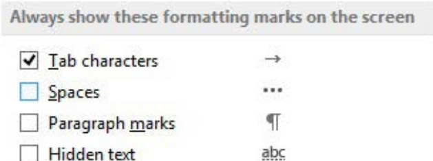
The main types of formatting marks include:
- Tab characters: Shown as arrows (→) indicating where tab stops occur
- Spaces: Displayed as dots (·) between words
- Paragraph marks: Appear as the paragraph symbol (¶) at the end of each paragraph
These symbols help you identify formatting issues, such as extra spaces or missing paragraph breaks, making it easier to create clean, professional documents.
Font formatting
Font formatting involves changing the appearance of your text by adjusting three main properties: size, type, and colour. These changes help create visual hierarchy and improve readability in your documents.
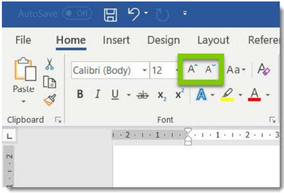
Font size
Font size determines how large or small your text appears and is measured in points (pt.). The larger the point value, the bigger the text will be. Most standard documents use font sizes between 10-12 points for body text.
Worked Example: Changing Font Size
Step 1: Select the text you want to modify
Step 2: Go to the Font group in the Home tab
Step 3: Choose a size from the Font Size dropdown menu, or type in a specific value
Step 4: Press Enter to apply the change
You can also use the increase or decrease font size buttons for quick adjustments without selecting specific point values.
Font type
The font type (or typeface) refers to the style and design of the letters. When you create a new document, the default font is typically Calibri, but you can change this to suit your document's purpose and style.
Different fonts create different impressions:
- Serif fonts (like Times New Roman) are traditional and work well for formal documents
- Sans-serif fonts (like Calibri or Arial) appear clean and modern
- Script fonts can add elegance but should be used sparingly
To change font type, select your text and choose a different font from the Font dropdown menu in the Home tab.
Font colour
Changing font colour can help emphasise important information or create visual interest in your document. However, it's important to use colour strategically and ensure good readability.
When choosing colours, remember that if you're printing in black and white, coloured text may not be as visible. Always consider your final output when making colour choices.
Text effects: Bold, italic and underline
Text effects help emphasise important words or phrases in your document. The three most common effects are bold, italic, and underline, which can be applied individually or in combination.

Applying text effects
Worked Example: Applying Text Effects
Step 1: Select the text you want to format
Step 2: Choose one of these options:
- Click the Bold (B), Italic (I), or Underline (U) buttons in the Home tab
- Use keyboard shortcuts: Ctrl+B for bold, Ctrl+I for italic, Ctrl+U for underline
When to use text effects
- Bold text draws immediate attention and is perfect for headings or key points
- Italic text provides subtle emphasis and is often used for book titles or foreign words
- Underlined text should be used sparingly, as it can be confused with hyperlinks in digital documents
These effects help create visual hierarchy and guide readers through your document more effectively.
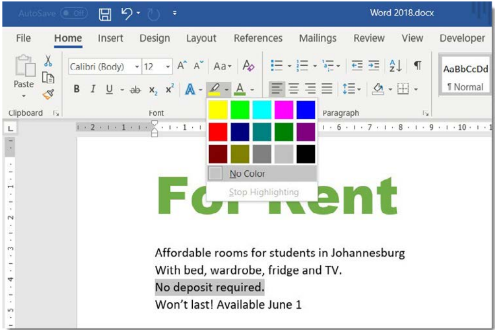
Text highlighting
Text highlighting adds a coloured background behind selected text, similar to using a highlighter pen on paper. This feature is excellent for drawing attention to important information or marking text for later review.
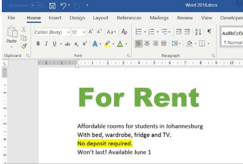
How to highlight text
Worked Example: Highlighting Text
Step 1: Select the text you want to highlight
Step 2: In the Home tab, click the Text Highlight Colour dropdown
Step 3: Choose your preferred colour from the palette
Step 4: The highlighting will be applied immediately
Removing highlights
To remove highlighting: Select the highlighted text, click the Text Highlight Colour dropdown, and choose "No Colour" from the menu.
Professional Tip: When highlighting multiple sections, you can activate the highlighting tool and then click and drag over different parts of your text without repeatedly accessing the menu. Click the highlighting button again to turn off the tool.
Effects and character spacing
Beyond basic formatting, you can apply special effects to text and adjust the spacing between characters to create more sophisticated document designs.
Character spacing
Character spacing allows you to make text appear more spread out (expanded) or compressed (condensed). This is useful for fitting text into specific spaces or creating design effects.
Worked Example: Adjusting Character Spacing
Step 1: Select your text
Step 2: Go to the Home tab, Font group
Step 3: Click the small dialogue box launcher (arrow) in the bottom right corner
Step 4: In the Advanced tab, choose "Expanded" or "Condensed" under Spacing
Step 5: Specify the spacing amount in points
This feature is particularly useful when creating headers, logos, or fitting text into constrained spaces.
Paragraph formatting
Paragraph formatting affects how entire paragraphs appear in your document. This includes spacing, alignment, and visual elements like borders and shading.
Paragraph spacing
Paragraph spacing controls the amount of space before and after paragraphs. This helps separate different sections of your document and improves readability.
You can adjust paragraph spacing by selecting the paragraph(s) you want to modify, going to the Layout tab and finding the Paragraph group, then adjusting the "Before" and "After" spacing values.
Proper paragraph spacing eliminates the need to press Enter multiple times to create gaps between paragraphs. This creates cleaner, more professional documents.
Line spacing
Line spacing determines the vertical space between lines within a paragraph. Common options include:
- Single spacing (1.0): Standard for most documents
- Double spacing (2.0): Often required for academic papers
- 1.5 spacing: A compromise between readability and space efficiency
To change line spacing, select your text and use the Line Spacing button in the Paragraph group of the Home tab.
Text alignment
Text alignment determines how paragraphs are positioned between the left and right margins of your page.
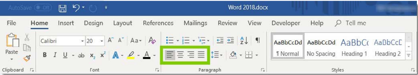
The four alignment options are:
- Align Text Left: Text aligns to the left margin (default setting)
- Center: Text centres between both margins
- Align Text Right: Text aligns to the right margin
- Justify: Text stretches to align with both left and right margins, like in newspapers
Choose alignment based on your document type and the impression you want to create. Left alignment works for most documents, while centre alignment is good for titles and headings.
Borders and shading
Borders and shading add visual elements around text or paragraphs, helping to separate content or draw attention to important information.
Adding borders
Borders create lines around selected text or paragraphs. To add borders, select the text or paragraph, go to the Home tab Paragraph group, click the Borders dropdown arrow, and choose from the border options, or select "Borders and Shading" for more choices.
Applying shading
Shading adds a coloured background behind text or paragraphs. Unlike highlighting, shading can be applied to entire paragraphs and offers more colour and pattern options.
Understanding Text vs. Paragraph Formatting:
- Text formatting applies to individual words or selected text
- Paragraph formatting affects entire paragraphs, including spacing and alignment
This distinction is crucial for applying the right type of formatting to achieve your desired result.
Text indentation
Indentation creates space at the beginning of paragraphs or lines, helping to organise your document structure and improve readability.
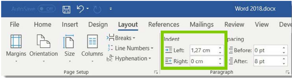
Types of indents
- First Line Indent: Only the first line of a paragraph is indented
- Hanging Indent: All lines except the first are indented (useful for bibliographies)
- Left Indent: The entire paragraph is indented from the left margin
- Right Indent: The entire paragraph is indented from the right margin
Applying indents
You can add indents by selecting the text you want to indent and using the Increase Indent or Decrease Indent buttons in the Home tab, or accessing the Layout tab for more precise indent measurements.
Indenting is more professional than using multiple tab characters and makes editing much easier. It also ensures consistent spacing throughout your document.
Styles
Styles are pre-designed formatting combinations that you can apply to text with a single click. They ensure consistency throughout your document and save time when formatting.
Word includes built-in styles such as:
- Normal: Standard body text formatting
- Heading 1, 2, 3: Different levels of headings with appropriate sizing and spacing
- Title: For document titles
- No Spacing: Removes extra spacing for compact text
Benefits of using styles
- Consistency: All headings look the same throughout your document
- Efficiency: Apply complex formatting instantly
- Easy updates: Change a style definition to update all text using that style
- Professional appearance: Documents look polished and well-designed
To apply a style, select your text and click on the desired style in the Styles group of the Home tab.
Key Points to Remember:
- Use the Show/Hide button (¶) to see formatting marks when troubleshooting document issues
- Font size is measured in points - larger numbers mean bigger text
- Apply text effects (bold, italic, underline) strategically to create emphasis without overdoing it
- Text alignment affects how paragraphs sit between the page margins - left alignment is standard for most documents
- Styles save time and ensure consistent formatting throughout your document
- Always consider your final output (print vs. digital) when choosing colours and effects