Information Management (Grade 10 NSC Matric Computer Application Technology): Revision Notes
Presenting Data
After you've analysed your data, the next crucial step is transforming it into a visual format that your target audience can easily understand. This process typically involves creating graphs, tables, and reports that clearly communicate your findings and insights.
Effective data presentation is not just about making information look nice – it's about making complex data accessible and actionable for your specific audience.
Why visual presentation matters
When you present data visually, you make complex information more accessible and memorable. Visual presentations help your audience quickly grasp patterns, trends, and relationships that might be difficult to spot in raw data. Whether you're creating a school project or preparing for your PAT (Practical Assessment Task), effective data presentation is essential for clear communication.
For PAT assessments, your ability to present data clearly and professionally can significantly impact your final grade. Visual presentation skills are not just academic requirements – they're essential workplace competencies.
Graphs and tables
Choosing the right type of chart or graph is crucial for effective data presentation. Each type of visual representation serves a specific purpose and works best with particular kinds of data.
Understanding different chart types
The most commonly used graphs include bar graphs, pie charts, line graphs, and Cartesian graphs. Each has its own strengths and ideal applications.
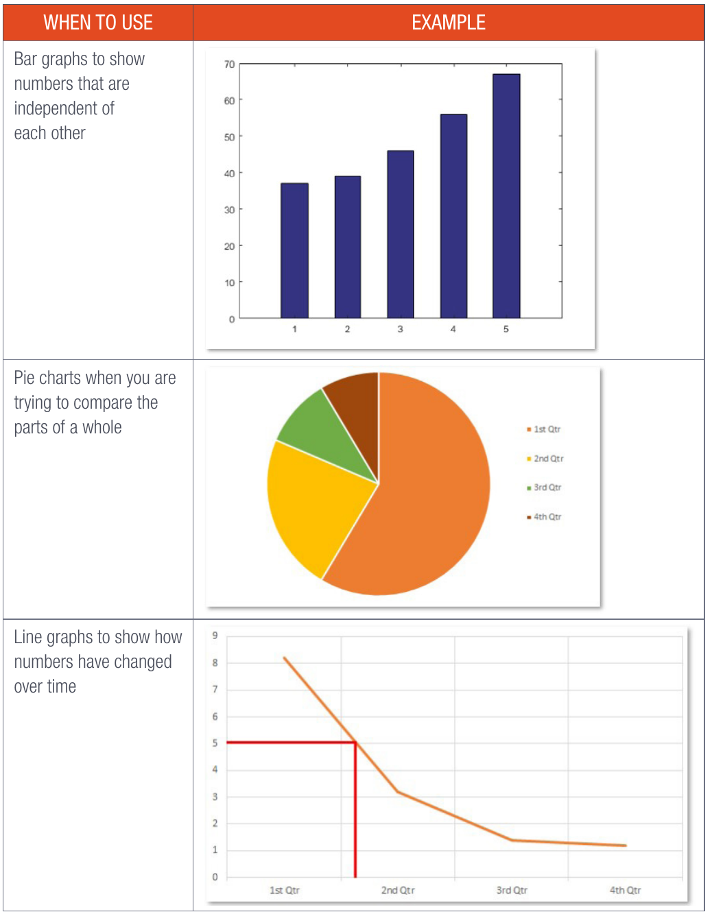
Bar graphs are perfect when you need to show numbers that are independent of each other. For example, if you're comparing the test scores of different students or the sales figures of various products, bar graphs make these comparisons clear and easy to understand. The height of each bar represents the value, making it simple to see which categories have higher or lower values.
Worked Example: Using Bar Graphs
When comparing monthly rainfall across different cities:
- Each city gets its own bar
- Bar height shows rainfall amount
- Easy to see which city had the most/least rain
- Perfect for comparing independent values
Pie charts work brilliantly when you want to show how different parts make up a whole. Think of them as showing slices of a pizza – each slice represents a portion of the total. They're ideal for displaying percentages, budget allocations, or market share data. However, pie charts become difficult to read when you have too many small segments.
Line graphs are your go-to choice for showing how numbers change over time. They're excellent for displaying trends, whether it's temperature changes throughout a day, company profits over several years, or your own academic progress across different terms. The connecting lines help viewers see the direction and rate of change.
Cartesian graphs for relationships
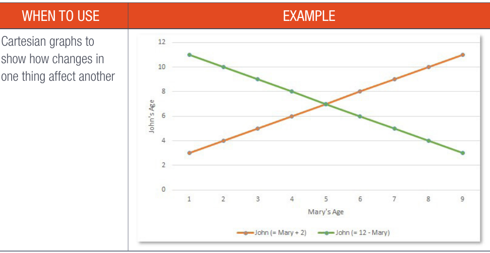
Cartesian graphs serve a special purpose – they show how changes in one variable affect another. These graphs use an x-axis (horizontal) and y-axis (vertical) to plot relationships between two different measurements. They're particularly useful in subjects like mathematics and science where you need to demonstrate cause-and-effect relationships or correlations between variables.
Getting help with chart selection
If you're unsure about which chart type to choose, modern software applications can help you make the right decision.
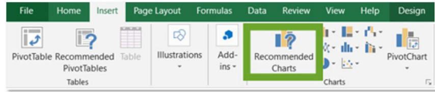
Excel's "Recommended Charts" feature analyses your data and suggests the most appropriate chart types based on the information you've selected. This tool can be particularly helpful when you're starting out with data visualisation or working with complex datasets.
Best practices for chart placement
When creating documents with charts, avoid placing graphs on the same sheet as your raw data. This can make your presentation look cramped and confusing. Instead, put your graphs on a separate sheet or section of your document. This approach makes it easier for readers (including your PAT assessor) to focus on and understand the information you're presenting.
Reports
A report represents another powerful method for presenting information. It's a structured document that organises relevant information in a clear, logical format. Reports help you systematically present problems, solutions, and the effectiveness of those solutions.
Structure of an effective report
Every well-written report contains several key sections that work together to tell a complete story:
Introduction: This section sets the stage for your report. You'll state the purpose of your report and provide essential background information about the issue you're addressing. It's important to use your subject knowledge to give a clear description of the problem and explain the solution you implemented. Think of this as your opportunity to help readers understand the context and importance of your work.
Body: This is the heart of your report where you describe the effect and impact of your solution. While you might include a database or other data collection tools, simply presenting raw data isn't enough. You need to process and analyse the information to extract meaningful insights. Present your findings clearly and directly, using your own words to explain what the data means. Graphs and tables can be incredibly helpful here to simplify complex information and make your points more visual and memorable.
Conclusion: This section evaluates whether your solution was successful and identifies any additional solutions that might be needed. If your solution didn't work as expected, explain what steps you plan to take next to resolve the problem. Be honest about both successes and areas for improvement.
Bibliography/References: Always include a list of the sources you used in your research and writing. This demonstrates the evidence base for your work, shows how current your information is, and proves you haven't committed plagiarism. You must use a consistent referencing method to properly cite your sources.
Think of your report structure like telling a story: the introduction sets the scene, the body describes what happened, the conclusion explains what it all means, and the references show where you learned about it.
Important writing tips
Start drafting your report as early as possible in your research process. This ensures you capture all the important details you observe along the way. The longer you wait, the more likely you are to forget crucial information that could strengthen your report.
Academic integrity and legal considerations
When creating reports and presentations, you must understand and respect important legal and ethical guidelines.
Understanding plagiarism
Plagiarism involves reproducing someone else's work as your own without acknowledging the original source. This can take many forms, including directly copying text, paraphrasing someone's ideas without credit, or even using entire paragraphs or images without proper attribution.
To prevent plagiarism, always plan your work carefully before you start writing. Make sure you understand your topic thoroughly and develop your own perspective on it. When you do use information from other sources, always acknowledge where it came from using proper referencing techniques.
Remember that your PAT should represent your own authentic work. When you submit your project, you're declaring that you haven't copied material from others without proper attribution.
Copyright protection
Copyright gives creators the legal right to control how their work is copied and used. This protection extends to inventors, artists, writers, and other creators who can decide who may use their work and under what conditions.
When working on your projects, be mindful that most published material, images, and digital content is protected by copyright. Using someone else's copyrighted material without permission could have legal consequences.
Intellectual property awareness
Intellectual property refers to new or original creations in various forms, including inventions, designs, brands, and published articles. Using someone's intellectual property without their permission is considered a serious violation.
Examples of intellectual property include:
- New inventions or technological innovations
- Creative designs and artistic works
- Brand names and logos
- Books, articles, and research publications
Always respect others' intellectual property rights and seek permission when necessary.
Slide show presentations
When you create a presentation based on your report, remember that presentations serve a different purpose than written reports. While your report contains comprehensive detail, your presentation should focus on the most important points and present information concisely.
Think carefully about which elements from your report are most crucial for your audience to understand. Your slides should highlight key findings, major conclusions, and important recommendations rather than attempting to include every detail from your written work.
A good rule of thumb: if your report is a detailed book, your presentation should be the compelling movie trailer that makes people want to know more.
Finalising your PAT
Before submitting your PAT, complete this essential checklist:
Pre-Submission Checklist:
-
Use the marking checklist: Verify that you've completed everything required according to the official assessment criteria.
-
Proofread thoroughly: Check your work carefully for spelling and grammatical errors. If you find mistakes, correct them immediately.
-
Verify your references: Ensure all sources are properly referenced and cited using the correct format.
-
Review document presentation: Check that your layout, fonts, and graphics create a professional, visually appealing presentation. Good presentation can make a significant difference in how your work is received.
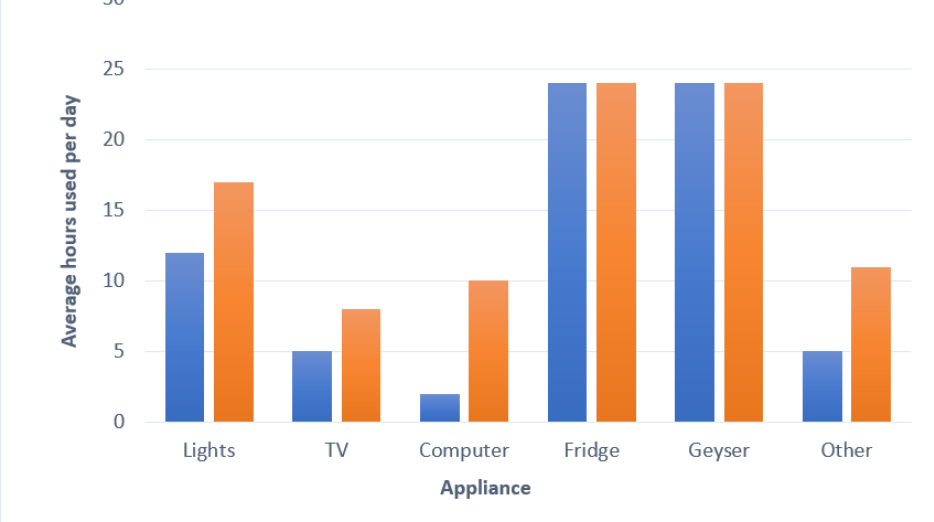
Understanding how to interpret and present data effectively, as shown in comparative charts like household appliance usage patterns, demonstrates your ability to extract meaningful insights from information and communicate them clearly to others.
Key Points to Remember:
-
Choose the right chart type: Bar graphs for independent comparisons, pie charts for parts of a whole, line graphs for changes over time, and Cartesian graphs for variable relationships.
-
Structure reports properly: Include introduction, body, conclusion, and references sections that work together to tell a complete story.
-
Maintain academic integrity: Always reference your sources, avoid plagiarism, and respect copyright and intellectual property rights.
-
Present information clearly: Use visual elements like graphs and tables to make complex data more accessible and memorable.
-
Plan and proofread: Start your work early, draught carefully, and thoroughly review everything before final submission.