Fieldwork and Practical Work (Grade 10 NSC Matric Geography): Revision Notes
Collecting, Processing, and Presenting Findings
Fieldwork is a crucial part of geography that helps us understand real-world patterns and processes. When conducting fieldwork, geographers follow a systematic approach to ensure their findings are accurate, organised, and meaningful. This process involves three essential stages that work together to transform raw observations into useful geographical knowledge.
The three stages of fieldwork
Understanding the systematic approach to fieldwork is essential for producing reliable geographical research. Each stage builds upon the previous one to create a comprehensive understanding of geographical phenomena.
Fieldwork typically follows three key stages that build upon each other:
- Collecting data - Gathering information from various sources
- Processing data - Organising the information into usable formats
- Presenting data - Creating visual representations to communicate findings
Each stage is important for producing reliable geographical research. Let's examine how this process works using temperature and rainfall data from Cape Town as our example.
Stage 1: Collecting data
Data collection involves gathering information from multiple sources to answer geographical questions. This information is called raw data because it hasn't been organised or processed yet.
Sources of geographical data
Geographers collect data from various sources including:
- Weather instruments (thermometers, rain gauges, barometers)
- Media reports and weather services
- Government organisations and statistical offices
- Specialised websites and databases
- Direct field observations
Data Source Selection
Choose multiple sources to ensure accuracy and reliability. Different sources can provide complementary information that strengthens your overall findings.
Example of raw data collection
When studying Cape Town's climate, we might collect daily temperature readings over several weeks. This raw data shows the actual measurements as they were recorded:
Raw Data Collection Example: Cape Town Temperatures
Daily temperature readings might look like this:
- Day 1: Max 26°C, Min 19°C
- Day 2: Max 29°C, Min 20°C
- Day 3: Max 31°C, Min 21°C
- Day 4: Max 25°C, Min 17°C
- Day 5: Max 24°C, Min 18°C
This type of unprocessed data collection gives us the basic information needed, but it's difficult to identify patterns or draw conclusions in this format.
Stage 2: Processing data
Raw data needs to be organised into formats that make it easier to analyse and understand. This involves sorting, grouping, and arranging the information systematically.
Converting raw data into processed data
Processing transforms scattered measurements into organised tables that reveal patterns. For example, daily temperature readings can be arranged to show maximum and minimum values clearly:
Data Processing Example: Organised Temperature Table
Converting raw daily readings into a structured format:
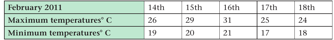
This systematic arrangement makes patterns immediately visible.
This processed format allows us to:
- Compare temperatures across different days
- Identify the warmest and coolest periods
- Calculate averages and ranges
- Spot trends and patterns more easily
Why Processing is Essential
Processing data is essential because it makes the information much more useful for analysis and interpretation. Without proper organisation, even the most accurate raw data remains difficult to understand and use effectively.
Stage 3: Presenting data
Once data has been processed, it can be presented visually to make patterns and relationships clearer. Visual presentations help both researchers and audiences understand geographical information more effectively.
Types of data presentation
Line graphs are excellent for showing changes over time. They help us visualise trends and patterns in temperature data:
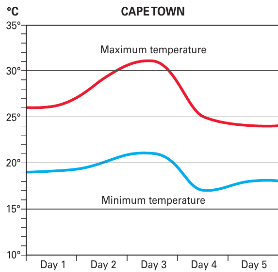
This graph clearly shows how Cape Town's maximum and minimum temperatures vary over a five-day period, making it easy to identify the warmest day and overall temperature patterns.
Bar graphs work well for showing amounts or quantities, such as rainfall measurements:
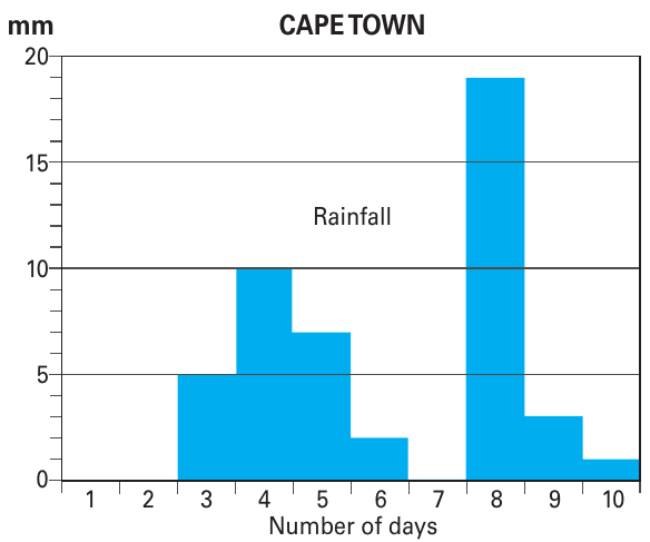
Bar graphs make it simple to compare rainfall amounts across different days and identify the wettest periods.
Climate graphs in atlases
Atlases use special combination graphs that show both temperature and rainfall information together. These climate graphs help us understand the overall climate patterns of different places.
Understanding climate vs weather
Critical Distinction: Climate vs Weather
It's important to distinguish between climate and weather:
- Weather refers to daily atmospheric conditions
- Climate describes the average weather patterns over long periods (typically 20-30 years)
Climate graphs show average conditions, not daily variations. The temperature shown represents the average of maximum and minimum readings over many years.
Reading climate graphs
Climate graphs combine two types of data presentation:
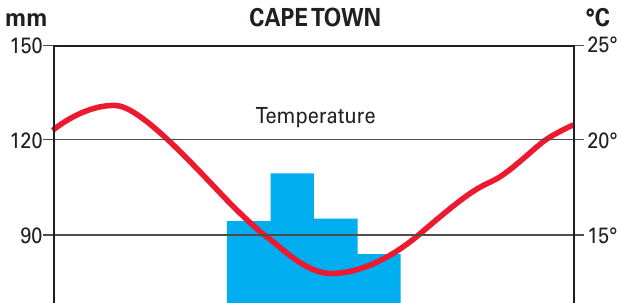
- Red line = average monthly temperatures
- Blue bars = average monthly rainfall
This format allows us to see both temperature and precipitation patterns throughout the year, helping us identify the climate type.
Comparing different locations
Climate graphs become particularly useful when comparing different places. For example, comparing Cape Town and Manchester reveals distinct climate differences:
Climate Comparison Example: Cape Town vs Manchester
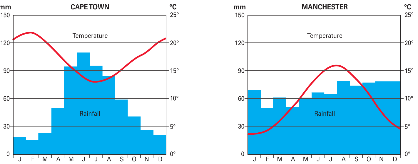
Cape Town (left graph):
- Shows a Mediterranean climate pattern
- Wet, cool winters (high rainfall in June-July)
- Dry, warm summers (low rainfall in December-January)
- Temperature range: approximately 13°C to 22°C
Manchester (right graph):
- Shows a temperate oceanic climate
- Rainfall distributed throughout the year
- Cooler overall temperatures
- Temperature range: approximately 3°C to 15°C
Key skills for interpreting climate data
When working with temperature and rainfall graphs, remember to:
- Identify the graph type - line graphs for temperature, bar graphs for rainfall
- Read the scales carefully - check units (°C for temperature, mm for rainfall)
- Look for patterns - seasonal variations, wet/dry periods, temperature ranges
- Compare maximum and minimum values - identify extremes and averages
- Consider the time scale - daily weather vs long-term climate averages
Rainfall measurement
Understanding Rainfall Measurement
Rainfall is measured using rain gauges and recorded in millimetres (mm). This measurement represents the depth of water that would accumulate on a flat surface during a specific period (day, week, or month).
Practical applications
Understanding how to collect, process, and present geographical data is essential for:
- Climate studies and weather forecasting
- Environmental monitoring and research
- Urban planning and development
- Agricultural planning and water management
- Tourism and economic development
These skills help geographers make informed decisions and communicate their findings effectively to different audiences.
Key Points to Remember:
- Fieldwork follows three stages: collect raw data, process it into usable formats, then present it visually
- Raw data is unprocessed information that needs organising before it becomes useful
- Processing data involves arranging information into tables and groups to reveal patterns
- Visual presentation using graphs and charts makes data easier to understand and interpret
- Climate graphs combine temperature lines and rainfall bars to show long-term weather patterns
- Always read scales carefully and distinguish between daily weather and long-term climate data