Population Pyramids (Grade 10 NSC Matric Geography): Revision Notes
Population Pyramids
What is a population pyramid?
A population pyramid is a special type of graph that shows how people of different ages and genders are distributed in a country or region. Think of it as a visual snapshot of a population's age and gender structure at a specific point in time.
The pyramid gets its name from its traditional triangular shape, though modern population structures can look quite different from the classic pyramid form. Many developed countries today show more rectangular or even inverted shapes!
These graphs are essential tools for understanding:
- How many young people versus older people live in a country
- Whether there are more males or females in different age groups
- What the population might look like in the future
- Economic and social challenges a country might face
How population pyramids work
Population pyramids are constructed like horizontal bar charts, but with a clever twist:
- Age groups are shown on the vertical axis, starting with 0-4 years at the bottom and increasing upwards (usually in 5-year intervals)
- Males are represented on the left side of the pyramid
- Females are shown on the right side
- Population numbers or percentages are displayed on the horizontal axis
- The length of each bar shows how many people (or what percentage) belong to that age-sex group
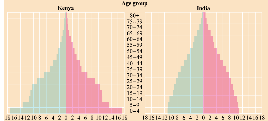
This diagram shows four different countries' population pyramids, each telling a unique demographic story about birth rates, death rates, and population growth patterns.
Interpreting population pyramids
Reading birth rates from pyramid shapes
The width of the base of a population pyramid reveals crucial information about birth rates:
- Wide base: Indicates a high birth rate and suggests the country has many young children
- Narrow base: Shows a low birth rate, meaning fewer babies are being born
- Very wide base: Often signals a developing country with high fertility rates and potential for rapid population growth
In the example shown, Kenya displays the widest base, indicating it has the highest birth rate among the four countries compared.
Understanding death rates and life expectancy
The shape of the pyramid's sides and top tells us about death rates and life expectancy:
- Big steps between age groups: Large differences in bar lengths between consecutive age groups indicate high death rates in certain age ranges
- Steep, inward-sloping sides: Suggest higher death rates and lower life expectancy
- Straighter, more vertical sides: Indicate lower death rates and higher life expectancy
- Narrow, pointed top: Shows fewer people living to old age
Infant mortality can be spotted by looking for a significant drop between the 0-4 age group and the 5-9 age group. This is one of the most critical indicators of a country's healthcare system quality.
Identifying economic patterns
Population pyramids reveal important information about a country's economic structure:
Economically active population (typically ages 15-64):
- Large middle sections indicate many working-age people
- This can support economic growth and development
Dependent population:
- Young dependents (0-14 years): Shown in the bottom portion
- Old dependents (65+ years): Represented at the top
- Countries with large dependent populations face greater economic challenges
Gender analysis
Comparing the left (male) and right (female) sides of pyramids helps identify:
- Gender imbalances in specific age groups
- Life expectancy differences between males and females
- Migration patterns that might affect gender ratios
Generally, females live longer than males, so the top portions of pyramids often show more females than males. This is a consistent pattern across most countries worldwide.
Population growth indicators
The overall shape of a pyramid indicates whether a population is:
Growing rapidly: Wide base, narrow top (classic pyramid shape)
- High birth rate, high death rate
- Many young people, few elderly
- Example: Kenya in the diagram
Growing slowly: Narrower base, wider middle section
- Moderate birth and death rates
- More balanced age distribution
- Example: India in the diagram
Stable or declining: Narrow base, wider top sections
- Low birth rate, low death rate
- Ageing population
- Example: Sweden in the diagram
Practical interpretation skills
When analysing population pyramids, follow these steps:
Step-by-Step Analysis: Reading a Population Pyramid
Step 1: Start with the base - Assess birth rates by examining the width of the youngest age groups
Step 2: Check the sides - Look for steep drops that indicate high death rates in specific age ranges
Step 3: Examine the top - A wider top suggests better healthcare and higher life expectancy
Step 4: Compare male and female sides - Note any significant imbalances
Step 5: Consider the overall shape - Determine if the population is growing, stable, or declining
Population pyramid types and their meanings
Understanding these three main types is crucial for demographic analysis:
Expansive pyramid (wide base, narrow top):
- Typical of developing countries
- High birth and death rates
- Young population
- Potential for rapid growth
Constrictive pyramid (narrow base, wider top):
- Characteristic of developed countries
- Low birth and death rates
- Aging population
- Slow or negative growth
Stationary pyramid (relatively straight sides):
- Birth and death rates are balanced
- Stable population growth
- Even age distribution
Key Points to Remember:
-
Population pyramids are graphs that show the age and gender structure of populations, helping us understand demographic patterns and predict future trends
-
Wide bases indicate high birth rates and young populations, while narrow bases show low birth rates and potential population decline
-
Steep sides with big steps between age groups reveal high death rates, whilst straighter sides suggest better healthcare and higher life expectancy
-
The middle section represents the economically active population, while the bottom and top sections show dependent populations that rely on economic support
-
Comparing male and female sides helps identify gender imbalances and differences in life expectancy between sexes