Displaying Data (Grade 11 NSC Matric Mathematical Literacy): Revision Notes
Displaying Data
Introduction
When you need to compare two different categories of data or two different sets of data, you need to choose the right type of graph. The goal is to make comparisons clear and easy to understand. In Mathematical Literacy, you'll work with several specific graph types that are designed for these comparisons.
The key to effective data visualization is matching the graph type to your specific comparison needs. Each graph type has unique strengths for different kinds of data relationships.
Types of graphs for comparing data
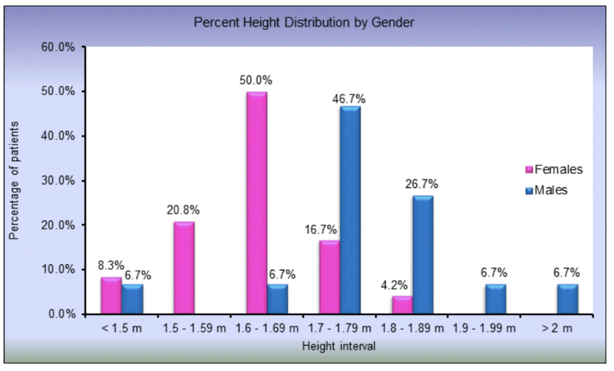
Double bar graphs
Double bar graphs contain two bars for each interval or category. Each bar represents a separate category of the data being compared.
Key characteristics:
- Two bars stand side by side for each category
- The height of each bar shows the frequency or value for that category
- Different colours or patterns distinguish between the two categories
- Useful for comparing frequency values across different categories
For example, the graph compares the height distribution between male and female patients. You can easily see which gender has more people in each height range.
In double bar graphs, never stack the bars on top of each other - they must remain side by side to allow proper visual comparison between categories.
Vertical stack bar graphs
Vertical stack bar graphs contain two bars for each interval, but these bars are stacked on top of each other rather than placed side by side.
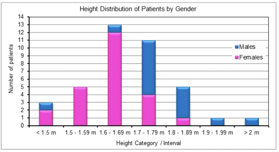
Important features:
- The two parts of each bar represent different categories within the data
- The height of the entire bar shows the total for both categories combined
- Each section of the bar must be proportional to the actual frequency values
- These graphs show both the total and the breakdown of components
This type of graph is particularly useful when you want to show both the total frequency of two categories combined and how each category contributes to that total.
Pie-of-pie and bar-of-pie charts
These charts combine two different visualization methods to show detailed breakdowns of data categories.
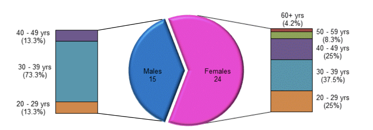
Bar-of-pie charts:
- Start with a pie chart showing the main categories
- Use stacked bars to show the detailed components of each main category
- The bars represent portions or percentages of specific categories, not the whole dataset
Pie-of-pie charts:
- Use multiple pie charts to show the breakdown of main categories
- One large pie chart shows the overall split
- Smaller pie charts show the detailed breakdown of each main category
These combination charts are most effective when you have main categories that need further subdivision. They help viewers understand both the big picture and the detailed components simultaneously.
Two line graphs
Line graphs are most effective for showing how data changes over time and for identifying trends.
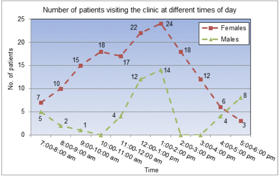
Key advantages:
- Excellent for showing changes in data over time periods
- Allow you to identify trends, patterns, and turning points
- When you place two line graphs on the same axes, you can compare how different data sets change over time
- Easy to spot maximum and minimum values for each category
The example shows how the number of male and female patients visiting a clinic changes throughout the day. You can easily compare the patterns and see when each group has peak visit times.
Scatter plot graphs
Scatter plots are useful for examining relationships between two different variables or quantities when no obvious pattern is immediately visible.
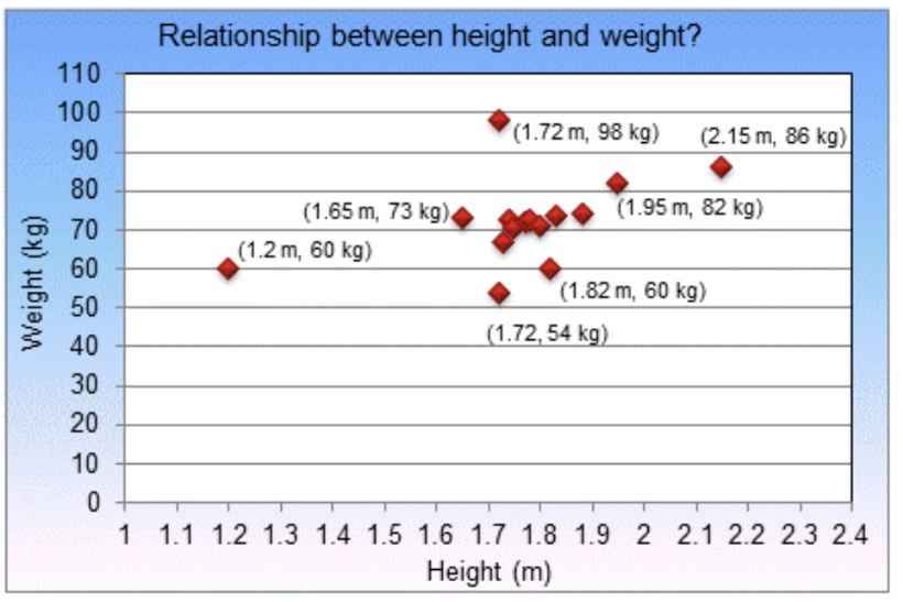
How to create scatter plots:
- Plot points on a coordinate system
- Each point represents two different values for two different variables
- The x-coordinate shows one variable, the y-coordinate shows the other variable
By looking at how the points are distributed across the graph, you can determine whether there's a relationship between the two variables.
Scatter plots are specifically designed for exploring relationships between continuous variables. Don't use them for categorical data or time series - use bar graphs or line graphs instead.
Understanding correlation
Correlation describes whether there is a relationship or pattern between variables in a scatter plot.
Types of correlation
Weak correlation:
- Only a weak pattern exists between the variables
- Points are spread out and don't follow a clear line
Strong correlation:
- A clear pattern or relationship exists between the variables
- Points cluster closely around an imaginary line
Positive correlation:
- As one variable increases, the other variable also increases
- Points form an upward sloping pattern
Negative correlation:
- As one variable increases, the other variable decreases
- Points form a downward sloping pattern
No correlation:
- No discernible pattern exists between the variables
- Points appear randomly scattered
Identifying outliers
Outliers are data points that don't fit the general pattern shown by most other points. These points signal that although a general pattern exists, there are instances where the pattern doesn't apply.
When identifying outliers, look for points that are clearly separated from the main cluster or trend line. These points often represent special cases or measurement errors that need further investigation.
The three scatter plots show different types of relationships: positive correlation, curved relationship, and negative correlation.
Worked examples
Worked Example: South African Provincial Population Analysis
From the pie chart and data table showing South African provincial populations:
| Province | Number of people | Percentage of total South African population |
|---|---|---|
| Eastern Cape | 6,509,300 | 14.0% |
| Free State | 2,696,710 | 5.8% |
| Gauteng | 9,443,000 | 20.3% |
| KwaZulu-Natal | 9,763,950 | 21.0% |
| Limpopo | 5,415,000 | 11.6% |
| Mpumalanga | 3,254,650 | 7.0% |
| North West | 3,799,000 | 8.2% |
| Northern Cape | 818,000 | 1.6% |
| Western Cape | 4,742,490 | 10.2% |
This pie chart effectively shows both absolute numbers and percentages, making it easy to identify:
- Largest province: KwaZulu-Natal at 21.0%
- Smallest province: Northern Cape at 1.6%
Worked Example: Calculating Pupil-Teacher Ratios
From the double bar graph comparing learners and teachers across provinces:
Formula: Pupil-teacher ratio =
Step 1: Eastern Cape calculation
- Pupils: 1,644,665
- Teachers: 49,536
- Ratio = ≈ 33:1
Step 2: KwaZulu-Natal calculation
- Pupils: 2,718,420
- Teachers: 76,324
- Ratio = ≈ 36:1
This shows KwaZulu-Natal has a higher pupil-teacher ratio, meaning more students per teacher.
Worked Example: Calculating Mean Pass Rates
From the line graph showing Matriculation Exam pass rates from 1994 to 2004:
Pass rates: 58.0%, 53.4%, 54.4%, 47.4%, 49.3%, 48.9%, 57.9%, 61.7%, 68.9%, 73.3%, 70.4%
Step 1: Add all values
Step 2: Divide by number of years Mean =
Key observations:
- Lowest point: 47.4% in 1997
- Highest point: 73.3% in 2003
- Overall trend: Improvement from 1997 onwards
Worked Example: Speed and Stopping Distance Correlation
From the scatter plot data:
| Speed (km/h) | 30 | 40 | 50 | 60 | 70 | 80 | 90 |
|---|---|---|---|---|---|---|---|
| Distance (m) | 16 | 27 | 40 | 65 | 66 | 105 | 155 |
Analysis:
- Shows strong positive correlation
- As speed increases from 30 to 90 km/h, stopping distance increases dramatically from 16m to 155m
- This demonstrates the critical safety relationship between speed and braking distance
Safety implication: Higher speeds require exponentially longer stopping distances, making accidents more likely and severe.
Worked Example: Olympic Marathon Time Trends
From the Olympic marathon winning times data (1948-1992):
| Year | Time (Hours & Minutes) |
|---|---|
| 1948 | 2:34 |
| 1952 | 2:23 |
| 1984 | 2:09 |
| 1992 | 2:13 |
Pattern analysis:
- General downward trend from 1948 to 1984
- Shows improved athletic performance over time
- Best time: 2:09 in 1984
- Slight increase in 1992 suggests performance plateau
Remember!
Key Points to Remember:
-
Choose the right graph type: Double bars for side-by-side comparisons, stacked bars for part-to-whole relationships, line graphs for trends over time, and scatter plots for exploring relationships between variables.
-
Correlation strength matters: Strong correlation means points cluster near a line pattern, while weak correlation means points are more spread out. Always look for outliers that don't fit the general pattern.
-
Read graphs carefully: Pay attention to scales, labels, and legends. Make sure you understand what each axis represents and what the different colours or patterns mean.
-
Calculate ratios correctly: For pupil-teacher ratios, use the formula . Always express your answer in the correct format (e.g., 33:1).
-
Look for trends and patterns: In line graphs, identify increasing or decreasing trends, maximum and minimum values, and turning points in the data.