Charts: Data Labels and Choosing the Correct Chart (Grade 12 NSC Matric Computer Application Technology): Revision Notes
Charts: Data Labels and Choosing the Correct Chart
When working with charts in spreadsheet applications, two critical skills you need to master are customising data labels and selecting the most appropriate chart type for your data. These skills will help you create clear, professional presentations of information that effectively communicate your message to your audience.
Understanding data labels
Data labels are the text elements that help readers understand what your chart is showing. They include chart titles, axis labels, and the numerical values displayed on or near data points. Properly formatted labels make your charts easier to read and more professional in appearance.
Understanding the different types of labels available in charts is fundamental to creating professional-looking data presentations. Each type of label serves a specific purpose in helping your audience interpret the information correctly.
There are several types of labels you can modify on any chart:
- Chart titles - the main heading that describes what the chart shows
- Axis titles - labels that explain what each axis represents
- Data point labels - the actual values shown on or near bars, lines, or pie segments
- Legend labels - explanations of what different colours or patterns represent
Methods for editing data labels
The spreadsheet application provides you with four main approaches to modify chart labels, depending on whether your chart is linked to the original data or not. Each method offers different advantages depending on your specific needs and the complexity of your chart.
Method 1: Changing chart titles directly
The simplest way to modify a chart title is to click directly on the existing title text. When you do this, the title becomes editable, and you can simply type your new title over the old one. This method works regardless of whether your chart is linked to the original data.
This direct editing method is ideal for quick title changes and works consistently across all chart types. It's particularly useful when you need to make immediate adjustments during presentations.
After typing your new title, click somewhere else on the chart or outside it to save the changes. This approach gives you immediate control over how your chart appears to viewers.
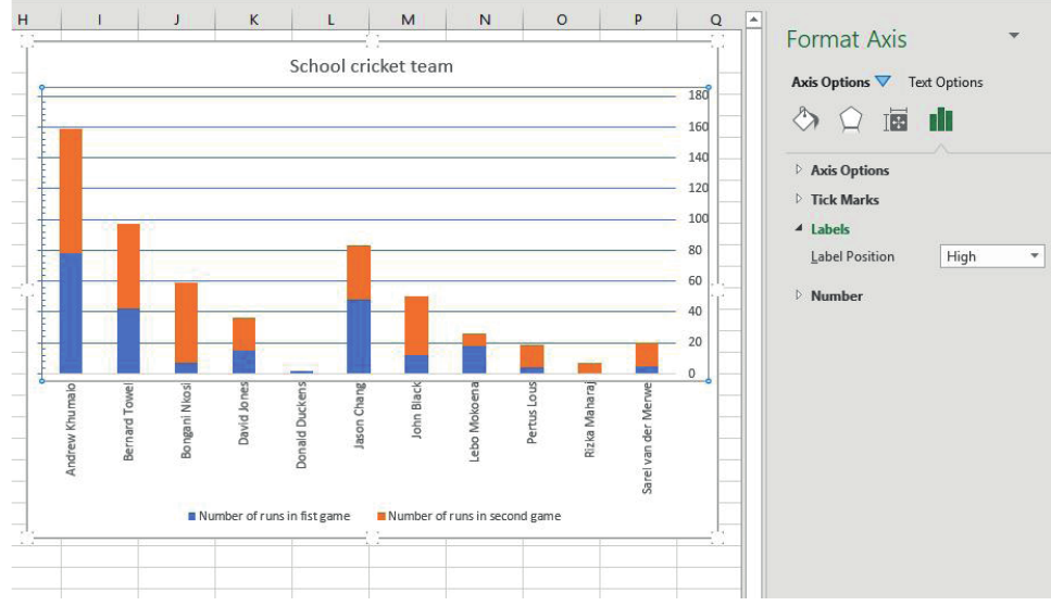
Method 2: Using the chart elements menu
For more comprehensive label editing, you can access the Chart Elements menu by selecting your chart and clicking the plus (+) icon that appears near it. This menu allows you to:
- Enable or disable axis titles
- Add or remove data labels
- Modify legend positioning
- Control gridline appearance
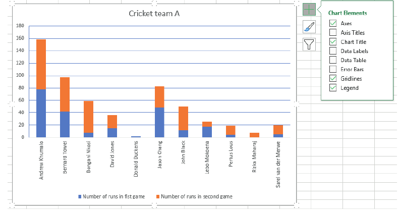
When you enable axis titles through this menu, placeholder text appears that you can then customise by clicking on it and typing your preferred labels.
The Chart Elements menu is your primary tool for comprehensive chart formatting. It provides access to all major chart components and should be your first choice when you need to make multiple formatting changes simultaneously.
Method 3: Editing labels through worksheet cells
When your chart is linked to data in your worksheet, you can often change labels by modifying the source data directly. This method is particularly useful because:
- Changes automatically update in the chart
- You maintain consistency between your data and your chart
- Multiple charts using the same data will all update simultaneously
This approach works well for axis labels that correspond to row or column headers in your original data table.
Method 4: Using the select data source dialogue
For more complex label modifications, especially when dealing with axis labels, you can use the Select Data Source dialogue. This method allows you to:
- Specify exactly which cells contain your label text
- Change the range of labels without affecting your original data
- Switch between using row headers and column headers as labels
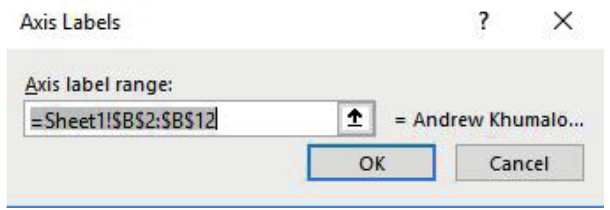
To access this feature, right-click on the axis you want to modify and select the appropriate option from the context menu. This opens a dialogue where you can specify the exact cell range containing your desired labels.
Adding additional data series
Sometimes you need to expand your chart to include more information. The Select Data Source dialogue also allows you to add new data series to existing charts. This is particularly useful when you have collected additional data that relates to your original chart.
When adding a new series, you specify both the series name and the range of values it should display. The chart automatically updates to accommodate the new information, adjusting colours and legends as needed.
Adding data series to existing charts maintains visual consistency while expanding the information presented. This technique is especially valuable when you need to compare multiple datasets or show additional context without creating entirely new charts.
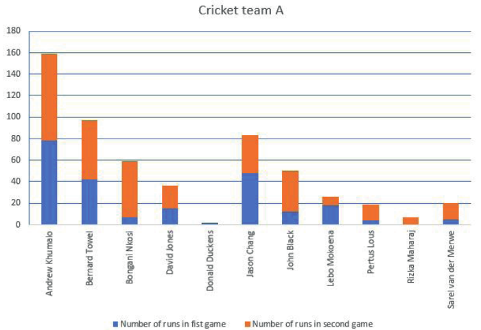
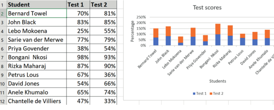
Choosing the correct chart type
Selecting the appropriate chart type is crucial for effective data presentation. Different types of data require different visualisation approaches to communicate your message clearly. The wrong chart type can confuse your audience or misrepresent your data.
Line charts: Tracking changes over time
Line charts work best when you need to show how values change over a period of time. They're particularly effective for:
- Project progress tracking
- Performance trends
- Any data where the sequence matters
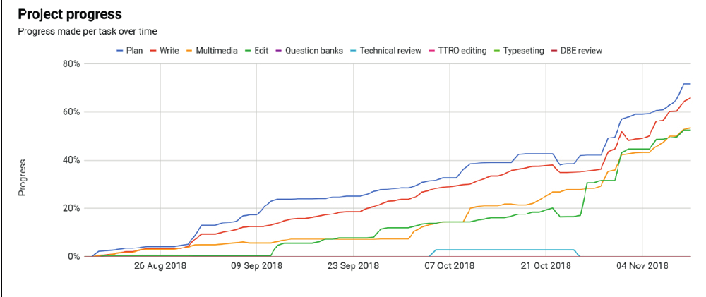
The connected points in a line chart help viewers see patterns and trends that might not be obvious in other chart types. Use line charts when time or sequence is an important factor in your data.
Worked Example: Choosing a Line Chart
Scenario: You're tracking your team's monthly sales figures over a 12-month period.
Why line chart works best:
- Shows the progression of sales month by month
- Makes it easy to spot seasonal trends
- Reveals whether sales are generally increasing or decreasing
- Allows viewers to see specific months where performance changed significantly
Pie charts: Showing parts of a whole
Pie charts are ideal when you want to demonstrate how individual values contribute to a total. They work well when:
- All values add up to 100% or a complete whole
- You have relatively few categories (typically 2-7 segments)
- You want to emphasise proportional relationships
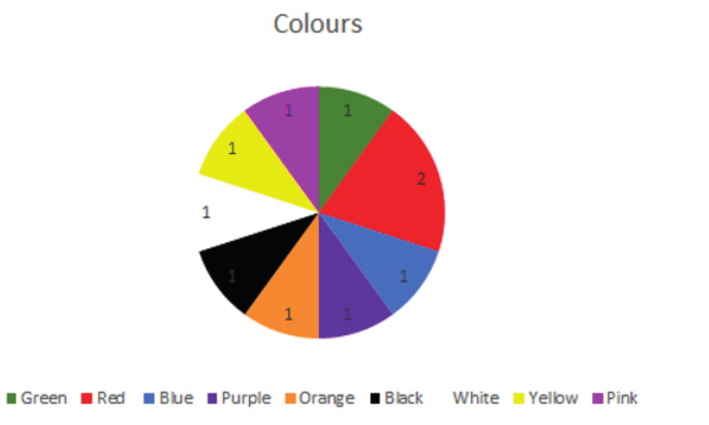
Pie charts become difficult to read when you have too many small segments. Consider grouping minor categories together if you have more than 7-8 categories, or use a different chart type entirely.
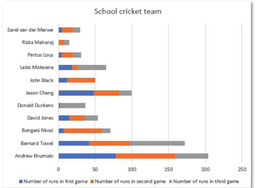
Bar charts: Comparing different groups
Bar charts excel at comparing values across different categories. They're versatile and work well for:
- Comparing performance between individuals or groups
- Showing survey results
- Any situation where you need to compare quantities
Bar charts can be horizontal or vertical, and can display single values or multiple data series (like stacked bars). Choose the orientation that makes your labels most readable.
Making the right choice
When deciding which chart type to use, understanding your data's nature and your communication goals is essential. The decision process should be systematic rather than arbitrary.
Critical Decision Questions:
Ask yourself these questions before selecting a chart type:
- Is time involved? If yes, consider a line chart
- Do the values add up to a meaningful total? If yes, a pie chart might work
- Are you comparing different groups or categories? If yes, a bar chart is often best
- How many data points do you have? Too many categories can make pie charts unreadable
Remember that the goal is always to make your data as clear and understandable as possible for your intended audience. Sometimes you might need to try different chart types to see which one tells your story most effectively.
Key Points to Remember:
- Data labels include chart titles, axis titles, data point values, and legend text - all of which help readers understand your chart
- You can edit labels directly by clicking on them, through the Chart Elements menu, by modifying source data, or via the Select Data Source dialogue
- Line charts work best for showing changes over time or sequences
- Pie charts are ideal for displaying parts of a whole, but only when you have few categories
- Bar charts excel at comparing values between different groups or categories
- Always choose your chart type based on what story you want your data to tell