Charts: Stacked Charts and Axes (Grade 12 NSC Matric Computer Application Technology): Revision Notes
Charts: Stacked Charts and Axes
Understanding stacked charts
A stacked chart is a powerful data visualisation tool that helps you show the relationship between different data categories whilst also displaying how each individual part contributes to the total. Think of it as breaking down a whole into its component parts while still being able to compare across different groups.
Stacked charts are particularly useful when you need to analyse data that has multiple components. For example, if you're looking at student performance across different subjects, or in our case study, cricket players' performance across multiple games.
Stacked charts excel at showing both the "big picture" (total values) and the detailed breakdown (individual components) in a single visualisation, making them invaluable for comprehensive data analysis.
Types of stacked charts
Stacked bar charts vs stacked column charts

The main difference between these two chart types is their orientation:
Stacked Bar Charts (horizontal orientation):
- Display data horizontally with bars extending from left to right
- Excellent for displaying data with long category names or labels
- Easier to read when you have many categories
- Categories are listed vertically along the left axis
Stacked Column Charts (vertical orientation):
- Display data vertically with columns extending from bottom to top
- Better suited for shorter category names
- Good for showing trends over time periods
- Categories are listed horizontally along the bottom axis
Memory Aid: Think "BAR = Better for Big labels" and "COLUMN = Comparing groups over time". The choice between bar and column charts often depends on your data labels and the story you want to tell with your data.
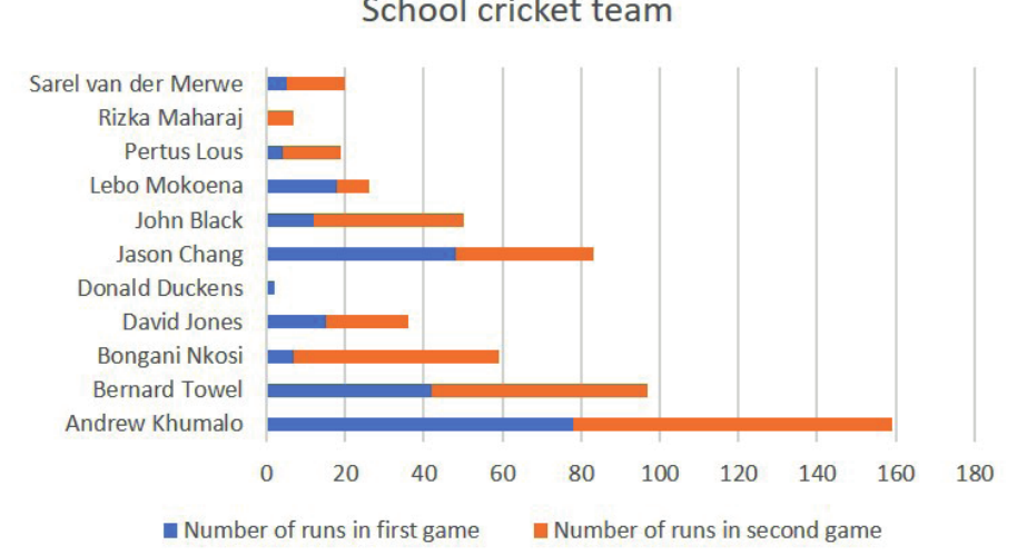
Real-world example: Cricket team analysis
Let's explore stacked charts using a practical example of analysing a school cricket team's performance across two games.
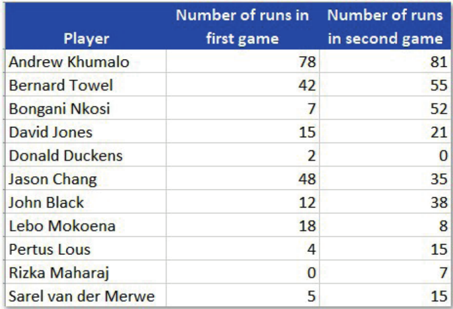
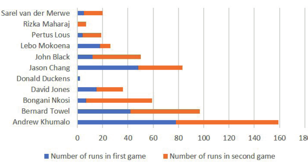
Practical Application: Cricket Performance Analysis
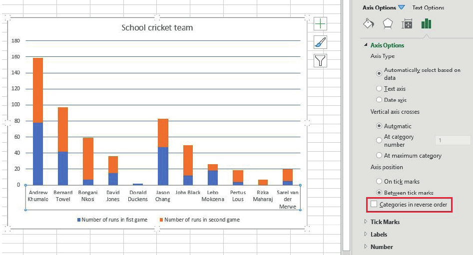
In this cricket team analysis, each player's performance is shown across two different games. The stacked chart allows us to see both individual game performance and total performance for each player. This makes it easy to identify top performers like Andrew Khumalo whilst also seeing how consistent each player was across both games.
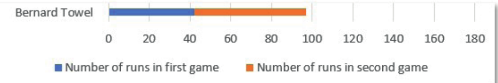
When we look at individual players like Bernard Towel, the stacked chart clearly shows his performance in the first game (blue section) and second game (orange section), giving us a complete picture of his batting contribution.
Creating stacked bar charts
To create a stacked bar chart in Excel, follow these essential steps:
Step-by-Step: Creating a Stacked Bar Chart
- Prepare your data: Organise your data with categories in rows and different series in columns
- Access the chart tools: Go to the Insert tab and select Charts
- Choose chart type: Select "See All Charts" option
- Select stacked bar: Choose the Bar option, then select "Stacked Bar" from the sub-categories
- Insert the chart: Click OK to create your stacked bar chart
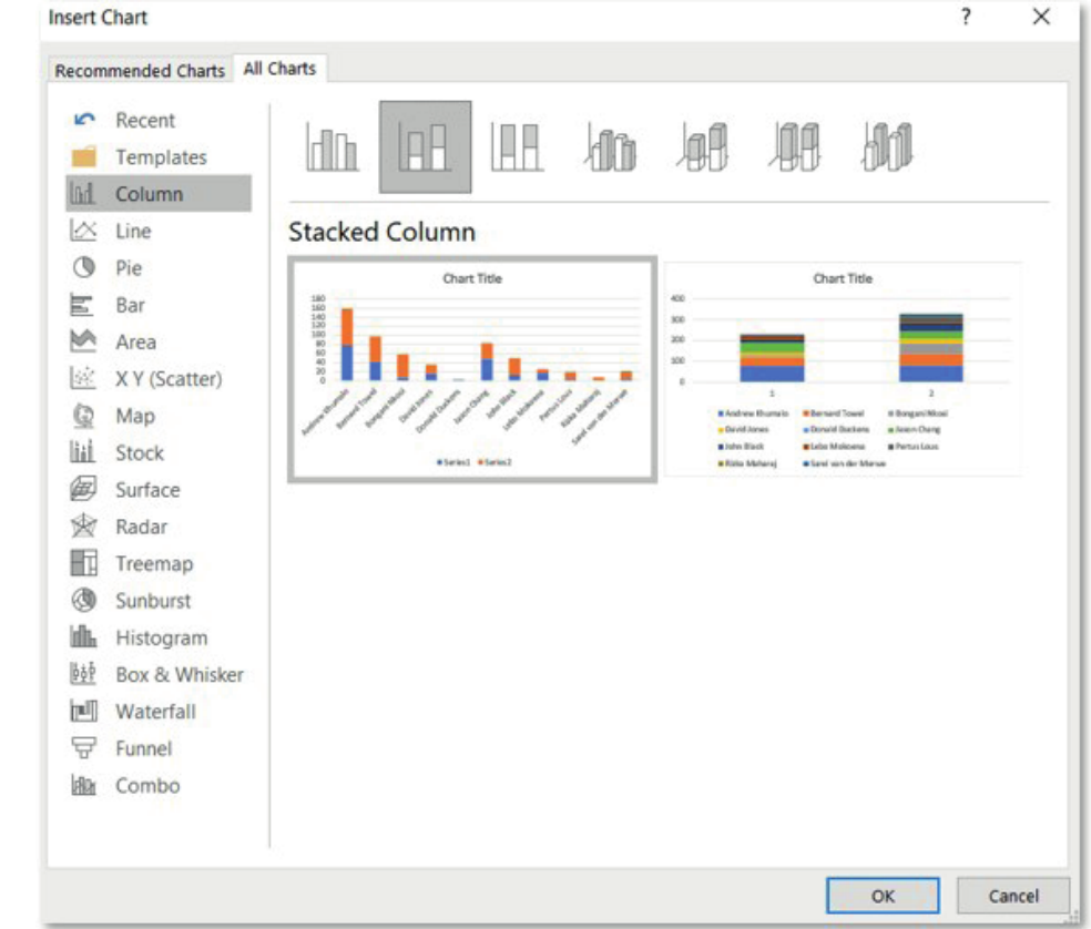
The resulting chart displays each player's data as horizontal bars, with each bar divided into segments representing different games or categories.
Creating stacked column charts
For stacked column charts, the process is similar but with vertical orientation:
Step-by-Step: Creating a Stacked Column Chart
- Select your data range: Highlight the data you want to chart
- Insert chart: Go to Insert > Charts > See All Charts
- Choose column type: Select Column, then "Stacked Column"
- Customise as needed: Add titles, legends, and formatting
The stacked column chart shows the same data but in vertical format, which can be more suitable depending on your presentation needs and label lengths.
Customising chart axes
Understanding chart axes
Every chart has two main axes:
- Horizontal axis (x-axis): Usually contains category labels or text data
- Vertical axis (y-axis): Usually contains numerical data such as values, percentages, or measurements
The type of data displayed on each axis depends on your chart orientation. For column charts, categories are on the horizontal axis and values on the vertical axis. For bar charts, this is reversed.
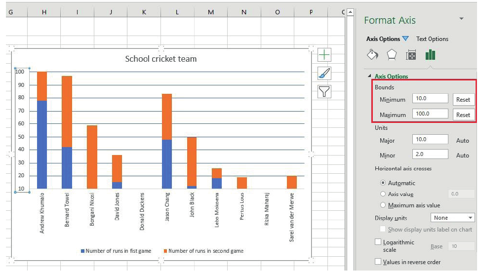
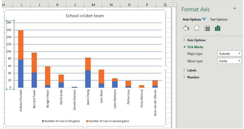
Changing axis scales and bounds
You can customise how your data is displayed by adjusting the axis bounds:
Minimum and Maximum Values: Set the starting and ending points for your numerical axis to focus on specific data ranges.
Major and Minor Units: Control the spacing between gridlines and tick marks to make your chart easier to read.
Formatting axis labels
Label Position: Choose where labels appear relative to the axis (next to axis, high, low, or none).
Label Orientation: Rotate text labels to prevent overcrowding, especially useful for long category names.
Distance from Axis: Adjust the spacing between labels and the axis line for better visual appearance.
Advanced axis options
Categories in Reverse Order: This option allows you to flip the order of your categories, which can be useful for creating specific visual effects or following certain data presentation conventions.
Display Units: For large numbers, you can choose to display values in thousands, millions, or other units to make the chart more readable.
Tick Marks: Customise the appearance of major and minor tick marks to improve chart clarity.
Exam tips and best practices
When to use stacked charts:
- Comparing parts of a whole across different categories
- Showing individual contributions to totals
- Analysing performance across multiple time periods or conditions
Chart formatting considerations:
- Use contrasting colours for different segments
- Include clear legends to identify data series
- Choose appropriate axis scales to highlight important data patterns
- Consider your audience when choosing between bar and column orientations
Common mistakes to avoid:
- Don't use too many categories in a single stacked chart
- Avoid similar colours that are difficult to distinguish
- Don't forget to label your axes clearly
- Ensure your chart title describes what the data shows
Remember!
Key Points to Remember:
- Stacked charts show both individual components and totals, making them perfect for part-to-whole analysis
- Bar charts work best with long category labels, while column charts are better for shorter labels
- Axis formatting is crucial for creating clear, professional-looking charts that effectively communicate your data
- Always consider your audience and purpose when choosing chart types and formatting options
- Practice creating different chart types to become comfortable with the various formatting options available