Data and Data Analysis (Grade 12 NSC Matric Physical Sciences): Revision Notes
Data and Data Analysis
Introduction to data representation
When conducting scientific experiments, the data you collect needs to be converted into different representations for proper analysis. One of the most important representations is the graph, which allows you to visualise relationships between variables and identify patterns in your experimental results.
Data representation is a critical skill in scientific analysis because it transforms raw measurements into visual formats that reveal patterns, trends, and relationships that might not be obvious from numbers alone.
How to draw graphs in science
The golden rule of scientific graphing
The Golden Rule of Scientific Graphing
The most crucial principle when plotting experimental data is that you should never connect the dots directly. Real experimental data will never follow a perfect line or curve due to measurement uncertainties and experimental errors. Instead, you should plot multiple data points and draw a best fit line that represents the overall trend in your data.
Essential features of scientific graphs
When creating graphs from experimental data, you must include several key elements to ensure accuracy and clarity:
Appropriate scaling is fundamental to good graph construction. Work out the range of your data and choose the highest and lowest points to determine your scale. The scale should use most of the available axis space and remain consistent throughout the entire axis. Use convenient intervals such as 10's, 20's, or 50's, and always use graph paper for maximum accuracy.
Proper axis labelling requires that each axis is clearly marked with what is being measured, including the appropriate units in brackets. For example, write "Temperature (°C)" or "Time (seconds)" rather than just the variable name.
Variable Placement Convention
Variable placement follows a standard convention where the independent variable (the one you control) goes on the x-axis, while the dependent variable (the one you measure) goes on the y-axis.
Data point marking involves plotting each point with a clear, visible symbol such as a cross or circle. Each point represents specific x and y coordinates from your experimental measurements.
Best fit lines should be added after all points are plotted. These lines show the general trend of your data without necessarily passing through every single point.
Origin considerations mean you should only start your graph at (0,0) if you have a data point there or if the best fit line passes through the origin. Otherwise, choose appropriate starting values for your axes.
Descriptive titles must clearly outline the relationship between the dependent and independent variables, helping readers understand what the graph demonstrates.
Multiple data sets require different symbols and colours for each set, with a clear key or legend to define what each symbol represents.
Types of relationships in data
Scientific data can show different types of mathematical relationships. Line graphs work best when the relationship between variables is continuous rather than discrete.
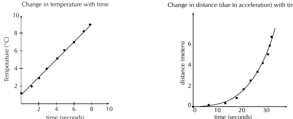
The diagram above illustrates two common relationship types. Linear relationships produce straight-line graphs when one variable increases at a constant rate relative to another. Exponential relationships create curved graphs where the rate of change accelerates over time.
Worked Example: Drawing Best Fit Lines
For linear relationships: Draw a straight best fit line using a ruler, ensuring roughly equal numbers of points fall on either side of the line.
For exponential relationships: When points appear to follow a curve, draw the best fit line freehand to follow the curved pattern of the data, as rulers cannot create the necessary curved shape.
Understanding units in scientific measurements
Units Are Essential
Units are absolutely essential in all scientific work. Without proper units, measurements become meaningless. For instance, saying you have "12 water" tells us nothing useful - you could have 12 ml of water, 12 litres of water, or even 12 bottles of water. Each represents a completely different quantity.
Units give meaning to numerical values and form an essential part of scientific language. You must always specify units when expressing any physical quantity to ensure clear communication and accurate calculations.
Qualitative and quantitative analysis
Qualitative analysis defined
Qualitative analysis focuses on examining the quality or characteristics of a substance or phenomenon. This type of research involves looking at how something appears compared to other cases, conducting in-depth analysis of specific situations, and making informed decisions about similar cases based on detailed observations.
Example: Qualitative Study of Student Habits
A qualitative study of university student study habits might involve interviewing only a few people extensively. Each participant would be asked detailed questions about their study methods and what approaches work best for them. The researcher would then make general, informed assertions about study habits based on these detailed case studies.
Quantitative analysis defined
Quantitative analysis involves working with specific numerical data and statistical methods. This type of research studies large groups of data samples, uses experimental controls, manipulates variables systematically, and employs mathematical modelling to analyse results.
Example: Quantitative Study of Student Habits
Using the same study habits example, a quantitative approach would involve surveying a large number of students to gather statistical data about actual study hours and productivity measures. The raw numerical data would then be analysed using graphical models and statistical techniques to identify patterns and relationships.
Forming conclusions based on scientific evidence
Linking results to hypotheses
When you complete an experiment and analyse your results, you need to examine how your findings relate to your original hypothesis. A proper scientific conclusion should clearly state whether your observed results support or contradict your initial hypothesis.
Never Change Your Hypothesis After Results
If your results don't match your original prediction, this doesn't mean you should change your hypothesis after the fact. Instead, you should try to explain what factors might have caused the unexpected results or what information you might have lacked when forming your original hypothesis.
Ensuring validity and reliability
Validity refers to whether your experiment actually tests what you intended to measure. Reliability concerns whether your results would be consistent if the experiment were repeated. The best way to ensure reliability is to repeat experiments multiple times and calculate average values from multiple trials.
Avoiding bias in scientific conclusions
Bias represents a form of systematic error that can affect scientific investigations and distort measurement processes. While it's difficult to eliminate bias completely, scientists must work to minimise its effects and acknowledge its potential impact on results.
Preventing Research Bias
Bias can be introduced when researchers try to force data to fit their expectations rather than objectively analysing what the results actually show. To prevent bias, you should clearly state all experimental parameters, avoid manipulating data to match preconceived ideas, and present information in ways that don't force readers to agree with predetermined conclusions.
Designing scientific models
Purpose and characteristics of models
Sometimes systems are too large or too difficult to study directly through experimentation. In these cases, scientists create models - testable ideas that describe large systems which cannot be easily tested in their entirety.
Characteristics of Good Scientific Models
A good scientific model should be able to explain as many observations of the large system as possible while remaining relatively simple to understand and test. Models serve as simplified representations that help us understand complex phenomena.
Historical example of effective modelling
Historical Example: The Spherical Earth Model
The spherical model of Earth provides an excellent example of successful scientific modelling. In the late 1400s, many educated people suspected that Earth might not be flat based on observations that didn't fit the flat Earth model.
The spherical Earth model was testable on a smaller scale and explained many previously puzzling phenomena, such as why ships appeared to sink below the horizon regardless of travel direction. The model gained further support when it successfully predicted the shape of Earth's shadow during lunar eclipses.
Key Points to Remember:
- Never connect dots directly when plotting experimental data - always use best fit lines to show overall trends
- Qualitative analysis focuses on quality and characteristics, while quantitative analysis deals with numerical data and statistics
- Units must always be specified when expressing physical quantities to give meaning to measurements
- Scientific conclusions should link results back to original hypotheses without changing hypotheses to fit unexpected results