Measuring the Distribution of Income and Wealth (HSC SSCE Economics): Revision Notes
Measuring the Distribution of Income and Wealth
Understanding income distribution
When economists examine how fairly an economy distributes its resources, they start by measuring how income flows to different groups in society. This measurement process helps us understand whether economic benefits reach all members of society or concentrate in the hands of a few.
What is personal income?
Personal income represents the money and monetary benefits that individuals or households receive from contributing to production. This income comes from several sources:
- Workers earn wages from their labour
- Landowners receive rent
- Capital owners earn interest
- Entrepreneurs make profit from their business activities
- Some people receive transfer payments from government, such as pensions or welfare benefits
Income vs Wealth: A Key Distinction
Income flows over time - we typically measure it weekly, monthly, or annually. This distinguishes it from wealth, which represents the stock of assets someone owns at a particular point in time. Think of income as a flow (like water running through a pipe) and wealth as a stock (like water stored in a tank).
Defining income inequality
Income inequality describes how evenly or unevenly income spreads across a population. At one end of the spectrum, perfect equality would mean everyone receives exactly the same income. At the other end, complete inequality would mean one person receives all income while everyone else gets nothing.
Real economies fall somewhere between these extremes. The key question is: how large is the gap between high earners and low earners? A society with low inequality sees relatively small differences between income groups. A society with high inequality experiences substantial gaps between the rich and poor.
Measuring income through quintile analysis
Economists use quintile analysis as a straightforward method to examine income distribution. This approach divides the population into five equal groups (quintiles), each representing 20% of people, ranked from lowest to highest income earners.
We then calculate what percentage of total income each quintile receives. In a perfectly equal society, each quintile would receive exactly 20% of total income. However, real data reveals significant inequality.
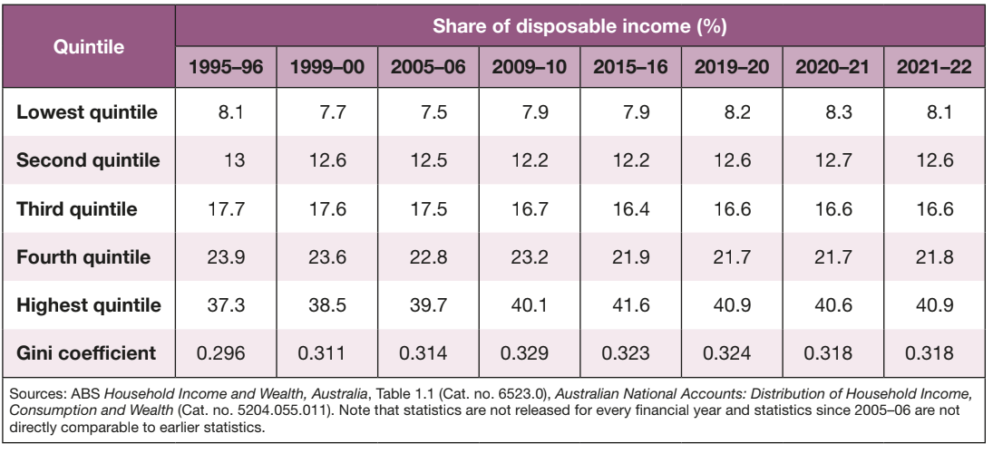
The table shows Australia's income distribution over recent decades. In 2021-22, the lowest 20% of Australians received just 8.1% of total disposable income (income after tax). Meanwhile, the highest 20% received 40.9% of income - more than five times their proportional share.
Growing Income Concentration
Notice how only the highest income quintile has increased its share over the past 25 years. The middle three quintiles have seen their shares decline or remain static. This pattern indicates growing income concentration at the top of the distribution.
Understanding the scale of income differences
Looking at actual dollar amounts helps us grasp the magnitude of income inequality. The average household in the highest quintile earns vastly more than those in lower quintiles.
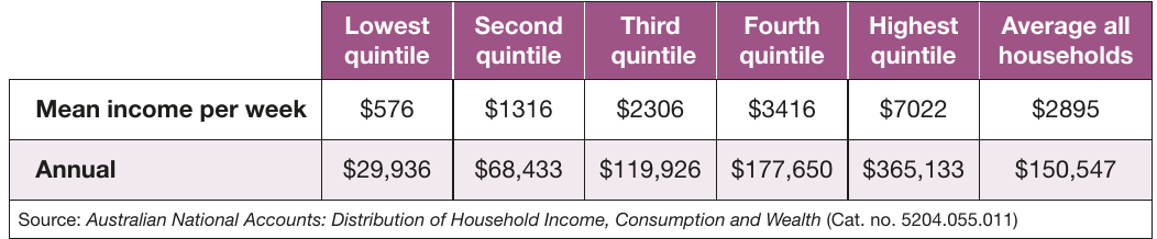
These figures reveal stark differences. The highest quintile earns an average of $365,133 annually - twelve times more than the lowest quintile's $29,936. Even the fourth quintile, which represents middle-to-upper-middle income households, earns less than half what the top quintile receives.
Mean income vs median income
Economists use two different measures when discussing "average" income, each telling us something different about the distribution:
Mean income calculates the arithmetic average. You sum all income in a group and divide by the number of people. This measure gets pulled upward by very high incomes, so it often exceeds what most people actually earn.
Median income identifies the middle point. Half the population earns more than this amount, and half earns less. The median provides a better sense of what a "typical" person earns because extreme values don't distort it.
Why the Difference Matters
In unequal societies, mean income sits well above median income, because high earners pull the average upward while the median stays closer to what most people actually experience. This gap between mean and median is itself an indicator of inequality - the larger the gap, the greater the inequality.
Visualizing inequality with the Lorenz curve
The Lorenz curve offers a powerful visual tool for understanding income inequality. This graph transforms quintile data into a curve that immediately shows how far a society deviates from perfect equality.
Constructing the Lorenz curve
To build a Lorenz curve, we plot cumulative percentages on both axes:
- The horizontal axis shows the cumulative percentage of the population (ranked from lowest to highest income)
- The vertical axis shows the cumulative percentage of total income these people receive
Starting at the origin (0,0), we plot points showing what share of income the bottom 20%, bottom 40%, bottom 60%, bottom 80%, and all 100% of the population receive. Connecting these points creates the Lorenz curve.
Interpreting the line of equality
The diagonal line running from corner to corner represents perfect equality - the "line of equality". At every point on this line, any given percentage of the population receives exactly that same percentage of income. For example, the bottom 40% of people would receive 40% of income.
In reality, income distribution never matches this perfect equality line. The actual Lorenz curve always bows below it (except at the endpoints). The extent of this bow reveals the degree of inequality.
Reading inequality from the curve
Interpreting Lorenz Curve Position
The further the Lorenz curve sags away from the line of equality, the greater the inequality:
- A curve that hugs close to the diagonal indicates relatively equal distribution
- A curve that dips far below shows severe inequality
You can understand this intuitively: if the curve bows downward, it means the cumulative income percentage lags behind the cumulative population percentage. In other words, it takes a larger share of the population to account for any given share of income - because income concentrates among fewer people at the top.
Quantifying inequality with the Gini coefficient
While the Lorenz curve provides visual insight, economists often need a single number to compare inequality across countries or track changes over time. The Gini coefficient serves this purpose.
Calculating the Gini coefficient
The Gini coefficient measures the area between the Lorenz curve and the line of equality. Looking at the Lorenz curve diagram, we label the area between these two lines as . The area below the Lorenz curve (under the triangle) is labeled .
The formula for the Gini coefficient is:
This ratio produces a number between 0 and 1. Notice that represents the entire triangular area under the line of equality.
Interpreting Gini coefficient values
Understanding what different Gini values mean helps us evaluate inequality:
Understanding Gini Coefficient Values
-
A Gini coefficient of 0 indicates perfect equality. Everyone receives identical income, so the Lorenz curve matches the line of equality. Area disappears, making the ratio .
-
A Gini coefficient of 1 indicates complete inequality. One person receives all income while everyone else gets nothing. Area shrinks to zero, making the ratio .
-
Lower values (closer to 0) indicate more equal societies
-
Higher values (closer to 1) indicate more unequal societies
Most developed economies have Gini coefficients between 0.25 and 0.40.
Australia's Gini coefficient in context
Australia's most recent Gini coefficient stands at 0.318 (2020-21), according to the ABS. This sits close to Australia's average since 1994 of 0.315, though it has increased from 0.296 in the mid-1990s.
The OECD measured Australia's Gini at 0.318 in 2020, placing Australia 21st out of 38 member countries. This means 20 countries have more equal income distribution, while 17 have less. Australia's coefficient slightly exceeds the OECD average of 0.315, indicating marginally more inequality than the typical developed nation.
Regional Variations in Inequality
Research from the Reserve Bank in 2022 found regional variations in inequality:
- Mining areas show higher Gini coefficients because mining jobs pay substantially more than other regional employment
- Major cities also display higher inequality due to the extremely diverse range of occupations, from low-wage service jobs to high-earning professional roles
Measuring wealth distribution
While income measures how much money flows to people over time, wealth represents the total value of assets people own at any moment. Measuring wealth distribution proves more complex than measuring income, but reveals even starker inequality.
The challenge of measuring wealth
The Australian Bureau of Statistics only began publishing official wealth distribution statistics in 2006. Data releases occur every few years rather than annually, making it harder to track short-term changes. Despite these measurement challenges, the available data paints a clear picture: wealth inequality far exceeds income inequality.
Comparing wealth and income inequality
The contrast between wealth and income distribution is striking. While the highest income quintile receives 40.9% of total income, the highest wealth quintile owns 62.8% of all wealth. At the other end, the lowest income quintile earns 8.1% of income, but the lowest wealth quintile owns less than 1% of total wealth.
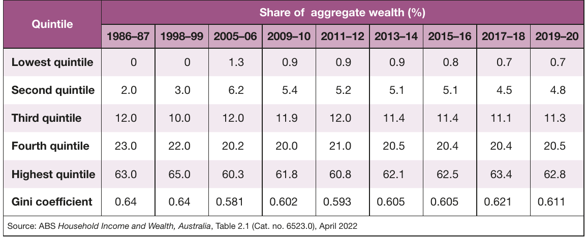
This table reveals how wealth concentrates at the top of society. The Gini coefficient for wealth (0.611 in 2019-20) significantly exceeds the Gini coefficient for income (0.318 in 2021-22). This difference tells us that while income inequality is moderate, wealth inequality is severe.
Understanding the concentration of wealth
About 70% of Australian households possess less than the average household wealth. In 2022, average household wealth reached $1,057,000 (excluding debts). This means the distribution is heavily skewed - a relatively small number of very wealthy households pull the average upward, while most households fall below this level.
The bottom 40% of the population combined owns less than 6% of total wealth. Meanwhile, the top 40% owns over 83% of all wealth. This concentration has remained relatively stable over time, though it has fluctuated slightly due to various economic factors.
Why wealth inequality exceeds income inequality
Several factors explain why wealth distributes more unequally than income:
Key Factors Driving Wealth Inequality
Wealth accumulation takes time. People need to save income over many years to build wealth. Young people starting their careers have had little time to accumulate assets, while older people have spent decades saving and investing.
Wealth generates more wealth. Those who already own assets earn returns on those assets (such as rent, dividends, or capital gains). This creates a compounding effect where wealth breeds additional wealth.
Wealth concentration is self-reinforcing. Wealthy families can pass assets to their children through inheritance. They can also provide financial help for education, housing deposits, or business start-ups, giving their children advantages in wealth accumulation.
Housing plays a major role. Property represents the largest asset for most Australian households. Significant house price increases in recent decades have dramatically increased wealth for existing homeowners, while making it harder for younger people to enter the property market.
The expansion of superannuation since the 1990s has helped reduce wealth inequality somewhat. Compulsory superannuation contributions mean even workers in lower income quintiles build some wealth over their careers. However, this effect is modest compared to the wealth concentration that already existed.
Key Points to Remember:
-
Income distribution is measured by dividing the population into quintiles (20% groups) and examining what share of total income each receives. Australia's highest quintile receives about 41% of income, while the lowest receives about 8%.
-
The Lorenz curve visualizes inequality by plotting cumulative population against cumulative income. The further the curve bows away from the diagonal "line of equality", the greater the inequality.
-
The Gini coefficient summarizes inequality in a single number between 0 (perfect equality) and 1 (complete inequality). It's calculated as , where is the area between the Lorenz curve and the line of equality. Australia's income Gini is around 0.318.
-
Wealth inequality is much greater than income inequality. Australia's wealth Gini coefficient (0.611) is nearly double its income Gini coefficient (0.318). The top 20% owns about 63% of all wealth, while the bottom 20% owns less than 1%.
-
Mean income (arithmetic average) differs from median income (the middle value). In unequal societies, mean exceeds median because high earners pull the average upward.