Drawing and Interpreting Economics Diagrams (HSC SSCE Economics): Revision Notes
Drawing and Interpreting Economics Diagrams
Introduction to economic diagrams
Understanding and using economic diagrams is a fundamental skill in SSCE HSC Economics. These visual tools help us analyse complex economic relationships, predict market outcomes, and evaluate policy impacts. Some diagrams are explicitly required by the syllabus (such as foreign exchange market models), while others provide valuable frameworks for deeper understanding of economic concepts.
Economic diagrams serve two main purposes. First, they allow us to represent macroeconomic phenomena at the "big picture" level, showing how entire economies respond to changes. Second, they enable microeconomic analysis of specific markets and sectors. Mastering these diagrams will strengthen your ability to respond to stimulus-based questions and communicate economic ideas clearly.
Economic diagrams are not just illustrations—they are analytical tools that help you visualize cause-and-effect relationships, predict outcomes, and support your arguments with visual evidence. Strong diagram skills can significantly improve your performance in extended response questions.
International trade and protection
Impact of international organisations on protection levels
International organisations like the World Trade Organization (WTO), supported by the International Monetary Fund (IMF) and World Bank, work to reduce trade protection globally. The economic impact of tariff reductions can be analysed using supply and demand diagrams.
When tariffs are removed or reduced:
- The domestic price falls from the protected level () to the world price ()
- Imports increase as foreign goods become relatively cheaper
- Domestic production contracts as import-competing firms face greater competition
- Consumer surplus increases due to lower prices and greater choice
- Some workers in import-competing industries may experience short-term unemployment
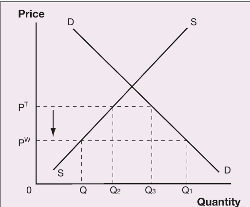
The diagram shows how removing protection shifts the economy from a higher domestic price (with tariff) to a lower world price. The quantity of imports increases substantially, shown by the expansion along the horizontal axis.
Trading bloc agreements and subsidies
Trading blocs have more complex effects on global trade. Some, like APEC, aim to reduce tariffs for all trading partners. Others, like USMCA, only reduce barriers among member nations. The European Union maintains external tariffs while providing production subsidies to member producers.
Production subsidies reduce firms' costs of production, shifting the supply curve rightward. This creates:
- Oversupply of products in global markets
- Depressed global prices
- Adverse impacts on non-subsidised producers outside the trading bloc
- Potential trade tensions and retaliation
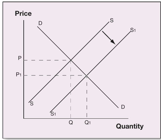
This diagram illustrates a rightward supply shift from to , resulting in lower equilibrium prices (from to ) and higher quantities (from to ). Subsidised producers gain market share at the expense of unsubsidised competitors.
Balance of payments relationships
The debt-trap cycle
A current account deficit (CAD) must be financed through the capital and financial account (KAFA) under a floating exchange rate system. This creates important linkages between international trade, investment flows, and income payments.
The Debt-Trap Cycle
The debt-trap cycle emerges when:
- Foreign borrowing or investment increases foreign liabilities
- Higher foreign liabilities lead to increased income outflows (interest and dividends)
- These outflows worsen the net primary income component of the current account
- The larger current account deficit requires additional foreign financing
- The cycle reinforces itself, making it difficult to break
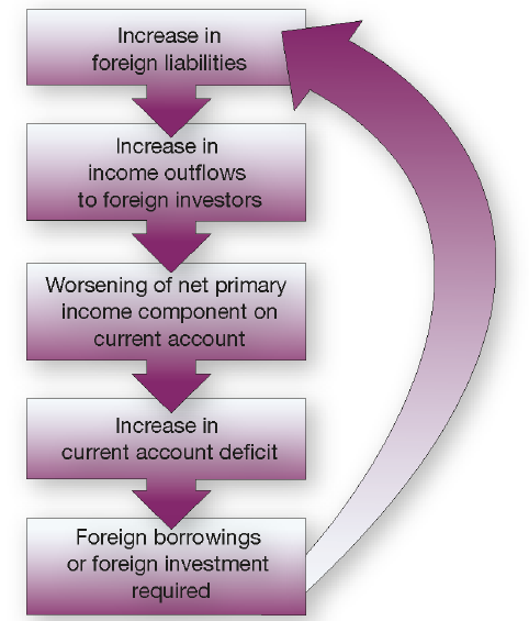
This flowchart demonstrates the self-reinforcing nature of external debt accumulation. Each step feeds into the next, creating a continuous cycle that can constrain economic policy choices.
Exchange rate determination
Floating exchange rate systems
Under floating exchange rates, currency values are determined by market forces of supply and demand. Multiple factors influence these forces, including:
- Relative interest rates between countries
- International competitiveness of exports
- Inflation rate differentials
- Economic growth prospects
- Speculation by foreign exchange market participants
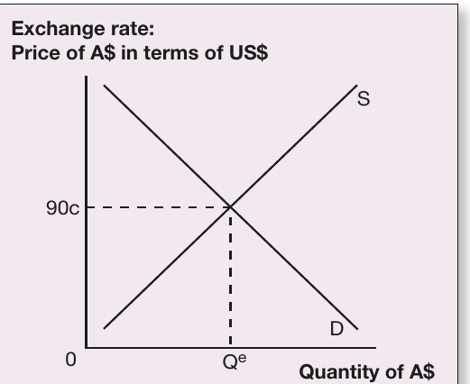
The diagram shows the Australian dollar priced in US dollars, with equilibrium at cents. At this exchange rate, the quantity of Australian dollars demanded equals the quantity supplied, represented by .
Changes in any underlying factor shift either the supply or demand curve, causing currency appreciation or depreciation. For example, higher Australian interest rates increase demand for Australian dollars (as foreign investors seek higher returns), shifting the demand curve rightward and appreciating the currency.
Fixed exchange rate systems
Fixed exchange rate regimes require government or central bank intervention to maintain the currency at a predetermined level. The authorities must actively buy or sell currency to prevent market forces from moving the exchange rate away from the fixed level.
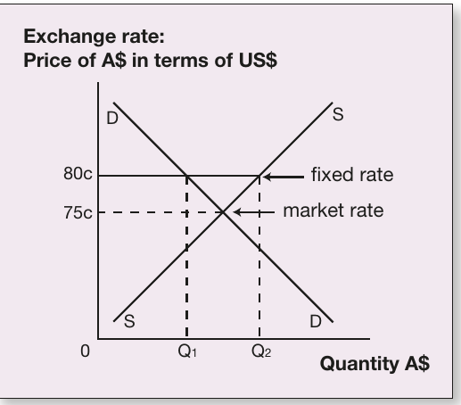
This diagram compares a fixed exchange rate ( cents) with the market rate that would prevail under floating conditions ( cents). When the fixed rate exceeds the market rate, there is excess supply of Australian dollars. The central bank must purchase the surplus currency (the distance ) to maintain the peg, using foreign exchange reserves.
Key implications of fixed rates:
- Require substantial foreign exchange reserves
- Limit monetary policy independence
- May become unsustainable if reserves are depleted
- Can provide exchange rate stability for international trade
Impact of balance of payments components on exchange rates
All transactions recorded in the balance of payments affect currency supply and demand. Understanding these relationships is essential for predicting exchange rate movements.
Factors that increase demand for Australian dollars (appreciation):
- Increased exports of goods and services
- Higher primary income received from overseas investments
- Increased secondary income received (transfers from abroad)
- Capital and financial inflows (foreign investment in Australia)
Factors that increase supply of Australian dollars (depreciation):
- Increased imports of goods and services
- Higher primary income payments to foreign investors
- Increased secondary income payments
- Capital and financial outflows (Australian investment abroad)
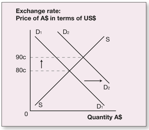
An increase in demand shifts the demand curve from to , appreciating the Australian dollar. This might occur due to stronger export demand or higher capital inflows attracted by rising Australian interest rates.
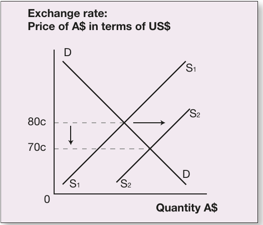
An increase in supply shifts the supply curve from to , depreciating the Australian dollar from cents to cents. This might result from increased import demand or capital outflows as Australian investors seek opportunities abroad.
Income distribution analysis
The Lorenz curve
The Lorenz curve is a graphical tool for visualising income inequality within an economy. It plots the cumulative proportion of income received against the cumulative proportion of income recipients (households ranked from lowest to highest income).
Perfect equality would produce a diagonal line (the "line of equality"), where each percentage of the population receives exactly that percentage of total income. In reality, income is distributed unevenly, so the actual Lorenz curve lies below this line.
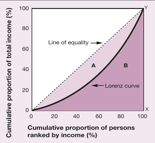
Key features of the Lorenz curve:
- The horizontal axis shows the cumulative proportion of persons ranked by income
- The vertical axis shows the cumulative proportion of total income
- Greater distance from the line of equality indicates greater inequality
- The curve always starts at and ends at
The Gini coefficient
The Gini coefficient translates the Lorenz curve into a single numerical measure of inequality. It is calculated as:
Where:
- is the area between the Lorenz curve and the line of equality
- is the area beneath the Lorenz curve
The Gini coefficient ranges from (perfect equality) to (complete inequality, where one person receives all income). Lower values indicate more equal income distribution. Australia's Gini coefficient typically ranges between and , indicating moderate inequality compared to global standards.
Governments can use the Lorenz curve and Gini coefficient to:
- Monitor changes in income distribution over time
- Assess the impact of tax and transfer policies
- Compare inequality levels internationally
- Justify redistributive policies or tax reforms
Market failure and externalities
Negative externalities
Externalities occur when economic activities impose costs or benefits on third parties not involved in the transaction. The price mechanism reflects only private costs and benefits, ignoring broader social impacts. This creates market failure, where resources are allocated inefficiently from society's perspective.
Common Negative Externalities
Negative externalities (external costs) are common in environmental economics, including:
- Air and water pollution from industrial production
- Carbon emissions contributing to climate change
- Noise pollution from transportation or manufacturing
- Depletion of natural resources
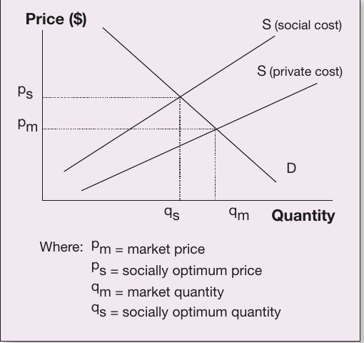
The diagram shows two supply curves. The lower curve represents private costs faced by producers. The upper curve includes both private costs and external costs imposed on society. At the market equilibrium (price , quantity ), production exceeds the socially optimal level (). The market overproduces because producers ignore external costs they impose on others.
To achieve the socially optimal outcome, governments can:
- Impose taxes equal to the external cost (Pigouvian taxes)
- Regulate production quantities or emission levels
- Create tradable pollution permits
- Subsidise cleaner production technologies
These interventions shift the effective supply curve upward, internalising external costs and reducing production to the efficient level where social costs equal social benefits.
Government policy trade-offs
The Phillips curve
Governments face difficult choices when pursuing multiple economic objectives simultaneously. The Phillips curve illustrates the short-run trade-off between inflation and unemployment.
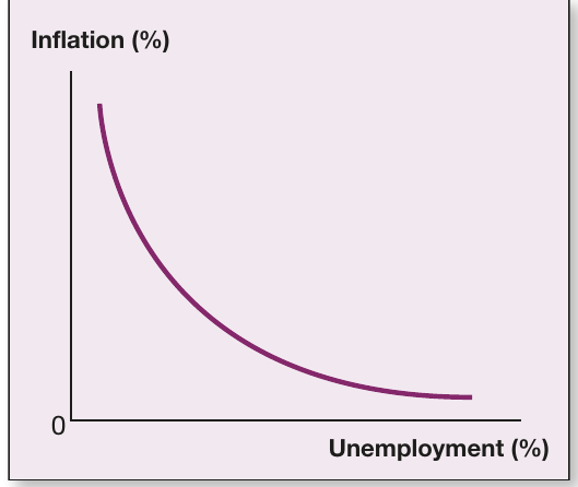
The downward-sloping curve shows an inverse relationship: lower unemployment is associated with higher inflation, and vice versa. This trade-off arises because:
- Strong economic growth reduces unemployment but increases demand pressures
- Rising demand pulls up wages and prices, generating inflation
- Conversely, slower growth reduces inflationary pressure but increases unemployment
Policy implications:
- Expansionary macroeconomic policy moves the economy up and left along the curve (lower unemployment, higher inflation)
- Contractionary policy moves the economy down and right (higher unemployment, lower inflation)
- Policymakers cannot simultaneously achieve very low inflation and very low unemployment in the short run
The Phillips curve relationship may break down in the long run or during supply shocks, when inflation and unemployment can rise together (stagflation).
Minimum wages and unemployment
Another policy trade-off exists between income equality and employment. Minimum wage legislation aims to ensure fair pay and reduce income inequality, but may create unemployment if set above the market-clearing level.
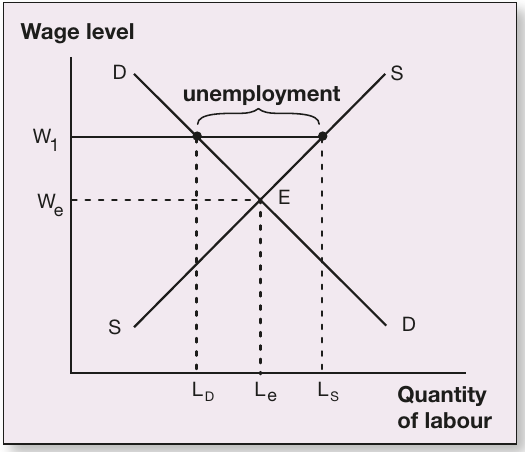
When the minimum wage () is set above the equilibrium wage (), the quantity of labour supplied () exceeds the quantity demanded (). The gap represents unemployment: workers willing to work at the minimum wage who cannot find jobs.
The magnitude of this effect depends on:
- How far above equilibrium the minimum wage is set
- The elasticity of labour demand (how responsive employment is to wage changes)
- The flexibility of firms to adjust through productivity improvements
- Enforcement mechanisms and compliance rates
Some economists argue that moderate minimum wages have minimal employment effects while reducing poverty. Others emphasise the unemployment costs, particularly for low-skilled workers. The optimal policy depends on balancing these competing considerations.
Economic growth versus environmental sustainability
Rapid economic growth may conflict with long-term environmental sustainability. If growth depletes natural resources or damages ecosystems, it can reduce the economy's productive capacity over time.
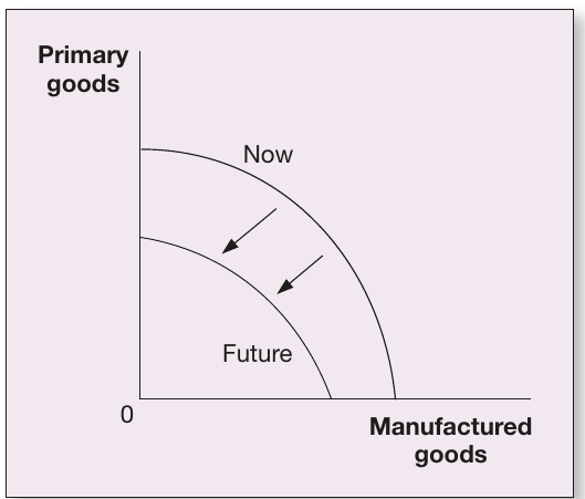
The production possibility frontier (PPF) shows the maximum combinations of goods an economy can produce with given resources and technology. Unsustainable growth practices cause the PPF to shift inward over time (from "Now" to "Future"), as environmental degradation reduces productive capacity.
Causes of inward PPF shifts:
- Depletion of non-renewable resources
- Soil degradation from intensive agriculture
- Loss of biodiversity affecting ecosystem services
- Climate change impacts on agricultural productivity
- Health costs from pollution reducing workforce productivity
Achieving sustainable growth requires:
- Investing in renewable energy and clean technologies
- Implementing environmental protection regulations
- Pricing natural resources to reflect their scarcity
- Developing circular economy approaches
- International cooperation on global environmental issues
Macroeconomic policy and the AS-AD model
The aggregate supply and aggregate demand framework
The AS-AD model provides a comprehensive framework for analysing economy-wide changes in output and price levels. It graphs the relationship between:
- General price level (vertical axis)
- Total output or real GDP (horizontal axis)
The Aggregate Demand (AD) Curve
The aggregate demand curve shows the total quantity of goods and services demanded at each price level. It slopes downward because:
- Lower prices increase real wealth, boosting consumption
- Lower domestic prices make exports more competitive
- Interest rate effects encourage investment when prices fall
The Aggregate Supply (AS) Curve
The aggregate supply curve shows the total quantity of goods and services producers are willing to supply at each price level. It slopes upward because:
- Higher prices make production more profitable
- Firms expand output as demand increases
- Wage and input costs adjust more slowly than output prices
Expansionary macroeconomic policy
Expansionary policy stimulates aggregate demand through:
- Lower interest rates (expansionary monetary policy)
- Reduced taxation (expansionary fiscal policy)
- Increased government spending (expansionary fiscal policy)
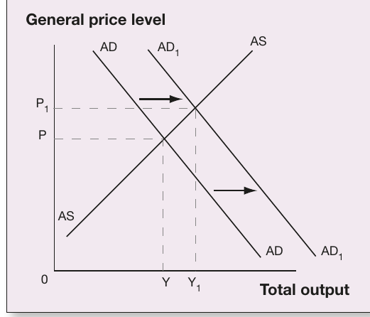
The AD curve shifts rightward from to . At the new equilibrium:
- Total output increases from to (higher economic growth)
- The price level rises from to (higher inflation)
- Unemployment falls as firms expand production
This policy approach is appropriate during recessions or periods of high unemployment, when the economy operates below potential output. However, excessive expansion can generate inflationary pressures if the economy approaches full capacity.
Contractionary macroeconomic policy
Contractionary policy reduces aggregate demand through:
- Higher interest rates (contractionary monetary policy)
- Increased taxation (contractionary fiscal policy)
- Reduced government spending (contractionary fiscal policy)
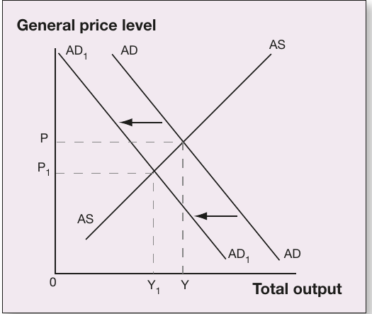
The AD curve shifts leftward from to . At the new equilibrium:
- Total output decreases from to (lower economic growth)
- The price level falls from to (lower inflation)
- Unemployment rises as firms reduce production
This approach is used when inflation is too high or the economy is overheating. The Reserve Bank of Australia typically implements contractionary policy by raising the cash rate when inflation exceeds the target range.
Supply shocks and microeconomic policy
Supply-side factors can also shift the AS curve, affecting both output and prices simultaneously. Negative supply shocks (such as oil price increases or natural disasters) shift AS leftward, while positive shocks (such as technological improvements or successful microeconomic reforms) shift it rightward.
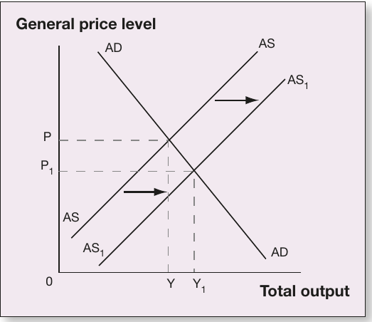
Stagflation Challenge
A leftward AS shift from to creates stagflation:
- Output falls from to (recession)
- Price level rises from to (inflation)
- This combination is particularly challenging for policymakers
Microeconomic reforms aim to shift AS rightward by:
- Reducing production costs through deregulation
- Increasing productivity through education and training
- Enhancing competition through trade liberalisation
- Improving infrastructure to reduce business costs
Unlike demand-side policies, successful microeconomic reforms achieve the desirable combination of higher output and lower inflation, making them attractive for long-term economic improvement.
Exam guidance
Drawing Economics Diagrams in Assessments
When drawing economics diagrams in assessments:
- Label all axes clearly with appropriate variables and units
- Mark equilibrium points precisely where curves intersect
- Use arrows to show shifts in curves and directions of change
- Label initial and new equilibrium positions distinctly (e.g., and )
- Include relevant annotations explaining the economic meaning
When interpreting diagrams:
- Identify which curves are shifting and in which direction
- Explain the economic factors causing the shifts
- Describe the impact on both price and quantity variables
- Link diagram changes to real-world economic outcomes
- Consider both short-run and long-run implications where relevant
Remember!
Key Points to Remember:
-
Supply and demand diagrams are fundamental tools for analysing markets, including international trade, foreign exchange, and labour markets. Rightward shifts increase equilibrium quantity, while leftward shifts decrease it.
-
Exchange rate diagrams show how currency values are determined by market forces under floating systems, or maintained through intervention under fixed systems. Changes in balance of payments components shift supply and demand curves.
-
The Lorenz curve and Gini coefficient measure income inequality, with greater distance from the line of equality indicating more unequal distribution. Values closer to zero represent greater equality.
-
The AS-AD model demonstrates how macroeconomic policies affect both output and inflation. Demand-side policies shift AD, while supply-side reforms shift AS. The model reveals unavoidable trade-offs in policy objectives.
-
Policy trade-offs are inherent in economic management, illustrated by the Phillips curve (inflation vs unemployment), minimum wage diagrams (equity vs employment), and PPF analysis (growth vs sustainability). Understanding these trade-offs is essential for evaluating policy effectiveness.