Line of Best Fit, Interpolation, and Extrapolation (HSC SSCE Mathematics Standard): Revision Notes
Line of Best Fit, Interpolation, and Extrapolation
What is a line of best fit?
When data points on a scatterplot show a linear pattern, we can draw a straight line through or near these points. This line is called the line of best fit (or regression line). It helps us see the overall trend in the data and make predictions about the relationship between two variables.
The line of best fit is a straight line that best represents the linear association between points on a scatterplot. We create this line through a process called linear regression, which models how two numerical variables relate to each other.
The equation of the line of best fit
Every line of best fit can be described using the gradient-intercept formula:
where:
- is the dependent variable (vertical axis)
- is the independent variable (horizontal axis)
- is the gradient (slope) of the line
- is the -intercept (where the line crosses the vertical axis)
Drawing a line of best fit
To draw a line of best fit, follow these steps:
- Create a scatterplot: Plot all your data points on a graph with appropriate scales on both axes.
- Position the line: Draw a straight line that comes as close as possible to all the data points.
- Balance the points: Aim for roughly the same number of points above and below the line. The line should pass through the middle of the data cluster.
- Assess the fit: Your line should capture the overall trend, even if some individual points are far from it.
Key principle: When drawing your line, ensure points are roughly balanced above and below it. This balance helps ensure your line accurately represents the overall trend in the data.
Worked example: Height and weight relationship
Let's look at data showing the height and weight of eight people:
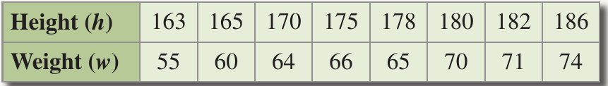
Worked Example: Creating a Line of Best Fit
To create a line of best fit for the height and weight data:
Step 1: Draw a number plane with height () on the horizontal axis and weight () on the vertical axis
Step 2: Plot each data point: , , , , , , , and
Step 3: Draw a straight line positioned so that points are distributed both above and below it
Step 4: The line should have a positive gradient showing that as height increases, weight tends to increase
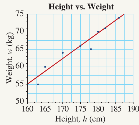
Interpretation: From this graph, we can describe the relationship as a strong positive linear association because:
- The line has a positive gradient (slopes upward)
- The points lie close to the line (strong association)
Understanding what the line tells us
The equation of the line of best fit provides valuable information about the relationship between variables.
The gradient ()
The gradient shows how much the dependent variable changes when the independent variable increases by unit. For example, if the gradient is in a height-weight relationship, weight increases by approximately kg for each additional centimetre of height.
The vertical intercept ()
The vertical intercept indicates the value of the dependent variable when the independent variable equals zero. However, this may not always have a practical interpretation in real-world contexts.
Interpolation: Predicting within the data range
Interpolation means using the line of best fit to estimate values that fall within the range of your existing data. This is generally a reliable method for making predictions, especially when your data shows a strong linear association.
When is interpolation reliable?
The reliability of interpolation depends on the strength of the linear association:
- Strong linear association: When points lie very close to the line of best fit, we can be confident in our predictions
- Weak linear association: When points are more scattered, our predictions are less reliable
Worked example: Life expectancy
The table below shows life expectancy at birth for females and males from 1910 to 2010:
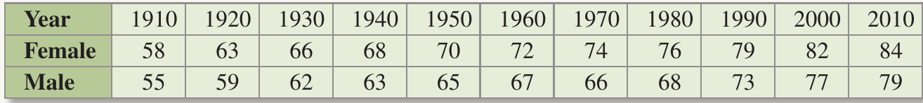
The data is plotted on a scatterplot with lines of best fit for both females and males:
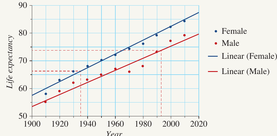
Worked Example: Using Interpolation to Predict Life Expectancy
Question 1: What was the life expectancy in 1935 for females?
Solution:
- Locate 1935 on the horizontal axis
- Draw a vertical line upward until it meets the blue line (females)
- Draw a horizontal line from this intersection to the vertical axis
- Read the value: approximately years
Question 2: What was the life expectancy in 1995 for males?
Solution:
- Locate 1995 on the horizontal axis
- Draw a vertical line upward until it meets the red line (males)
- Draw a horizontal line from this intersection to the vertical axis
- Read the value: approximately years
Why this is interpolation: Both these predictions use interpolation because 1935 and 1995 fall within the data range (1910-2010).
Extrapolation: Predicting beyond the data range
Extrapolation means using the line of best fit to predict values that fall outside the range of your existing data. These predictions can be for values either smaller or larger than your dataset.
Important cautions about extrapolation
Use extrapolation with care!
Extrapolation must be used carefully because:
- The linear relationship shown in your data may not continue beyond the data range
- Real-world factors may cause the relationship to change
- Predictions become less reliable the further you move from your actual data
Worked example: Age and height
The table shows a student's height at different ages from 7 to 16 years:

This data is plotted on a scatterplot with a line of best fit:
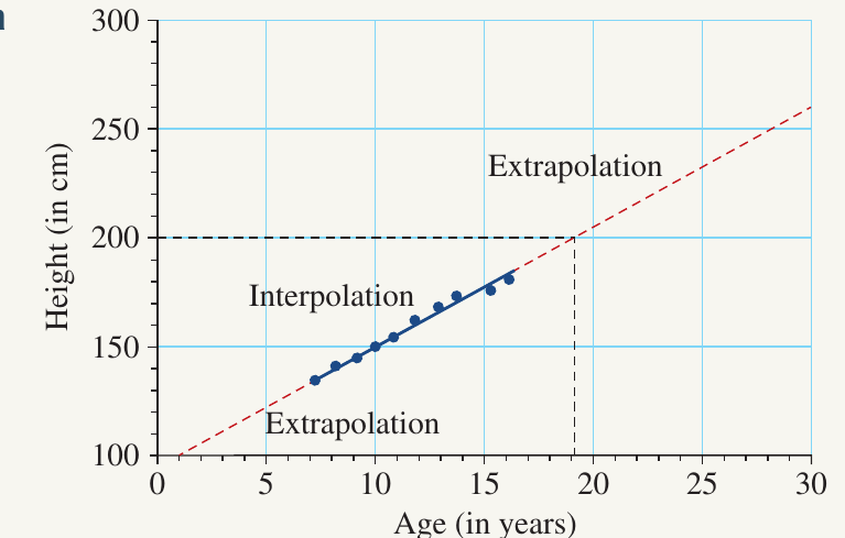
The graph clearly shows three zones:
- Extrapolation (below age 7): Predicting heights for younger ages
- Interpolation (ages 7-16): Predicting heights within the observed age range
- Extrapolation (above age 16): Predicting heights for older ages
Worked Example: Understanding the Limitations of Extrapolation
Question 1: Predict the height of the student when they are aged 19 years.
Solution:
- Extend the line of best fit to age 19
- Draw a vertical line from 19 years until it meets the extended line
- Draw a horizontal line to the vertical axis
- Read the value: approximately cm
Why this is extrapolation: This prediction uses extrapolation because age 19 is outside the data range (7-16 years).
Question 2: What are the limitations of this linear model?
Solution: The model has serious limitations because:
- Children's height increases at a relatively constant rate during growth
- Adult height stabilises and stops increasing
- Using this model to predict height at age 30 would give an unrealistic result of approximately cm
- The linear relationship observed in childhood doesn't continue into adulthood
Important lesson: This example demonstrates why we must be cautious when using extrapolation, especially when predicting far beyond our data range.
Key differences between interpolation and extrapolation
The main differences are:
Interpolation
- Makes predictions within the range of existing data
- Generally more reliable and accurate
- The linear relationship is observed within this range
- Safer to use for practical predictions
Extrapolation
- Makes predictions outside the range of existing data
- Less reliable, accuracy decreases with distance from data
- Assumes the linear relationship continues unchanged
- Must be used with caution and awareness of limitations
Exam tip: Always identify whether a prediction requires interpolation or extrapolation. If using extrapolation, consider whether the linear relationship is likely to continue beyond the data range.
Remember!
Key Points to Remember:
-
A line of best fit approximates the linear relationship between variables on a scatterplot. It's described by the equation
-
Draw the line so that points are roughly balanced above and below it, capturing the overall trend in the data
-
Interpolation predicts values within your existing data range and is generally reliable, especially with strong linear associations
-
Extrapolation predicts values beyond your data range and must be used cautiously, as relationships may change outside the observed range
-
Always consider real-world context - some relationships (like childhood growth) don't continue linearly forever!