Choosing and Applying the Appropriate Transformation (VCE SSCE General Mathematics): Revision Notes
Choosing and Applying the Appropriate Transformation
When working with non-linear relationships between variables, we need to choose the right transformation to linearise the data. This makes it possible to model the relationship using a straight line, which is simpler to work with and interpret.
The circle of transformations
The circle of transformations is a visual tool that helps us decide which transformation might work best for linearising a particular non-linear scatterplot. It shows the types of scatterplots that can be transformed using squared, logarithmic, or reciprocal transformations.
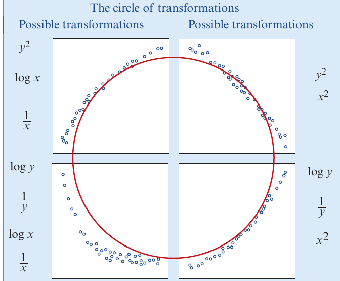
The circle organizes different transformation types according to the shape of the scatterplot they can help linearise. Each quadrant shows a different curve pattern, and the transformations listed around that section can potentially straighten out that type of curve.
The circle of transformations provides a systematic approach to selecting appropriate transformations. By matching your scatterplot's shape to the patterns shown in the circle, you can quickly identify which transformations are most likely to linearise your data.
Important notes when using the circle of transformations
Critical Limitations to Remember:
There are two key points to remember when using the circle of transformations:
-
Multiple options available: For any given scatterplot shape, there is usually more than one type of transformation that might work. This gives us flexibility to try different approaches.
-
Applies only to consistent trends: These transformations only work for scatterplots with a consistently increasing or consistently decreasing trend. If the data goes up and down, the circle of transformations won't help.
Determining the best transformation
Since we often have several transformation options that might work, how do we decide which one is best? The best transformation is the one that produces the best linear model.
To identify the best transformation, we examine two things for each transformation we try:
Using residual plots
A residual plot shows us how well the transformed data fits a linear pattern. After applying a transformation and fitting a least squares line, we create a residual plot:
Interpreting Residual Plots:
- Good transformation: The residual plot shows points randomly scattered around the horizontal line at zero, with no clear pattern or curve
- Poor transformation: The residual plot shows a curved pattern, indicating the transformation hasn't fully linearised the relationship
A residual plot is one of the most powerful diagnostic tools for assessing whether your transformation has successfully linearised the relationship.
Using the coefficient of determination (r²)
The coefficient of determination () tells us what percentage of the variation in one variable is explained by the other variable.
- Higher values (closer to 100%) indicate a better fit
- Compare the values for different transformations
- The transformation with the highest generally provides the best linear model
Considering interpretation
When two or more transformations perform similarly well (similar residual plots and values), choose the transformation that is easiest to interpret in the context of the variables. A transformation that has a meaningful real-world interpretation is preferable to one that doesn't.
Interpretation matters! Even if a transformation produces slightly better statistical results, a transformation with clear practical meaning is often more valuable for understanding and communicating your findings.
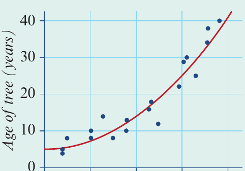
Worked example: choosing the best transformation for tree age and diameter
Worked Example: Choosing the Best Transformation for Tree Age and Diameter
Let's work through a complete example to see how this process works in practice.
The problem
The scatterplot below shows the age (in years) and diameter at 1.5 metres height (in cm) for a sample of 19 trees of the same species. We want to find a regression model that allows us to predict tree age from diameter.
Step 1: Identify potential transformations
Looking at the scatterplot, we can see:
- The trend is consistently increasing (as diameter increases, age increases)
- The relationship is non-linear (the points follow a curve, not a straight line)
- The curve gets steeper as we move to the right
Comparing this scatterplot to the circle of transformations, we identify three transformations that might work:
- transformation (squaring the diameter)
- transformation (taking the reciprocal of age)
- transformation (taking the logarithm of age)
Step 2: Apply each transformation and examine results
We apply all three transformations and create both a scatterplot and residual plot for each:
Step 3: Analyze the residual plots
Looking at the residual plots:
transformation (diameter squared):
- The residual plot shows points fairly randomly scattered around zero
- No strong curved pattern is visible
- This transformation appears effective
transformation (reciprocal of age):
- The residual plot still shows a curved pattern
- Points are not randomly scattered around zero
- This transformation has been less effective at linearising the relationship
transformation (logarithm of age):
- The residual plot shows points reasonably well scattered around zero
- Only a slight pattern is visible
- This transformation appears quite effective
Step 4: Compare r² values
Next, we compare the coefficient of determination for each transformation:
- For the transformation:
- For the transformation:
- For the transformation:
Both the and transformations have very high values, indicating strong explanatory power. The transformation has a noticeably lower value.
Step 5: Choose the best transformation
Both the and transformations appear to work well. To choose between them, we consider interpretation:
- transformation: Diameter squared relates to the cross-sectional area of the tree trunk. This makes sense biologically, as tree age might relate to how much the tree has grown in girth (area)
- transformation: The logarithm of age doesn't have an obvious meaningful interpretation in this context
Since both transformations perform similarly well statistically, but diameter squared has a more meaningful interpretation, we choose the transformation.
Step 6: Write the final model
After choosing the transformation, we fit a least squares line to model the relationship between age and diameter squared.
The equation is:
This equation can now be used to predict the age of trees of this species from their diameter measurements.
Comparing different scatterplot shapes
Here are some common scatterplot shapes you might encounter:
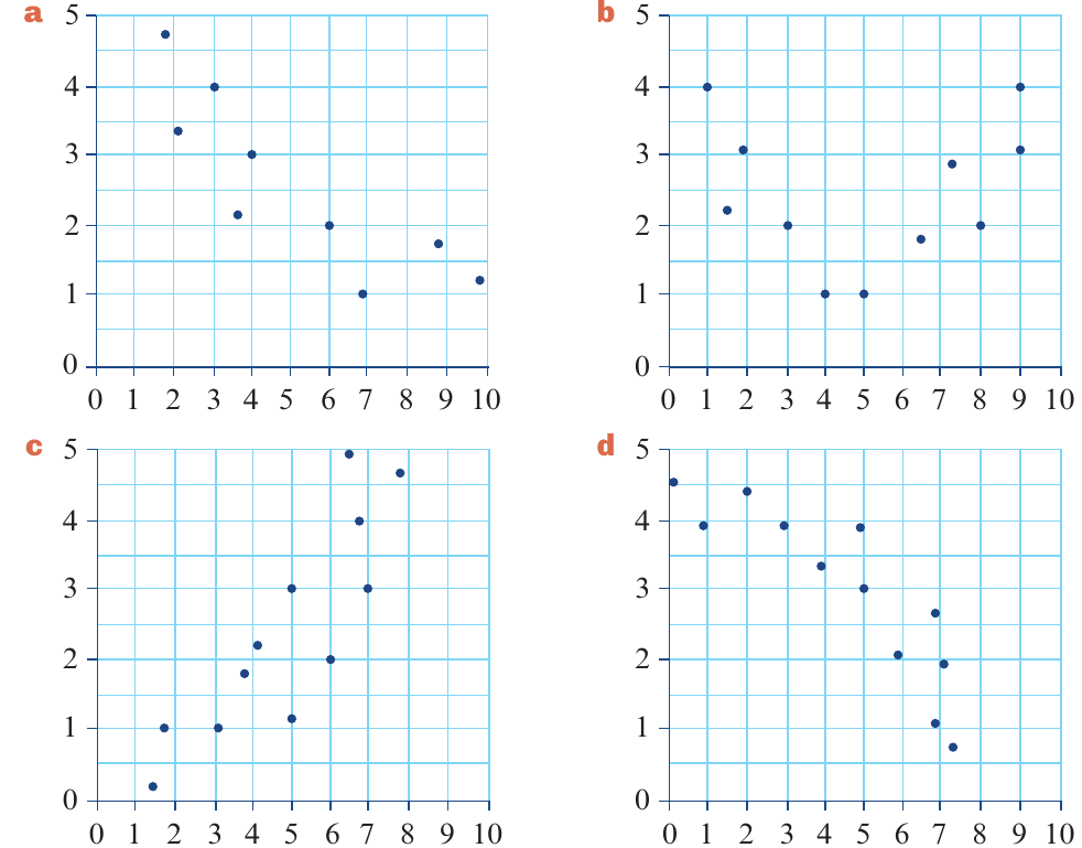
These four plots show different patterns:
- Plot (a): Negative linear correlation
- Plot (b): U-shaped (quadratic) pattern
- Plot (c): Positive linear correlation
- Plot (d): Inverted U-shaped (parabolic) pattern
For plots showing consistent increase or decrease, the circle of transformations can help. For plots like (b) and (d) that go up and then down (or down and then up), the circle of transformations doesn't apply.
Remember!
Key Points to Remember:
- The circle of transformations is a visual guide to help you choose which transformation (, , , , , ) might linearise a non-linear scatterplot
- The circle only applies to scatterplots with consistently increasing or consistently decreasing trends
- To choose the best transformation, examine the residual plot (looking for random scatter with no pattern) and compare values (higher is better)
- When multiple transformations work equally well, choose the one that is easier to interpret in the context of your variables
- A good transformation results in a residual plot with no clear pattern and a high value close to 100%