The Squared Transformation (VCE SSCE General Mathematics): Revision Notes
The Squared Transformation
Introduction to squared transformations
The squared transformation is a powerful technique used to linearise curved data. It works as a stretching transformation that changes how values are spread along either the x-axis or the y-axis.
The key purpose of this transformation is to straighten curved scatterplots so that we can fit a linear regression line and make accurate predictions.
Understanding squared transformations is essential for working with non-linear data. This technique allows you to use familiar linear regression methods on data that would otherwise be too curved to model accurately.
There are two types of squared transformations:
- x² transformation: transforms the explanatory variable
- y² transformation: transforms the response variable
How squared transformations work
The x² transformation
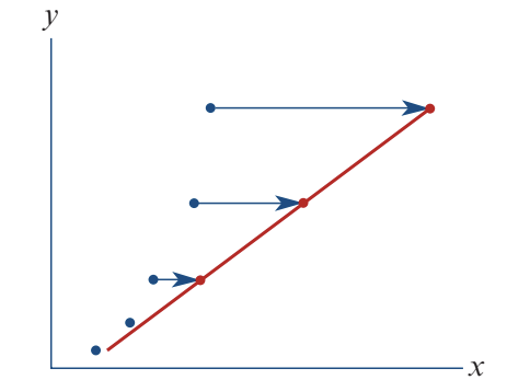
When you apply an x² transformation, you square all the x-values while keeping y-values unchanged. This spreads out the higher x-values relative to the lower ones.
Effect: High x-values get stretched further apart, while low x-values stay closer together. This straightens upward-curving data into a linear pattern.
When to use it: Choose x² transformation when your scatterplot shows a curve that bends upward as x increases.
The y² transformation
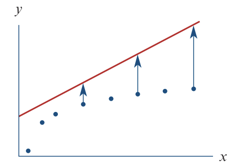
When you apply a y² transformation, you square all the y-values while keeping x-values unchanged. This spreads out the higher y-values relative to the lower ones.
Effect: High y-values get stretched further apart, while low y-values stay closer together. This straightens certain curved patterns into a linear relationship.
When to use it: Choose y² transformation when your scatterplot shows a curve where y increases at an increasing rate.
When using y² transformation, remember you'll need to take the square root at the end to convert your prediction back to the original y units. This is a crucial step that's easy to forget!
Worked example: applying the x² transformation
Let's see how the x² transformation works with real data.
Worked Example: Base Jumper Height Prediction
The scenario
A base jumper leaps from a cliff 1560 metres above a valley floor. The table shows the jumper's height above the ground for the first 10 seconds:
| Time (seconds) | 0 | 1 | 2 | 3 | 4 | 5 | 6 | 7 | 8 | 9 | 10 |
|---|---|---|---|---|---|---|---|---|---|---|---|
| Height (metres) | 1560 | 1555 | 1540 | 1516 | 1482 | 1438 | 1383 | 1320 | 1246 | 1163 | 1070 |
Step 1: Examine the original scatterplot
First, we plot height against time:
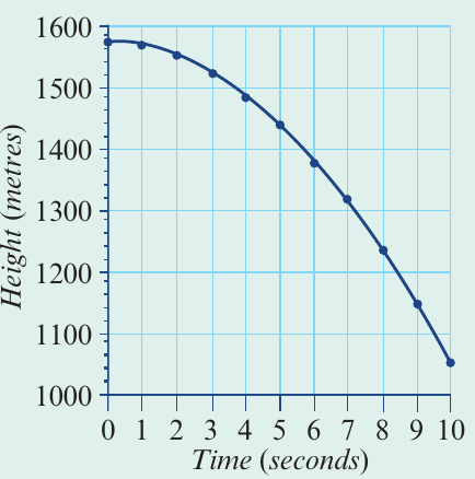
The scatterplot shows a strong negative association, but the relationship is clearly curved, not linear. We cannot fit a straight line to this data accurately.
Step 2: Apply the x² transformation
To linearise the data, we transform the time axis by squaring each time value. This changes our scale from time to time².
For example:
- When time = 0, time² = 0
- When time = 3, time² = 9
- When time = 10, time² = 100
Now we plot height against time²:
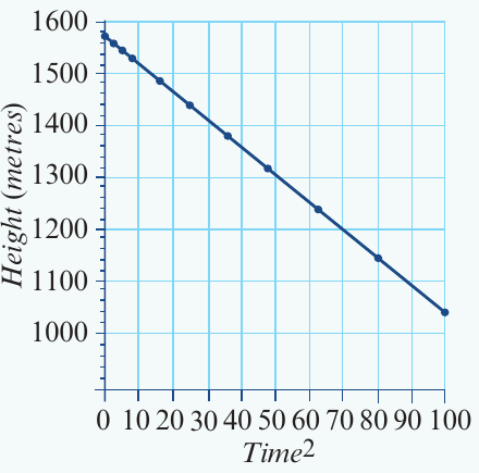
The relationship is now linear! The points form a clear straight-line pattern.
Step 3: Find the regression equation
Now that we have linearised data, we can fit a least squares regression line. The equation is:
This equation tells us:
- The initial height (when time² = 0) is 1560 metres
- For every unit increase in time², height decreases by 4.90 metres
Step 4: Make predictions
We can use this equation to predict the jumper's height at any time during the fall.
Question: What is the height after 3.4 seconds?
Solution:
Substitute time = 3.4 into the equation:
Answer: The base jumper is predicted to be 1503 metres above the valley floor after 3.4 seconds.
Worked example: applying the y² transformation
Now let's see how the y² transformation works with a different type of data.
Worked Example: Fertiliser and Crop Yield
The scenario
Researchers studied the effectiveness of liquid fertiliser on strawberry plants. Different amounts of fertiliser (in mL) were given to plant groups, and average crop yield (in kg) was measured.
Step 1: Examine the original scatterplot
The original plot shows fertiliser amount (x-axis) against crop yield (y-axis):
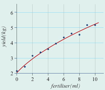
There is a strong positive association, but the relationship is curved rather than linear.
Step 2: Apply the y² transformation
To linearise this data, we transform the y-axis by squaring each yield value. This changes our vertical scale from yield to yield².
Now we plot yield² against fertiliser:
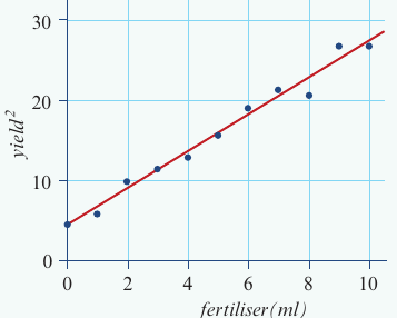
The transformation has worked! The relationship between yield² and fertiliser is now linear.
Step 3: Find the regression equation
We fit a least squares regression line to the transformed data. The equation is:
This equation shows:
- When no fertiliser is used, yield² = 4.45
- For each additional mL of fertiliser, yield² increases by 2.29
Step 4: Make predictions
Question: Predict the yield when 6.5 mL of fertiliser is used.
Solution:
First, substitute fertiliser = 6.5 into the equation:
Important extra step: Because we transformed y by squaring it, we must now take the square root to get back to the original yield units:
Looking at the context (crop yield cannot be negative), only the positive value makes sense.
Answer: The predicted yield is 4.4 kg.
Notice the crucial difference between the two examples: in the x² transformation (base jumper), we didn't need to take a square root at the end because we never squared the y-variable (height). In the y² transformation (fertiliser), we must take the square root to convert yield² back to yield.
Using technology for transformations
Performing squared transformations involves many calculations, making calculators very helpful. The general process is:
- Enter your original data into lists (one for x-values, one for y-values)
- Create a new list for the transformed variable (either x² or y²)
- Plot the transformed data to check if it's now linear
- Fit a regression line to the linearised data
- Record the equation in terms of your transformed variable
- Use the equation to make predictions, remembering to square root if you used y² transformation
The calculator will display the regression equation and correlation coefficient, confirming whether the transformation successfully linearised your data.
Using Technology Efficiently
Modern calculators can perform all these transformations automatically. The key is understanding what the calculator is doing so you can interpret the results correctly and remember to apply the square root when needed for y² transformations.
Exam tips
Common Mistakes to Avoid
-
Choosing the transformation: Look at your scatterplot shape. If the curve bends upward as x increases, try x². If y increases at an increasing rate, try y².
-
Don't forget the square root: When using y² transformation, always remember to take the square root of your final answer to convert back to original units.
-
Only positive square roots: In real-world contexts (heights, yields, distances), negative values often don't make sense. Choose the positive square root.
-
Check your work: After transformation, verify that your scatterplot is now linear. If it's still curved, you may need a different transformation.
-
Label clearly: Always specify which variable you've transformed (time² or yield², not just "squared").
Key Points to Remember:
-
The squared transformation is a stretching transformation that spreads out high values relative to low values on one axis.
-
x² transformation squares the explanatory variable and is used when data curves upward with increasing x.
-
y² transformation squares the response variable and requires an extra step of taking the square root when making final predictions.
-
The purpose of squared transformations is to linearise curved data so we can use linear regression techniques.
-
After transformation, always verify the data is now linear before fitting a regression line and making predictions.
-
Remember the mnemonic: "Square to straighten, root to return" - this reminds you that y² transformations need the square root step to get back to original units.