Using the Least Squares Regression Line to Model a Relationship Between Variables (VCE SSCE General Mathematics): Revision Notes
Using the Least Squares Regression Line to Model a Relationship Between Variables
Introduction
When we identify a linear relationship between two variables, we can use a mathematical model to make predictions. The least squares regression line is a powerful tool that allows us to predict the value of one variable based on another.
Think of regression modelling as finding the best-fitting straight line through your data points, then using that line to make informed predictions about new situations.
Understanding the regression equation
The regression line has the form:
where:
- is the response variable (what we're trying to predict)
- is the explanatory variable (what we're using to make predictions)
- is the intercept (where the line crosses the y-axis)
- is the slope (how steep the line is)
A practical example: car prices and age
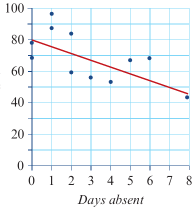
Let's explore this concept using real data about secondhand car prices. Suppose we collected information about the age (in years) and price (in dollars) of several cars of the same brand and model.
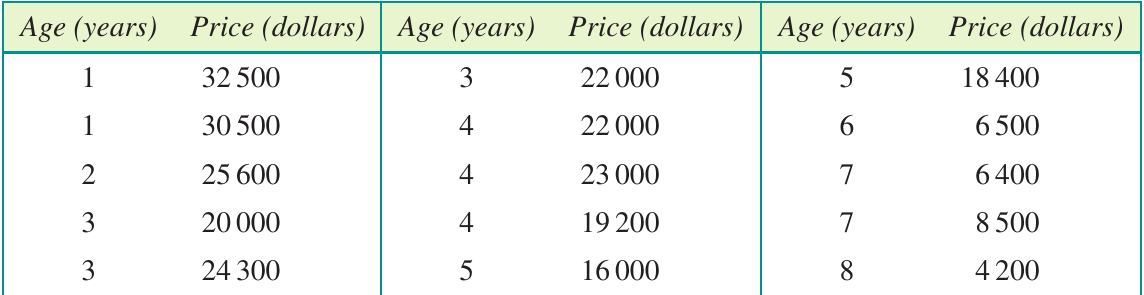
When we plot this data on a scatterplot, we can see a clear pattern:
The scatterplot shows a strong, negative, linear association between price and age. As cars get older, their prices decrease. The correlation coefficient is , indicating a very strong relationship.
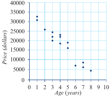
Using statistical methods, we can find the least squares regression line for this data:
Interpreting the slope and intercept
Understanding what the numbers in your regression equation mean is crucial for making sense of your model.
The slope
The slope tells us the average change in the response variable for each one-unit increase in the explanatory variable.
For our car example, the slope is . This means:
- On average, for each additional year of age, the price of these cars decreases by $3940
- The negative sign indicates the relationship is inverse (as age goes up, price goes down)
The intercept
The intercept estimates the average value of the response variable when the explanatory variable equals zero.
For our car example, the intercept is . This means:
- On average, when the car's age is 0 years (when it's brand new), the price was $35,100
Important note: The intercept interpretation may not always make practical sense. If your data doesn't include values near , the intercept might fall outside the meaningful range of your data.
Using the regression line to make predictions
Once you have your regression equation, you can use it to predict values. There are two methods:
Method 1: Graphical approach
Draw a vertical line from your x-value up to the regression line, then draw a horizontal line across to the y-axis to read off the predicted value.
Method 2: Algebraic substitution
Substitute the x-value directly into the regression equation and calculate the result.
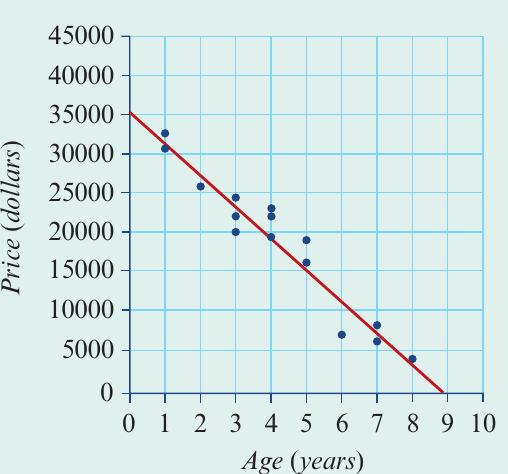
Worked Example: Predicting Car Prices
Question: Use the equation to predict the price of a car that is 5.5 years old.
Solution:
Substitute into the equation:
The predicted price for a 5.5-year-old car is $13,430.
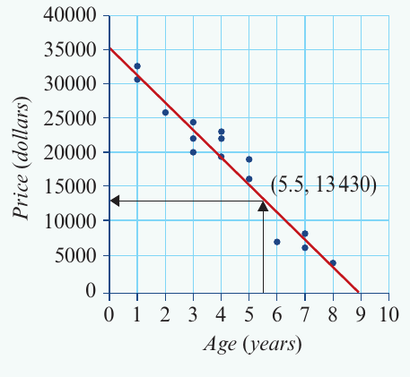
The algebraic method is generally more accurate than reading from the graph.
Interpolation and extrapolation
Not all predictions are equally reliable. Understanding the difference between interpolation and extrapolation is essential.
Interpolation: predicting within the data range
Interpolation means making predictions for values of the explanatory variable that fall within the range of your original data.
For our car example:
- Our data includes cars aged 1 to 8 years
- Predicting the price of a 5.5-year-old car is interpolation (5.5 is between 1 and 8)
- Interpolation predictions are generally reliable because we're working within known territory
Extrapolation: predicting outside the data range
Extrapolation means making predictions for values of the explanatory variable that fall outside the range of your original data.
For our car example:
- Predicting the price of a 12-year-old car would be extrapolation (12 is beyond our maximum age of 8)
- Extrapolation predictions are generally unreliable because we don't know if the relationship continues in the same way
Why extrapolation can be problematic
Why Extrapolation Can Fail
Consider what happens if we use our equation to predict the price of a 12-year-old car:
A negative price is impossible! This demonstrates that the linear model breaks down outside our data range. The relationship might change (perhaps cars reach a minimum value and level off), or other factors might become important.
Exam tip: Always check whether a prediction requires interpolation or extrapolation, and comment on its reliability accordingly.
The coefficient of determination
The coefficient of determination, written as , measures how well the regression line explains the variation in your data.
Understanding r²
- is calculated by squaring the correlation coefficient
- It's usually expressed as a percentage
- It tells you what proportion of the variation in the response variable can be explained by the variation in the explanatory variable
Interpreting r² values
For our car example, with :
This means: 93% of the variation in car prices can be explained by the variation in their ages.
The remaining 7% of price variation is due to other factors not captured by the model (such as condition, mileage, or specific features).
What makes a good r² value?
Assessing Predictive Power
- (30%): Generally considered to have good predictive power
- Higher values indicate stronger predictive power
- Even lower values can be useful in some contexts
Comparing different models
You can use to compare which explanatory variable is more important.
Worked Example: Comparing Educational Factors
In a study of educational attainment:
- Correlation with amount spent on education: , so (6.8%)
- Correlation with student ratio: , so (14.4%)
The student
ratio is a more important explanatory variable because it explains 14.4% of the variation in educational attainment, compared to only 6.8% for spending.The residual plot
So far, we've assumed the relationship between our variables is linear. But how can we check this assumption? This is where residual plots become essential.
What is a residual?
A residual is the vertical distance between an actual data point and the predicted value on the regression line.
Residuals can be:
- Positive when the actual value is above the regression line
- Negative when the actual value is below the regression line
- Zero when the actual value falls exactly on the regression line
Worked Example: Calculating a Residual
Question: The actual price of a 6-year-old car is $6500. Calculate the residual using the regression equation:
Solution:
Step 1: Note the actual price
Step 2: Calculate the predicted price
Step 3: Calculate the residual
The negative residual tells us the actual price was $4960 below what the model predicted.
Constructing a residual plot
A residual plot is a graph with:
- The explanatory variable on the horizontal axis
- The residuals on the vertical axis
- A horizontal line at zero (this is the reference line)
Here's the residual plot for our car data:
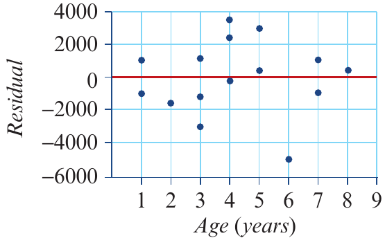
Interpreting residual plots: checking the linearity assumption
The key question: Do the residuals appear random, or is there a pattern?
Pattern 1: Random scatter (linear relationship is appropriate)
When the relationship is truly linear, the residual plot shows points scattered randomly around the zero line with no obvious pattern.
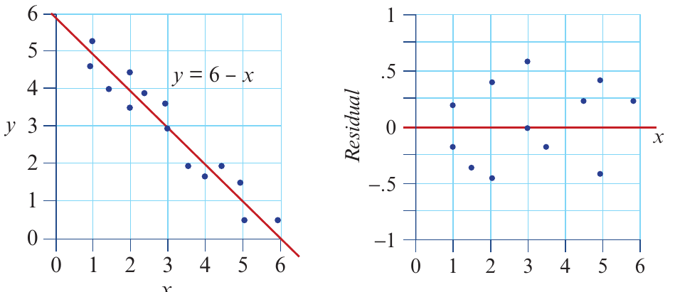
In the left panel, we see the original scatterplot with a linear regression line. The right panel shows the corresponding residual plot with points randomly scattered above and below zero. This confirms that a linear model is appropriate.
Interpretation: The linearity assumption is met - the points look like a random cloud with no structure.
Pattern 2: Curved pattern (linear relationship is NOT appropriate)
When the relationship is actually non-linear, the residual plot shows a systematic pattern or curve.
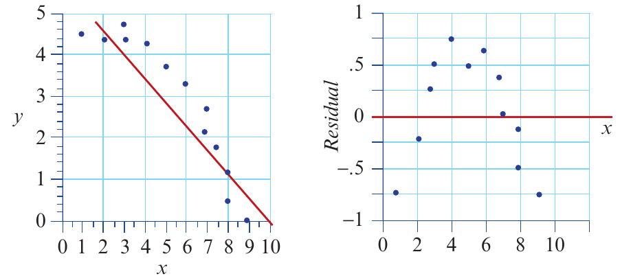
Here, the residual plot shows a clear curved pattern. This indicates the relationship is non-linear, and a straight line isn't the best model for this data.
Interpretation: The linearity assumption is not met - there's a visible curve in the residuals.
Examining multiple residual plots
Let's practice identifying which residual plots indicate problems with linearity:
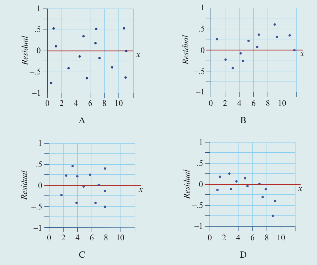
Analysis:
| Plot | Pattern | Linearity Assumption |
|---|---|---|
| A | Random scatter of points around zero | Met - linear model is appropriate |
| B | Clear curved pattern | Not met - relationship is non-linear |
| C | Random scatter of points around zero | Met - linear model is appropriate |
| D | Funnel or curved pattern | Not met - relationship is non-linear |
Exam tip: When interpreting residual plots, look for systematic patterns. Random scatter = good; curves or other patterns = problem with linear model.
Performing a complete regression analysis
A thorough regression analysis involves multiple steps. Here's the complete process:
Steps in a regression analysis
- Construct a scatterplot to investigate the nature of the association
- Calculate the correlation coefficient () to quantify the strength of the relationship
- Determine the equation of the regression line
- Interpret the coefficients:
- Explain what the y-intercept () means in context
- Explain what the slope () means in context
- Calculate and interpret the coefficient of determination ()
- Use the regression line to make predictions (being mindful of interpolation vs extrapolation)
- Calculate residuals and construct a residual plot to test the linearity assumption
- Write a report summarising your findings
Example report: car price analysis
Here's how to bring all the components together in a comprehensive report:
Example: Analysis of the Relationship Between Car Age and Price
From the scatterplot, we observe a strong, negative, linear association between the price of secondhand cars and their age, with a correlation coefficient of . There are no obvious outliers in the data.
The equation of the least squares regression line is:
Interpretation of coefficients:
The slope of the regression line indicates that, on average, the price of these secondhand cars decreases by $3940 each year.
The intercept predicts that, on average, the price of these cars when new was $35,100.
Predictive power:
The coefficient of determination ( or 93%) indicates that 93% of the variation in the price of these secondhand cars is explained by the variation in their age. This represents very strong predictive power.
Model validity:
The residual plot shows no clear pattern, with points scattered randomly around zero. This confirms the assumption of a linear association between the price and age of these secondhand cars is appropriate.
Conclusion:
Age is an excellent predictor of price for these secondhand cars, with the linear model explaining 93% of price variation. The model is suitable for making predictions for cars aged between 1 and 8 years (within the data range).
Key Points to Remember:
-
The regression equation allows us to model relationships and make predictions
-
The slope () tells you the average change in for each one-unit increase in
-
The intercept () tells you the predicted value of when (though this may not always be meaningful)
-
Interpolation (predicting within the data range) is reliable; extrapolation (predicting outside the data range) is unreliable
-
The coefficient of determination () measures the proportion of variation explained by the model - higher is better!
-
Residual plots help check if a linear model is appropriate: random scatter = good; patterns = problem
-
A complete regression analysis includes describing the relationship, finding the equation, interpreting coefficients, checking assumptions, and reporting results clearly