Key Skills (VCE SSCE Health and Human Development): Revision Notes
Key Skills
Analysing the extent to which health status data reflect concepts of health and wellbeing
Understanding how health status indicators relate to the broader concepts of health and wellbeing is a crucial analytical skill. To master this skill, you need a strong grasp of the five dimensions of health and wellbeing (physical, social, mental, emotional, and spiritual) and how different health indicators reflect various aspects of these dimensions.
Health status data can relate to any health indicator, and each indicator reflects different aspects of health and wellbeing to varying degrees. Your task is to analyse health indicators and their associated data to explain how closely they align with the complete picture of health and wellbeing.
Each health indicator provides valuable information, but no single indicator captures the complete picture of health and wellbeing. Understanding both what an indicator reveals and what it doesn't reveal is essential for thorough analysis.
Steps for effective analysis
Follow these steps to ensure your analysis is thorough and well-structured:
- Determine the health status indicator – Identify which specific indicator is shown in the data (for example, life expectancy, mortality rates, or psychological distress levels)
- Consider connections to health and wellbeing – Think about which aspects of the health and wellbeing concept are captured by this indicator and its data
- Identify reflected dimensions – Determine which of the five dimensions of health and wellbeing (physical, social, mental, emotional, spiritual) are reflected by the health indicator. Provide clear justification for your choices
- Identify non-reflected dimensions – Equally important is recognizing which dimensions are not captured by the indicator, as this shows the limitations of the data
Always consider both what an indicator does reflect and what it doesn't reflect about health and wellbeing. This demonstrates critical thinking and shows you understand the limitations of health data.
Worked example: psychological distress
Let's examine how psychological distress data relates to health and wellbeing concepts.
Worked Example: Analysing Psychological Distress Data
Understanding psychological distress
Psychological distress refers to unpleasant feelings and emotions that impact how well a person can function in daily life. It is measured using the Kessler Psychological Distress Scale, which consists of ten questions about various feelings and emotions. These questions reflect aspects of emotional and mental health and wellbeing.
Connecting to health and wellbeing dimensions
The questions on the Kessler Scale ask about feelings such as depression. While many people feel sad occasionally, experiencing these feelings most or all of the time can indicate that emotions are not being managed effectively. This suggests that emotional health and wellbeing may not be at optimal levels.
What the data reflects
Psychological distress data provides insight into emotional and mental health and wellbeing. However, it doesn't capture every aspect of these dimensions. For example, the Kessler Scale doesn't measure the ability to recognize and understand emotions, or the capacity to use logic and reason when forming opinions.
What the data doesn't reflect
The data provides no specific information about physical, social, or spiritual health and wellbeing. This demonstrates an important principle: while psychological distress is a valuable health indicator, it only captures part of the complete health and wellbeing picture.
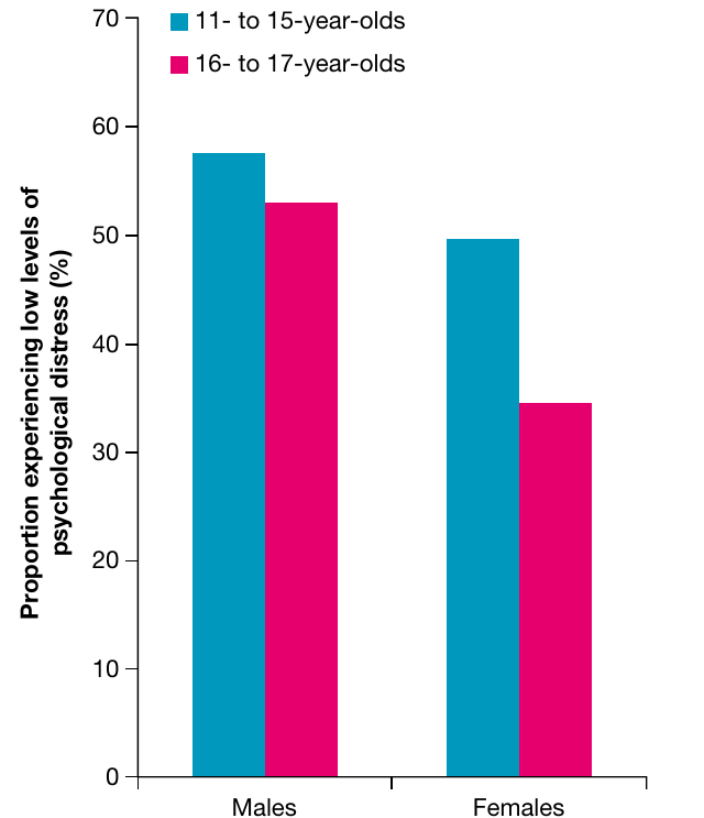
The figure above shows that males have higher rates of low psychological distress than females in both age groups (11-15 years and 16-17 years). This may indicate higher levels of emotional and mental health and wellbeing for males in the specific areas measured by the Kessler Psychological Distress Scale.
Practice activities
Activity 1: The table below shows the proportion of 15-17 year-olds who assessed their health status as fair or poor. Using this data, discuss the extent to which self-assessed health status reflects the concept of health and wellbeing.
| Gender | Fair or poor self-assessed health status (%) |
|---|---|
| Males | 4.9 |
| Females | 8.3 |
Source: ABS, Australian Health Survey: Updated Results, 2011-12
Activity 2: Discuss the extent to which rates of hospitalisation reflect the concept of health and wellbeing.
Drawing conclusions from health data about youth health status in Australia
This skill focuses on interpreting and analysing health data effectively. Health status data is presented using various measurements, and understanding these common measures will help you develop strong analytical abilities.
Health status measures
Data relating to health status can be presented using the following measures:
- Self-assessed health status – Individuals' own perceptions of their health
- Life expectancy – Average number of years a person can expect to live
- Mortality – Death rates in a population
- Morbidity – Rates of illness and disease, including incidence (new cases) and prevalence (total existing cases)
- Burden of disease – Impact of disease measured through DALY (disability-adjusted life years), YLL (years of life lost), and YLD (years lived with disability)
- Rates of hospitalisation – Frequency of hospital admissions
- Core activity limitation – Difficulty performing everyday activities
- Psychological distress – Levels of unpleasant emotions affecting functioning
Steps for interpreting graphs and tables
To become skilled at data analysis, you need to interpret information presented in graphs, tables, and charts. Follow this systematic approach:
A systematic approach to reading graphs and tables ensures you don't miss important information and helps you draw accurate conclusions from the data.
- Read the title – This usually indicates what information the graph or table presents. The title may appear at the top or next to the figure number
- Read the axes – For bar graphs and line graphs, check both horizontal and vertical axes. Note the units being used (percentage, year, number, rate, proportion, etc.)
- Check the key or legend – This helps you identify different elements of the data, such as which colours or symbols represent different groups
- Read any notes – Additional written information at the bottom of graphs may explain elements that seem unclear. These notes often provide crucial context
- Look for patterns – Identify trends over time, similarities between groups, and differences between groups. This helps you understand what the data is actually showing
Worked example: injury death rates
Let's analyse injury death rates over time for males and females aged 15-19.
Worked Example: Drawing Conclusions from Injury Death Rate Data
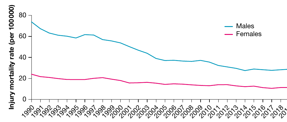
When asked to draw two conclusions about injury death rates from the figure above, a strong response would include:
Conclusion 1: Gender differences in injury mortality
Males experienced poorer health status than females regarding injury death rates. The data shows males consistently had higher death rates from injuries throughout the period from 1990 to 2018. In 2018, the rate for females was approximately 11 per 100,000, while for males it was around 28 per 100,000 - more than double the female rate.
Conclusion 2: Greater improvement for males
The death rate for males decreased more than the death rate for females between 1990 and 2018. The male death rate fell by approximately 47 per 100,000 (from roughly 75 per 100,000 in 1990 to about 28 per 100,000 in 2018). The female death rate decreased by approximately 12 per 100,000 (from around 23 per 100,000 in 1990 to about 11 per 100,000 in 2018).
Key elements of strong conclusions:
- Make clear statements that answer the question
- Use specific information and dates from the graph to support your points
- Include actual figures to demonstrate your ability to interpret data accurately
- Compare different groups or time periods where relevant
- Link data back to health status implications
Always support your conclusions with specific data points, dates, and figures from the graph or table. Numbers and evidence are essential for demonstrating your analytical skills.
Practice activities
Activity 3: Using data from Figure 2.9 (not shown in these materials), draw conclusions about health status for 10-14 year-olds and 15-19 year-olds compared with other age groups.
Activity 4: Using data from Figure 2.13 (not shown in these materials), draw conclusions about health status for 10-14 year-olds and 15-19 year-olds compared with other age groups.
Key Points to Remember:
- Health status indicators reflect different dimensions of health and wellbeing to varying degrees - always consider what is captured and what is missing
- Strong analysis requires identifying both what an indicator reflects and what it doesn't reflect about health and wellbeing
- When interpreting data, follow a systematic approach: read the title, check axes and units, understand the key, read notes, and identify patterns
- Support your conclusions with specific data points, dates, and figures from graphs or tables
- Always link data back to what it means for health status - numbers alone aren't enough without interpretation