Data Presentation (Edexcel A-Level Mathematics): Revision Notes
2.2.1 Data Presentation
Data presentation involves organising and displaying data in a clear, concise, and visually appealing manner to make it easier to interpret and analyse. Effective data presentation is essential in statistics as it allows for a better understanding of trends, patterns, and relationships within the data. Various methods can be used to present data, including tables, charts, and graphs.
Types of Data Presentation
Tables
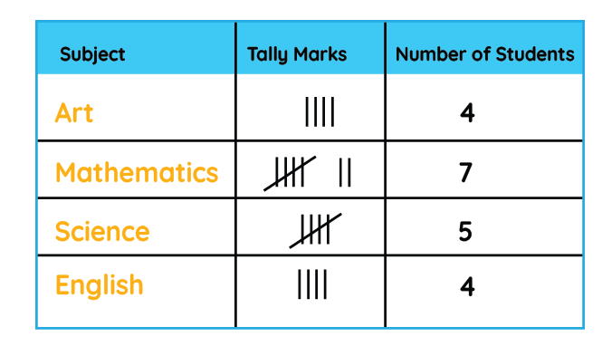
Frequency Tables: Used to summarise how often each value or range of values occurs in a dataset.
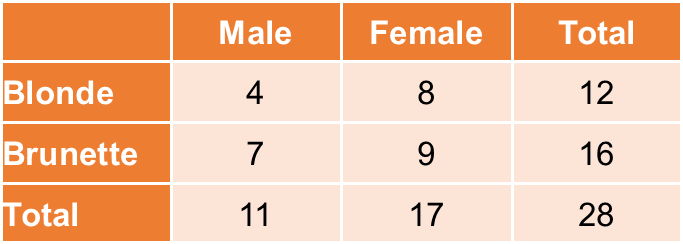
Contingency Tables: Display the frequency distribution of variables across categories, often used for categorical data to show relationships between two variables.
Charts and Graphs
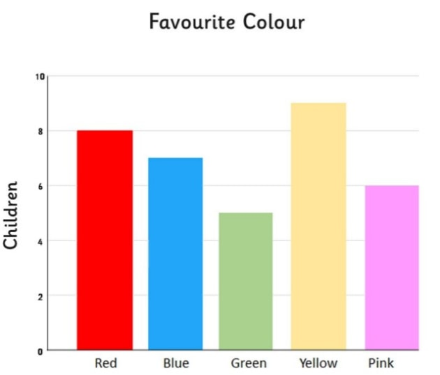
Bar Charts: Used to compare the frequency, count, or proportion of categorical data. Each bar represents a category, and the height of the bar reflects the value.
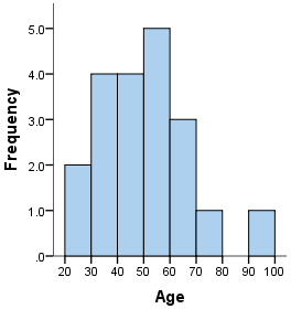
Histograms: Similar to bar charts but used for continuous data. The bars are adjacent to each other, representing frequency distributions over intervals (bins).
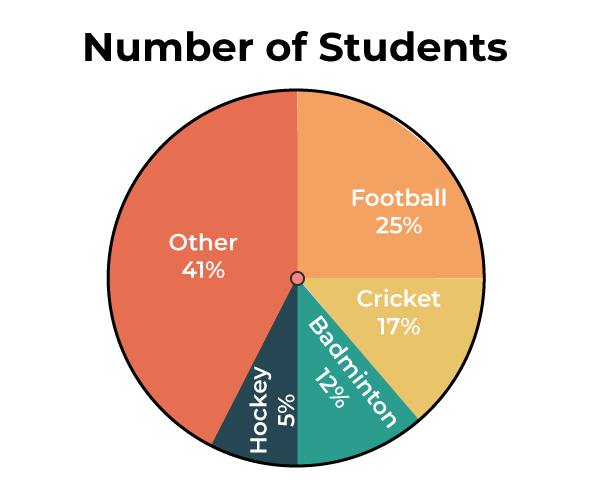
Pie Charts: Circular charts are divided into sectors, each representing a proportion of the whole. They are best used for displaying relative proportions of categorical data.
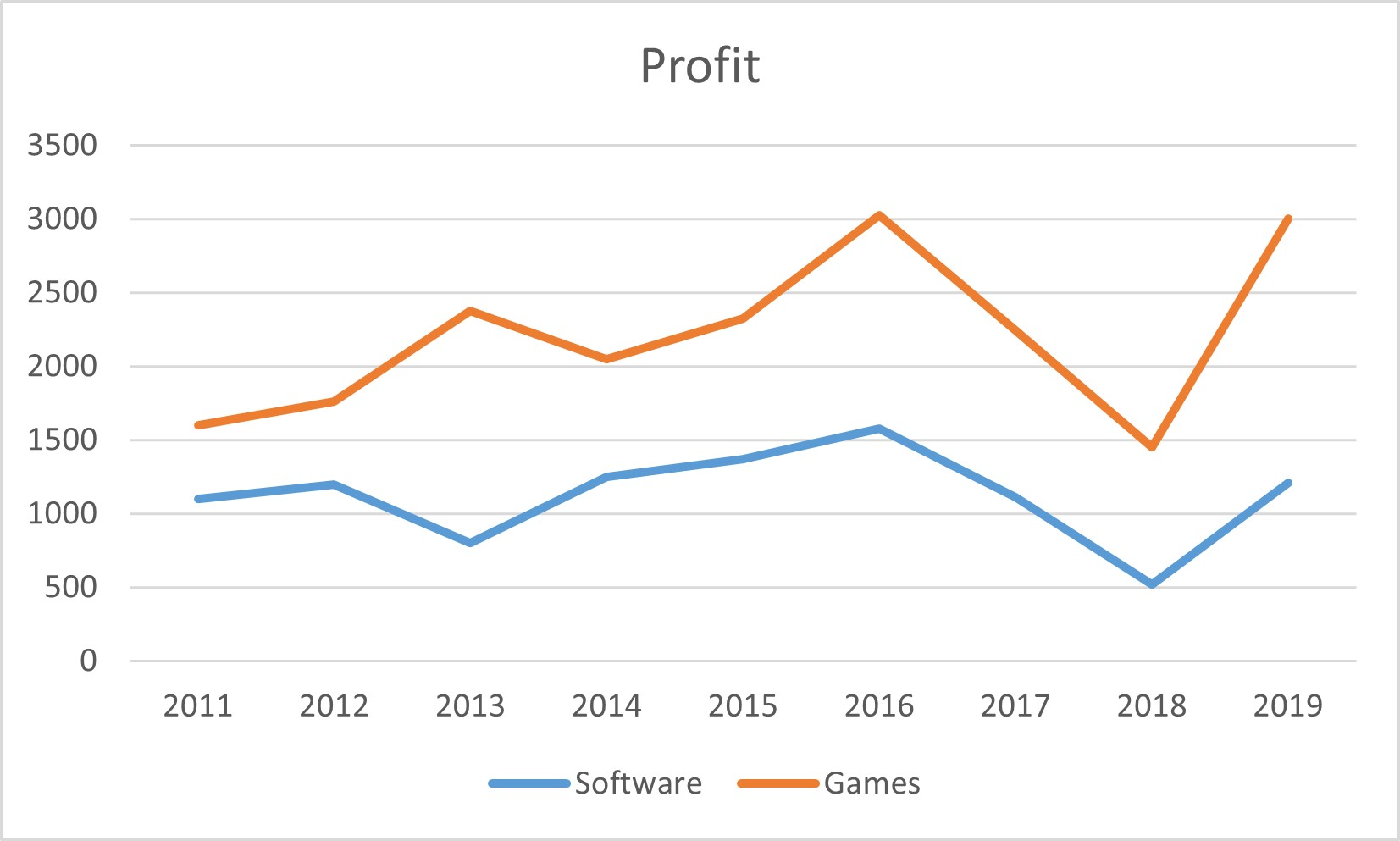
Line Graphs: Display data points connected by straight lines, typically used to show trends over time.
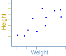
Scatter Plots: Used to display the relationship between two continuous variables. Each point represents an observation, with its position determined by the values of the two variables.
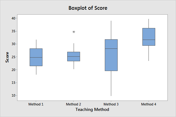
Box Plots: Used to summarise the distribution of a dataset by showing the median, quartiles, and potential outliers. They are useful for comparing distributions across different groups.
Advanced Graphs
- Cumulative Frequency Graphs (Ogives): Show the cumulative frequency of data points below a certain value, useful for estimating medians, quartiles, and percentiles.
- Stem-and-Leaf Plots: Display data where each data point is split into a "stem" and a "leaf", helping to visualise the distribution while retaining the original data values.
- Dot Plots: Simple plots where each data point is represented by a dot along a number line, useful for small datasets and showing distribution.
Choosing the Right Method
The choice of data presentation method depends on the type of data and the purpose of the analysis:
- Categorical Data: Bar charts and pie charts are commonly used.
- Continuous Data: Histograms and line graphs are appropriate.
- Relationships Between Variables: Scatter plots are ideal for displaying the relationship between two continuous variables, while contingency tables and bar charts work well for categorical variables.
- Comparative Analysis: Box plots and multiple bar charts are effective for comparing distributions across different groups.
Example Data Presentations
Example 1: Bar Chart Imagine a survey of favourite fruit among people. The results are:
- Apple:
- Banana:
- Orange:
- Grapes: A bar chart would display each fruit on the -axis, with the height of the bars representing the number of people who chose each fruit.
Example 2: Histogram Consider the heights (in ) of students:
- Heights range from to . A histogram would divide the heights into intervals (e.g., , , etc.) on the -axis, with the frequency of students in each interval on the -axis.
Example 3: Scatter Plot Suppose you want to explore the relationship between hours studied and exam scores for a group of students:
- Hours studied (-axis) and exam scores (-axis) are plotted for each student.
- The scatter plot would reveal any correlation between studying time and performance.
Interpreting Graphs and Charts
- Bar Charts: Look for the tallest and shortest bars to determine the most and least frequent categories.
- Histograms: Analyse the shape of the distribution (e.g., skewness, peaks) to understand the data's spread and central tendency.
- Pie Charts: Focus on the size of each sector to compare proportions.
- Line Graphs: Examine the slope of the lines to identify trends over time (increasing, decreasing, or constant).
- Scatter Plots: Observe the pattern of points to identify correlations (positive, negative, or none).
- Box Plots: Check the length of the boxes and whiskers to assess data spread and identify potential outliers.
Importance of Effective Data Presentation
- Clarity: Well-presented data is easier to understand and interpret, helping to communicate the key findings.
- Insight: Effective presentation methods can reveal patterns, trends, and relationships that might not be immediately apparent in raw data.
- Decision-Making: Clear data presentation aids in making informed decisions based on statistical evidence.
Summary
Data presentation involves organising and displaying data using tables, charts, and graphs. The choice of method depends on the type of data and the analysis's purpose. Mastering data presentation techniques is crucial for effectively communicating statistical findings and making data-driven decisions.