Box Plots & Cumulative Frequency (Edexcel A-Level Mathematics): Revision Notes
2.2.2 Box Plots & Cumulative Frequency
Box Plots
Box plots are a visual way of showing the distribution of data. They summarise a data set using five key values:
- Minimum: The smallest value in the data set.
- Lower Quartile : The median of the lower half of the data (25th percentile).
- Median: The middle value when the data is ordered (50th percentile).
- Upper Quartile : The median of the upper half of the data (75th percentile).
- Maximum: The largest value in the data set.
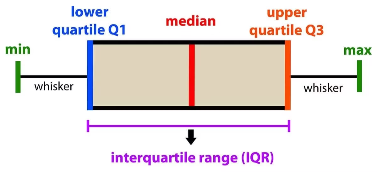
A box plot is drawn as follows:
- A box is drawn from the lower quartile to the upper quartile .
- A line inside the box represents the median.
- Whiskers extend from the box to the minimum and maximum values. These features allow us to see the spread and skewness of the data at a glance.
Example: Consider the following data set:
- Minimum:
- Lower Quartile : (median of the first five numbers)
- Median: (middle value of the entire data set)
- Upper Quartile : (median of the last five numbers)
- Maximum:
The box plot for this data would have the box from to with a line at (the median), and whiskers extending from (minimum) to (maximum).
Cumulative Frequency
Cumulative frequency is used to find the number of observations below a particular value in a data set. It's especially useful for determining medians, quartiles, and percentiles.
To create a cumulative frequency table:
- Start with a frequency table showing how often each data point occurs.
- Add the frequency of each data point to the sum of the frequencies of all previous data points.
Example: For the following frequency table:
| Data Value | Frequency |
|---|---|
The cumulative frequency table would be:
| Data Value | Frequency | Cumulative Frequency |
|---|---|---|
Cumulative Frequency Graph
- Plot points at the upper boundary of each data value range against its cumulative frequency.
- Join these points with a smooth curve or straight lines. This graph helps in estimating the median, quartiles, and percentiles directly from the graph.
Example: If the cumulative frequency curve reaches at the upper boundary of the "" range, this means that 10 data points are less than or equal to . You can use this graph to find the median (the value where cumulative frequency is half the total) or other percentiles.
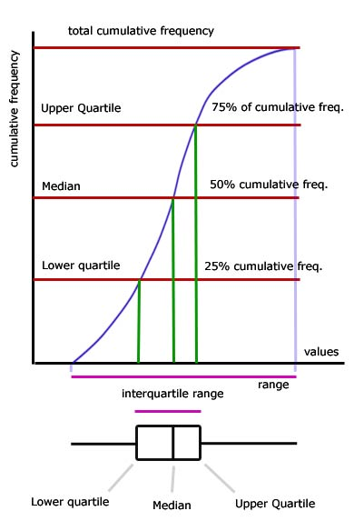
Connecting Box Plots and Cumulative Frequency:
You can use the cumulative frequency graph to determine key values like the median, Q1, and Q3, which you then use to construct a box plot. This makes these two tools very complementary for analysing data distributions.
Data Analysis of Giraffe Heights
Given Data
The table shows the heights (in metres) of 80 giraffes.
| Height, (m) | Frequency | Cumulative Frequency (C.F.) |
|---|---|---|
| 4.6 ≤ < 4.8 | ||
| 4.8 ≤ < 5.0 | ||
| 5.0 ≤ < 5.2 | ||
| 5.2 ≤ < 5.4 | ||
| 5.4 ≤ < 5.6 | ||
| 5.6 ≤ < 5.8 |
Tasks
a) Draw a cumulative frequency diagram.
- A cumulative frequency curve is plotted on the graph.
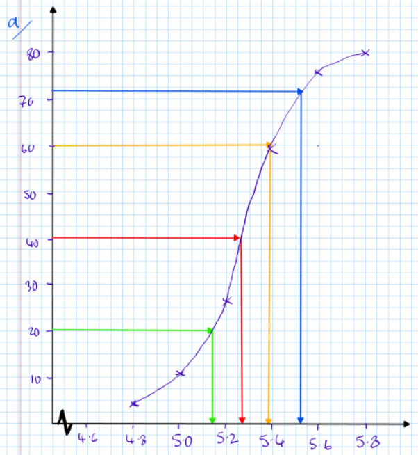
b) Estimate the median height of the giraffes.
- Median 5.26 m
c) Estimate the lower quartile and the percentile.
- Lower Quartile = 5.16 m
- Percentile:
- Calculation:
- Percentile $≈ 5.52 m
d) Draw a box plot to represent this data.
-
Min = 4.6 (from the table)
-
LQ = 5.16
-
Median = 5.26
-
UQ = 5.38 (from the graph)
-
Max = 5.8 (from the table)
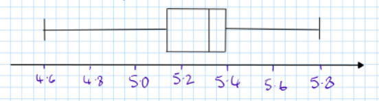
-
The box plot is drawn using these values.
e) Estimate the number of giraffes with heights below .
- Since is the upper quartile , 75% of giraffes have heights below this.
- Calculation: