Intrepreting Data (Edexcel A-Level Mathematics): Revision Notes
2.3.2 Interpreting Data
Interpreting data involves analysing and drawing meaningful conclusions from data presented in various formats, such as tables, charts, or graphs. This process is crucial for understanding trends, identifying patterns, and making informed decisions based on the data. Below is a guide to interpreting different types of data presentations, along with examples to illustrate key points.
Understanding the Context
Before interpreting any data, it's important to understand the context:
- What is the data about? Identify the subject or phenomenon being analysed.
- How was the data collected? Consider the methodology used (e.g., surveys, experiments).
- What are the key variables? Understand the independent and dependent variables and any relevant factors.
Interpreting Bar Charts
Bar Charts are used to compare the frequency, count, or proportion of different categories.
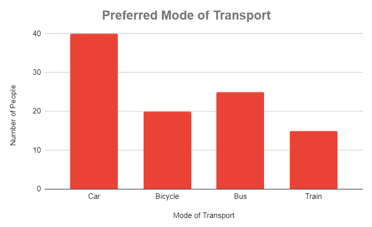
Example: A survey asked 100 people about their preferred mode of transport. The results are displayed in a bar chart:
Interpretation:
- Most Preferred Mode: The "Car" category has the tallest bar, indicating that most people prefer travelling by car.
- Least Preferred Mode: The "Train" category has the shortest bar, showing it is the least preferred.
- General Trend: Most people prefer personal transport (car), with public transport options being less popular.
Interpreting Histograms
Histograms display the distribution of continuous data across intervals or bins.
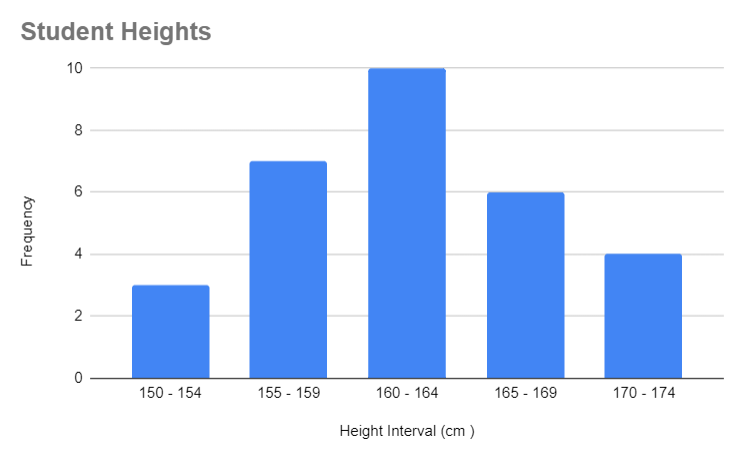
Example: The heights of 30 students are measured, and the data is grouped into intervals:
Interpretation:
- Distribution Shape: The histogram is roughly symmetrical, indicating a normal distribution of heights.
- Central Tendency: Most students fall into the 160-164 cm interval, suggesting this is the most common height range.
- Spread: The range of heights is from 150 to 174 cm, showing moderate variability in student heights.
Interpreting Pie Charts
Pie Charts are used to display the relative proportions of different categories within a whole.
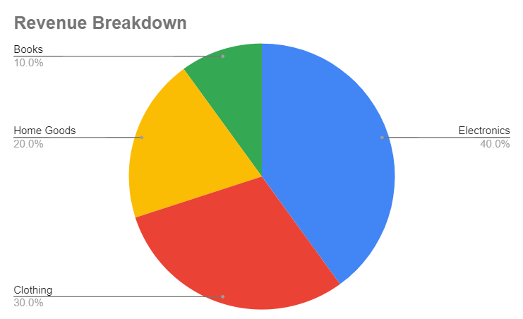
Example: A company's revenue is divided among four product categories:
Interpretation:
- Largest Sector: "Electronics" occupies the largest sector, contributing 40% of the total revenue.
- Smallest Sector: "Books" contribute only 10%, indicating this category is the least significant in terms of revenue.
- Proportional Comparison: Electronics generate twice as much revenue as Home Goods, highlighting their importance to the business.
Interpreting Line Graphs
Line Graphs are used to show trends over time or other continuous variables.
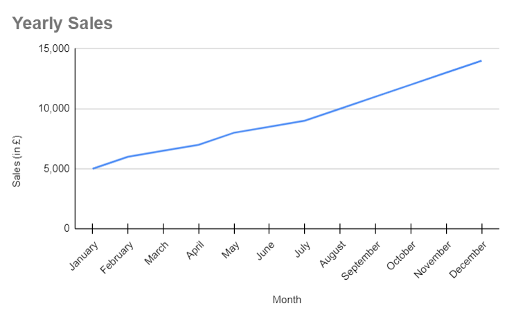
Example: A company's monthly sales over a year are plotted on a line graph:
Interpretation:
- Overall Trend: The line graph shows a steady increase in sales over the year, indicating positive growth.
- Seasonal Trends: The steepest increase occurs towards the end of the year, possibly due to holiday sales.
- Forecasting: If the trend continues, sales are expected to keep increasing in the following year.
Interpreting Scatter Plots
Scatter Plots show the relationship between two continuous variables.
Example: A study examines the relationship between study hours and exam scores:
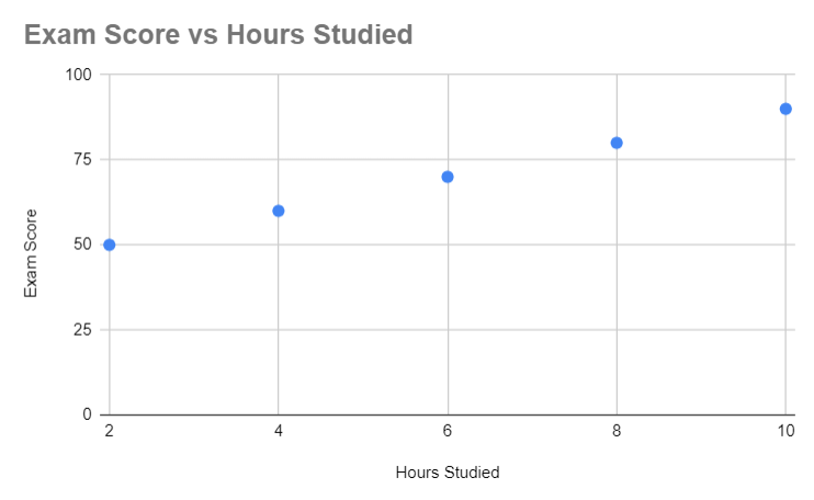
Interpretation:
- Positive Correlation: The points on the scatter plot rise from left to right, indicating a positive correlation between hours studied and exam scores.
- Strength of Relationship: The points are close to forming a straight line, suggesting a strong relationship between the variables.
- Outliers: If there were a point far away from the others (e.g., studying 10 hours but scoring 50), it would indicate an outlier, possibly due to other factors affecting the score.
Interpreting Box Plots
Box Plots summarise the distribution of data by showing the median, quartiles, and potential outliers.
Example: The test scores of students in two classes are compared using box plots:
| Class | Minimum | Q1 | Median | Q3 | Maximum |
|---|---|---|---|---|---|
| Class A | 45 | 55 | 65 | 75 | 85 |
| Class B | 50 | 60 | 70 | 80 | 90 |
Interpretation:
- Central Tendency: Class B has a higher median score (70) than Class A (65), indicating better overall performance.
- Spread: Class A has a wider interquartile range (IQR), suggesting greater variability in scores.
- Outliers: Check for any points outside the whiskers; these would indicate outliers.
Summary
Interpreting data is about understanding and analysing the information presented in different formats. By examining trends, patterns, and relationships within data, you can draw meaningful conclusions and make informed decisions. The examples provided illustrate how to approach and interpret data in various common formats, such as bar charts, histograms, pie charts, line graphs, scatter plots, and box plots.