Maths skills 3 (AQA GCSE Design and Technology): Revision Notes
Maths skills 3: Data presentation and graph interpretation
Understanding data visualisation
When working with data in design activities and real-world situations, you need to be able to identify and interpret information effectively. Presenting data in a visual format helps to emphasise important points and typically makes complex information much easier to understand and analyse.
Visual data presentation is a powerful communication tool that transforms raw numbers into clear, actionable insights. This skill is essential across many fields, from business analysis to scientific research.
Types of charts and graphs
Bar charts
Bar charts are the go-to choice when you need to display data that can be organised into distinct categories. Each bar represents a different category, and the height or length of the bar shows the frequency or value for that category.
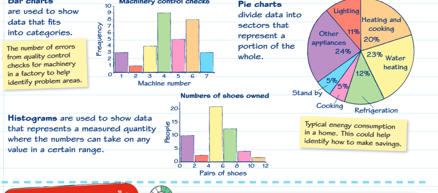 Bar charts are particularly useful for comparing different groups or categories. For example, in quality control situations, you might use a bar chart to show the number of errors found on different machines in a factory. This visual representation makes it immediately obvious which machines are having the most problems and need attention.
When to use bar charts:
- Comparing quantities across different categories
- Displaying survey results by demographic groups
- Showing performance metrics across different departments or time periods
Pie charts
Pie charts work best when you want to show how different parts make up a complete whole. The entire circle represents 100% of your data, and each slice (or sector) shows what proportion each category contributes to the total.
These charts are excellent for displaying information like household energy consumption, where you can clearly see that heating and cooking might use 20% of total energy, water heating uses 23%, and so on. This type of visualisation makes it easy to identify which areas offer the greatest opportunities for energy savings.
Pie charts are most effective when you have fewer than 7-8 categories. Too many slices make the chart difficult to read and interpret accurately.
Histograms
Histograms are designed to display continuous data where values can fall anywhere within a specific range. Unlike bar charts that show distinct categories, histograms group data into ranges or intervals.
Key difference: Histograms deal with measured quantities that can take on any value within certain limits, while bar charts show distinct, separate categories. This is a crucial distinction when choosing the right visualisation method.
The key difference is that histograms deal with measured quantities that can take on any value within certain limits. For instance, when showing how many pairs of shoes people own, the data might range from 0 to 12 pairs, and the histogram shows how many people fall into each range group.
Line graphs
Line graphs excel at showing trends and changes over time. They're particularly valuable when you need to compare two different sets of information on the same timeline.
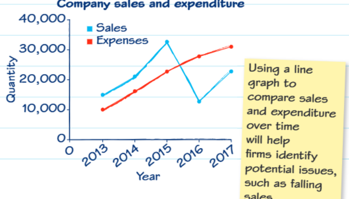 These graphs help businesses track performance by comparing metrics like sales versus expenses over several years. The visual representation makes it easy to spot patterns, such as declining sales or rising costs, which might indicate potential problems that need addressing.
Practical applications and cost analysis
Understanding how to interpret data becomes crucial in real-world decision making. Consider the example of choosing between rechargeable and alkaline batteries for a child's toy.
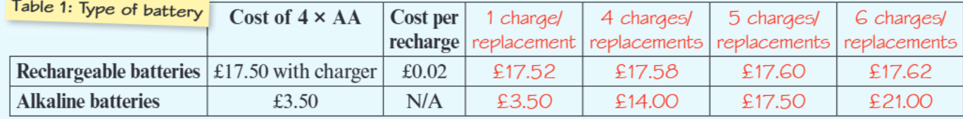
Worked Example: Battery Cost Analysis
Initial costs:
- Alkaline batteries: £3.50 for a four-pack
- Rechargeable batteries + charger: £17.50
Step-by-step analysis:
- First purchase: Alkaline appears cheaper (£3.50 vs £17.50)
- After 2nd replacement: Alkaline = £7.00, Rechargeable = £17.50
- After 3rd replacement: Alkaline = £10.50, Rechargeable = £17.50
- After 4th replacement: Alkaline = £14.00, Rechargeable = £17.50
- After 5th replacement: Alkaline = £17.50, Rechargeable = £17.50 (break-even point)
- Beyond 5th replacement: Rechargeable batteries offer significant savings
Conclusion: The break-even point occurs around the fifth replacement, after which rechargeable batteries become more economical.
Graph construction and interpretation skills
When creating or reading line graphs, pay careful attention to the scales on both axes. The scales don't always start at zero, which can sometimes make differences appear more dramatic than they actually are. Always use a sharp pencil and ruler when drawing graphs to ensure accuracy.
Critical Warning: Always check graph scales carefully! Scales that don't start at zero can be misleading and make small differences appear much larger than they actually are. This is a common source of misinterpretation in data analysis.
When interpreting graphs, look for patterns and trends rather than just individual data points. Ask yourself questions like: Are values increasing or decreasing over time? Are there any sudden changes that might indicate important events? How do different data series compare to each other?
Key Points to Remember:
- Bar charts are perfect for comparing categories - think "bars for categories"
- Pie charts show parts of a whole - the entire pie represents 100% of something
- Histograms display ranges of continuous data where values can fall anywhere within specific intervals
- Line graphs are ideal for showing trends over time and comparing multiple data sets
- Always check graph scales carefully - they don't always start at zero and this can affect how you interpret the data