Grouping data (AQA GCSE Statistics): Revision Notes
Grouping data
What is grouping data?
When you collect lots of individual data values, it can be difficult to see patterns or trends. Grouping data helps you organise your information into categories or ranges, making it much easier to spot distributions and identify patterns in your dataset.
Think of it like organising your music collection - instead of having hundreds of individual songs in one big list, you might group them by genre or artist to make them easier to work with.
Data grouping is a fundamental skill in statistics that transforms raw data into meaningful, interpretable information. This process is essential for creating frequency tables, histograms, and other visual representations of data.
Essential terminology
Before diving into grouping data, you need to understand these key terms:
Class intervals are the groups or ranges that you create for your data. Crucially, these groups must not overlap - each piece of data should fit into exactly one interval.
Upper and lower class boundaries are the values that separate one class interval from the next. These boundaries define where one group ends and another begins.
Class width is calculated by finding the difference between the upper class boundary and the lower class boundary. This tells you how much range each interval covers.
Guidelines for effective grouping
When grouping your data, follow these important principles:
Critical Grouping Principles:
You should aim to use as few groups as is reasonable for your dataset. If you create too few groups, you might miss important patterns because you've oversimplified the data. If you create too many groups, each group might only contain a few data values, making patterns unclear.
The number of class intervals and their width can significantly help you identify patterns in your data. Getting this balance right takes practice, but generally aim for between 5-10 intervals for most datasets.
Working with continuous data
For continuous data (like heights, weights, or temperatures), there must be no gaps between your intervals. This is where inequality notation becomes essential.
When writing intervals for continuous data, use the format where the lower boundary is included but the upper boundary is not. For example: means "height is greater than or equal to 145, but less than 150".
This notation ensures that a value like 150.0 cm clearly belongs in the next interval , not in the previous one.
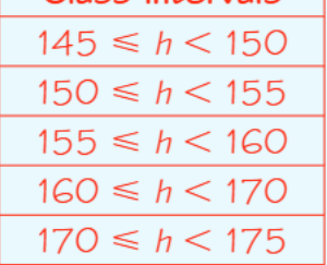
Worked example: Student heights
Let's examine a practical example using height data from 30 female students:
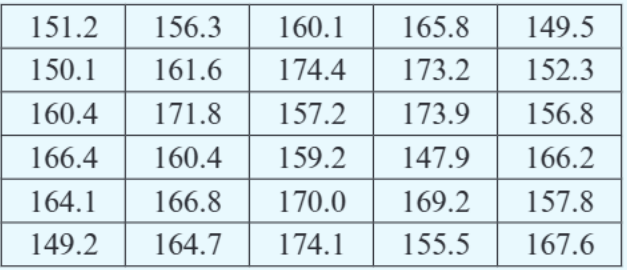
The heights range from approximately 147 cm to 174 cm. To group this data effectively, we need to choose appropriate class intervals.
Worked Example: Grouping Height Data
Step 1: Determine the range The heights range from approximately 147 cm to 174 cm.
Step 2: Choose starting point and interval width The first interval should contain all values from 145 up to but not including 150. Notice that we don't need to start exactly at the smallest data value (147.9 cm) - starting at 145 makes the intervals cleaner and easier to work with.
Step 3: Create complete grouping For the complete grouping:
Step 4: Handle boundary values Notice how values exactly on the boundary (like 155.0 cm) belong in the interval that starts with that value. The third interval begins with 155, so a student who is exactly 155.0 cm tall fits into this group.
Step 5: Add intervals as needed If a student taller than the others joins the group (say 176.0 cm), you would need to add an extra interval: . Remember that intervals don't have to be of equal width - you can adjust them based on your data's distribution.
Different ways to show intervals
There are several ways to represent the same intervals, and it's important to recognise them all:
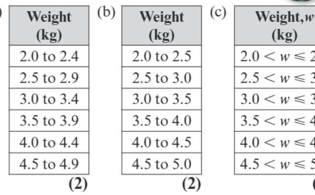
Method (a) uses "to" notation: "2.0 to 2.4", "2.5 to 2.9". This is readable but can be ambiguous about boundary values.
Method (b) is similar but with slightly different boundaries: "2.0 to 2.5", "2.5 to 3.0". Again, it's unclear where exactly boundary values belong.
Method (c) uses mathematical inequality notation: "". This is the most precise method because it clearly shows which boundary is included and which is excluded.
The inequality method is generally preferred in statistics because it eliminates confusion about where boundary values belong.
Common exam tips
Watch Out for These Common Pitfalls:
-
Always check your intervals cover the full range of your data. Don't accidentally exclude the highest or lowest values.
-
For continuous data, never leave gaps between intervals. Every possible value should fit into exactly one group.
-
Pay careful attention to inequality symbols. Mix up < and ≤ and you could place values in the wrong intervals.
-
Consider the context of your data when choosing interval widths. Equal widths aren't always the best choice - sometimes the data distribution suggests different sized intervals would be more meaningful.
Remember!
Key Points to Remember:
- Class intervals are non-overlapping groups that help reveal patterns in your data
- Use inequality notation (≤ and <) for continuous data to avoid gaps and overlaps
- Aim for a reasonable number of groups - typically 5-10 intervals work well
- Intervals don't have to be equal width - adjust them based on your data distribution
- Always check that your intervals cover the complete range of your dataset