Choosing the right format (AQA GCSE Statistics): Revision Notes
Choosing the right format
When working with data representation, selecting the most appropriate format is crucial for effective communication. You need to understand how to interpret and compare different data presentations, as well as make informed decisions about which format best suits your data and audience.
Understanding your data type
Before selecting a display format, you must first identify the characteristics of your data. This involves asking yourself several important questions about the nature of your information.
Consider whether your data is discrete or continuous. Discrete data consists of separate, countable values that cannot be subdivided meaningfully, whilst continuous data can take any value within a range and can be measured to any degree of precision.
You should also determine if your data is qualitative or quantitative. Qualitative data describes characteristics or categories that cannot be measured numerically, whereas quantitative data consists of numerical measurements or counts.
Finally, consider whether your data has been organised into groups or ranges, as this affects which display methods will be most effective. Grouped data often requires different presentation approaches than individual data points.
Considering your audience and purpose
The choice of format should always take into account who will be viewing your presentation and what message you want to convey. Think carefully about your target audience's level of statistical knowledge and what specific insights you want them to gain from the data.
Different formats excel at highlighting different aspects of your data, so your presentation goals should guide your format selection. Some formats are better for showing exact values, whilst others excel at demonstrating trends or making comparisons.
Common data display formats
Tables
Tables present raw data in an organised structure using rows and columns. This format works effectively for displaying discrete, continuous, qualitative, or quantitative data types.
Tables allow readers to access exact values quickly and make precise comparisons between individual data points. However, tables can make it challenging to identify broader trends and patterns in your data, especially when dealing with large datasets.

Bar charts
Bar charts offer versatility in data presentation, accommodating discrete, continuous, qualitative, and quantitative data types. They excel at making comparisons between different categories and can effectively highlight trends and patterns in your data.
Bar charts can be presented in either vertical or horizontal orientations and can be adapted for multiple data series comparisons. They provide a visual impact that makes differences between values immediately apparent to viewers.
Histograms
Histograms serve a specific purpose in displaying continuous data that has been organised into groups or ranges. The crucial feature of histograms is that the area of each bar represents the frequency of data within that range, not just the height.
This format proves particularly valuable for showing the distribution pattern of continuous data and identifying the most common ranges of values. Histograms also help reveal whether data follows normal distribution patterns or shows other distribution characteristics.
Pie charts
Pie charts specialise in displaying proportional relationships within a dataset. They show how different categories contribute to the total as percentages, making them ideal for demonstrating relative sizes of different parts of a whole.
An important limitation of pie charts is that they display proportions rather than actual totals, which means viewers cannot determine absolute quantities from the chart alone.
Comparative pie charts can be used when you need to compare proportional relationships between different groups, though this requires careful consideration of whether the comparison will be meaningful.
Worked example: Patient waiting times
Worked Example: Analysing Patient Waiting Time Data
Let's examine how the same dataset can be presented using different formats, each with distinct advantages and limitations.
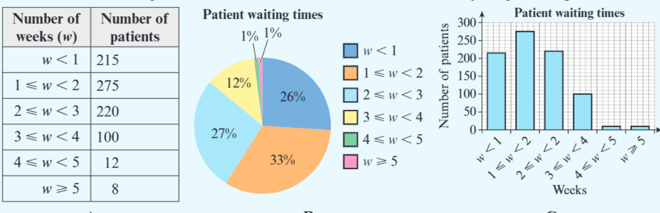
Consider this patient waiting time data presented in three different formats:
Format A (Table): The table clearly displays the exact number of patients in each waiting time category. This format makes it straightforward to identify that 275 patients (the highest number) waited between 1-2 weeks. You can easily read precise values for any category.
Format B (Pie chart): The pie chart reveals the proportional breakdown, showing that 33% of patients waited 1-2 weeks, which represents the largest proportion. However, you cannot determine the actual number of patients in each category without referring back to additional information.
Format C (Bar chart): The bar chart effectively demonstrates the trend in patient responses, making the peak at 1-2 weeks visually obvious. However, the scale selection makes it difficult to distinguish between the smaller categories, particularly the final two groups with very few patients.
This example demonstrates that format selection significantly impacts what insights viewers can easily extract from your data.
Exam tips and common mistakes
When choosing data formats in exams, always justify your choice by explaining why your selected format best suits both the data type and the intended purpose. Avoid formats that obscure important details or create misleading impressions.
Common Mistakes to Avoid:
-
Histogram confusion: Remember that histograms are specifically designed for continuous grouped data, and the area of bars matters, not just height. Don't confuse histograms with bar charts, as they serve different purposes.
-
Pie chart limitations: Remember they work best when you want to show how parts relate to a whole, but they become difficult to interpret when there are too many small categories or when precise values are important.
-
Poor scaling choices: Don't let poor scaling hide important information in your visual presentations.
Consider using statistical software when appropriate, but always ensure you understand why you're choosing each format rather than simply selecting options randomly.
Key Points to Remember:
- Data type determines format options - identify whether your data is discrete/continuous and qualitative/quantitative before choosing a display method
- Match format to purpose - tables show exact values, bar charts compare categories, histograms show continuous distributions, pie charts display proportions
- Consider your audience - choose formats that your viewers can easily interpret and that highlight the insights most relevant to them
- Justify your choices - in exams, always explain why your chosen format is most appropriate for the specific data and purpose
- Avoid common pitfalls - don't use histograms for discrete data, don't use pie charts when exact values are crucial, and don't let poor scaling hide important information