Choropleth maps (AQA GCSE Statistics): Revision Notes
Choropleth maps
What are choropleth maps?
A choropleth map is a powerful data visualisation tool that uses different colours or shading patterns to display how data varies across different geographical regions. These maps are particularly useful for showing the distribution and concentration of data across areas, making patterns and trends immediately visible.
The word "choropleth" comes from Greek, meaning "area" and "multitude", which perfectly describes how these maps show quantities distributed across regions.
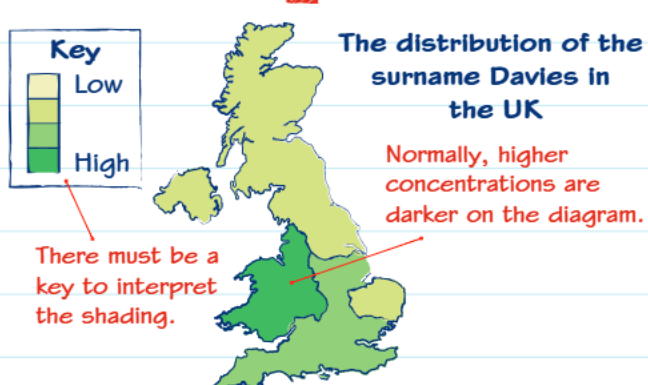
For example, this map shows how the surname "Davies" is distributed across the United Kingdom. The different shades represent varying concentrations - lighter colours indicate lower concentrations whilst darker colours show higher concentrations. You can immediately see that Wales and western England have much higher concentrations of this surname.
How to interpret choropleth maps
The most crucial element of any choropleth map is the key or legend. This tells you exactly what each shade or colour represents, and you must always check this first before attempting to interpret the data.
Always check the key first before attempting to interpret any choropleth map. This is the most common mistake students make - trying to interpret the shading without understanding what it represents.
Key features to remember:
- Darker shading typically represents higher values (though this can vary)
- There must always be a key to interpret the different shades
- The key shows specific ranges of values for each shading pattern
- Patterns help identify geographical trends and concentrations
Choropleth maps using grids
Choropleth maps can also be applied to grid systems to show how populations or quantities change across a specific area. This is particularly useful for displaying scientific data or population studies.
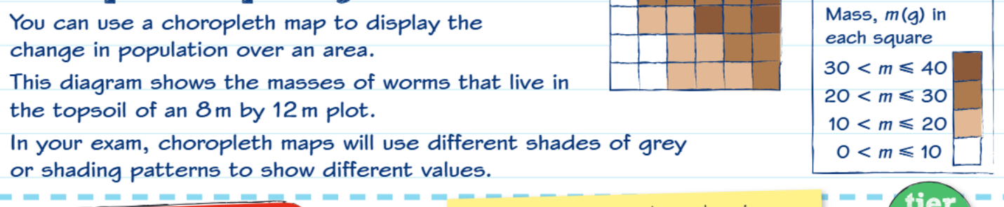
This example demonstrates how worm populations vary across different squares of topsoil in a measured plot. Each square represents a specific area, and the shading indicates the mass of worms found in that location.
In GCSE exams, you'll typically encounter choropleth maps that use different shades of grey, various shading patterns (dots, lines, cross-hatching), and specific value ranges for each pattern.
Worked example: Flower distribution
Worked Example: Creating a Choropleth Map of Flower Distribution
The problem: A field has been divided into 2-metre squares, and the number of flowers in each square has been counted.
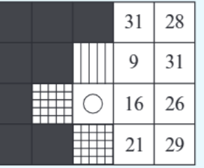
Step 1: Examine the raw data The numbers show flower counts in each grid square, ranging from 9 to 31 flowers per square.
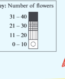
Step 2: Create appropriate categories The key shows four ranges:
- 0-10 flowers: Circle (hollow)
- 11-20 flowers: Vertical lines
- 21-30 flowers: Grid pattern
- 31-40 flowers: Solid black
Step 3: Apply the shading Each square gets shaded according to its flower count and the key ranges.
Step 4: Interpret the results From the completed choropleth map, you can observe that there's a higher density of flowers around the edges of the field, which might indicate better growing conditions in those areas.
Creating your own choropleth map
When constructing a choropleth map in an exam, follow these essential steps:
Step 1: Analyse the data range Look at the highest and lowest values in your dataset. This helps you decide on appropriate intervals.
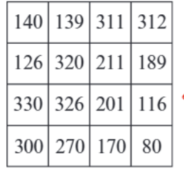
For example, with data ranging from 80 to 330, you might create four categories with roughly equal intervals.
Step 2: Choose suitable intervals It's usually best to have 4-6 categories. Make sure the intervals are logical and easy to understand.
Step 3: Create a clear key Your key must show:
- The exact value ranges for each category
- The shading pattern for each range
- A logical progression from light to dark (or simple to complex patterns)
Step 4: Apply shading consistently Make sure every area is shaded according to your key, and double-check your work.
Common Construction Mistakes to Avoid:
- Creating unequal or awkward intervals (e.g., 0-7, 8-23, 24-31)
- Forgetting to shade some areas
- Using shading that doesn't match your key
- Making the key unclear or incomplete
Exam tips and techniques
Important exam considerations:
- You cannot use colour on exam papers, so become familiar with different shading patterns
- Always include a comprehensive key - marks are often awarded specifically for this
- Use logical intervals - avoid random or awkward number ranges
- Check your shading matches your key - this is a common source of errors
When describing choropleth maps in exams: Focus on general distribution patterns rather than listing individual values. Examiners want to see that you understand the overall trends and geographical patterns shown by the data.
Effective description techniques:
- Make general comments about distribution patterns
- Identify areas of high and low concentration
- Look for geographical trends or patterns
- Use specific examples from the map to support your observations
Remember!
Key Points to Remember:
-
Choropleth maps use shading to show how data varies across geographical areas - the key is essential for interpretation
-
Always check the key first before attempting to interpret any choropleth map - this tells you what each shade represents
-
Darker shading typically means higher values but always verify this with the key as conventions can vary
-
When creating choropleth maps, use logical intervals with 4-6 categories and ensure every area is properly shaded
-
In exams, focus on general distribution patterns rather than specific individual values when describing what the map shows