Histograms and frequency polygons (AQA GCSE Statistics): Revision Notes
Histograms and frequency polygons
What is a histogram?
A histogram is a special type of bar chart used to display grouped continuous data. The key feature that makes histograms different from regular bar charts is that there are no gaps between the bars (unless one of the class intervals has zero frequency). This is because continuous data flows from one value to the next without breaks.
When constructing histograms, remember these essential rules:
- If class intervals are equal in width, then all bars must have equal width
- The frequency is always plotted on the vertical axis (y-axis)
- The continuous variable is shown on the horizontal axis (x-axis)
What is a frequency polygon?
A frequency polygon provides an alternative way to display the same grouped continuous data. You create a frequency polygon by joining the midpoints of the tops of the bars in a histogram using straight lines. This creates a polygon shape that helps you visualise the overall shape and pattern of the data distribution.
Benefits of Frequency Polygons: Frequency polygons are particularly useful because they make it easier to compare different sets of data and to identify the general trend or shape of the distribution. They provide a clearer visual representation of data patterns than histograms alone.
Interpreting histograms
Reading information from histograms involves understanding what each bar represents and being able to work with both individual frequencies and cumulative frequencies. This skill is essential for data analysis and frequently tested in examinations.
Let's look at how to interpret histogram data with a practical example. Consider a histogram showing the distances people could throw a rock. From this type of display, you can:
- Read individual frequencies directly from the height of each bar
- Calculate cumulative frequencies by adding frequencies together
- Determine how many people fall within specific ranges
Key Calculation Principle: For cumulative frequencies, you add frequencies together progressively. For instance, if a histogram shows that 5 people threw between 4m and 5m, and 8 people threw between 5m and 6m, then you can calculate that people threw up to 6 metres in total.
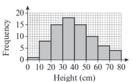
Worked example: Children's heights
Worked Example: Constructing Histogram and Frequency Polygon
Given data: The table shows information about the heights of children in a club:
| Height, h (cm) | Frequency |
|---|---|
| 110 < h ≤ 120 | 8 |
| 120 < h ≤ 130 | 13 |
| 130 < h ≤ 140 | 16 |
| 140 < h ≤ 150 | 10 |
| 150 < h ≤ 160 | 7 |
Part (a): Drawing the histogram
Step 1: Set up your axes
- Horizontal axis: Height (cm) from 110 to 160
- Vertical axis: Frequency from 0 to about 20
Step 2: Check the class intervals
- Each interval has a width of 10 cm (, , etc.)
- Since all intervals are equal, all bars must have equal width
Step 3: Draw each bar
- 110-120: height of 8
- 120-130: height of 13
- 130-140: height of 16
- 140-150: height of 10
- 150-160: height of 7
Part (b): Drawing the frequency polygon
Step 1: Find the midpoint of each class interval
- 110-120: midpoint =
- 120-130: midpoint =
- 130-140: midpoint =
- 140-150: midpoint =
- 150-160: midpoint =
Step 2: Plot points at each midpoint
- (115, 8), (125, 13), (135, 16), (145, 10), (155, 7)
Step 3: Join the points with straight lines
- Connect each point to the next with a straight line to form the polygon
Drawing Tips for Examinations: Always use a ruler and sharp pencil when drawing graphs in exams for accuracy and neatness. Clear, precise drawings demonstrate mathematical understanding and earn maximum marks.

Common exam tips and traps
Understanding the common pitfalls and key principles will help you avoid mistakes and demonstrate clear mathematical understanding in examinations.
Key Points to Remember:
- Always check if class intervals are equal - if they are, your bars must be equal width
- Frequency polygons use midpoints of the class intervals, not the class boundaries
- There are no gaps between histogram bars for continuous data
- Always label your axes clearly with appropriate units
- Use a ruler for straight, neat lines in your drawings
Typical Exam Traps to Avoid:
- Drawing gaps between histogram bars (this is wrong for continuous data)
- Using the wrong points when drawing frequency polygons (use midpoints, not endpoints)
- Making bars different widths when class intervals are equal
- Forgetting to label axes or include units
Key Points to Remember:
- Histograms display grouped continuous data with no gaps between bars (unless there's zero frequency)
- Frequency polygons are created by joining the midpoints of histogram bar tops with straight lines
- Equal class intervals mean equal bar widths in your histogram
- Always read frequencies from the vertical axis and check what each bar represents
- Use midpoints of class intervals when constructing frequency polygons, not the class boundaries