Misleading diagrams (AQA GCSE Statistics): Revision Notes
Misleading diagrams
Understanding how to spot misleading diagrams is crucial for interpreting data correctly. Sometimes graphs and charts can give false impressions, either intentionally or by accident. Learning to recognise these issues will help you become a critical thinker when analysing statistical information.
Developing the ability to identify misleading elements in data presentations is an essential skill that extends beyond academic study - it helps you evaluate claims in media, research, and everyday decision-making.
What makes a diagram misleading
Diagrams become misleading when the way information is presented doesn't accurately represent the true relationships in the data. This can happen through poor design choices or deliberate manipulation to create a particular impression.
Common misleading features to watch for
Scale problems
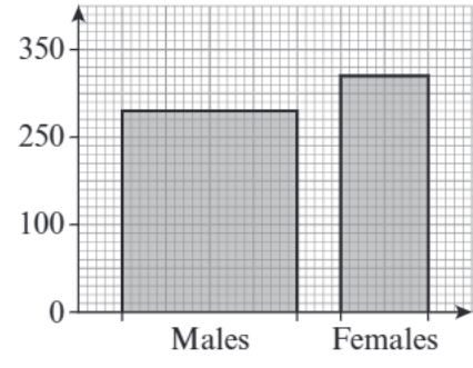
One of the most frequent issues occurs with vertical scales that don't behave as expected. When a scale doesn't start at zero, small differences between values can appear much larger than they actually are. Additionally, scales that aren't linear (don't increase by equal amounts) can distort the visual representation of data.
Critical Scale Issue: When scales don't start at zero, this is one of the most common ways data can be misrepresented. Always check the starting point of your scales before interpreting differences between data points.
Labelling issues
Charts without clear labels on their axes make it impossible to understand what the data actually represents. Missing or unclear labels prevent readers from interpreting the information correctly.
Missing essential features
Charts that lack important elements like keys or legends leave readers guessing about what different colours, patterns, or symbols represent.
Specific types of misleading diagrams
Three-dimensional charts
3D effects in charts often cause more problems than they solve. In 3D bar charts, it becomes very difficult to compare the heights of different bars accurately because the perspective distorts our perception of size.
3D pie charts
These present particular challenges because the angles become distorted. Sections positioned towards the back of the chart may appear smaller than they actually are, whilst sections at the front can seem disproportionately large.
The human eye has difficulty accurately judging angles and depths in 3D representations, which is why 2D charts are generally more reliable for data comparison.
Pictograms with varying image sizes
When pictograms use images of different sizes to represent data, comparing values becomes nearly impossible. The visual impact of larger symbols can be misleading, making some categories appear more significant than their actual values warrant.
How to identify misleading elements
When examining any chart or graph, follow a systematic approach. First, check whether the vertical axis starts at zero - if it doesn't, consider how this affects your interpretation of the differences between data points. Look for clear labelling on both axes to ensure you understand what's being measured.
Worked example analysis
Worked Example: Identifying Misleading Features
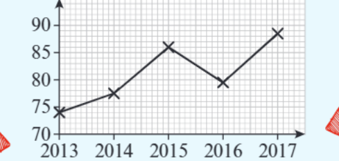
Let's examine a line graph that demonstrates common misleading features:
Analysis Steps:
Step 1: Check the scale - This graph shows several problematic elements. The vertical scale doesn't start at zero, which exaggerates the apparent differences between the data points over the years.
Step 2: Examine the labels - Without proper axis labels, we can't determine what quantity is actually being measured, making the data meaningless for analysis.
Step 3: Assess the impact - The scale issue is particularly significant - when scales don't start at zero, small changes in data can appear as dramatic increases or decreases. This creates a misleading impression about the rate of change over time.
Strategies for accurate interpretation
Always examine the scale carefully before drawing conclusions about data trends. Check that axes are properly labelled and that you understand what units are being used. Be especially cautious with 3D representations, as these often make accurate comparisons more difficult rather than easier.
When you encounter charts in exams or real-world situations, take time to identify any features that might be misleading. This critical evaluation skill will help you make more informed judgements about statistical claims.
Key Points to Remember:
- Check if scales start at zero - if not, small differences can look much bigger than they really are
- Always look for clear axis labels - without them, you can't understand what the data represents
- Be wary of 3D effects in charts as these often distort your ability to compare values accurately
- Missing keys or legends make it impossible to interpret different elements in the chart
- Pictograms using different sized images prevent accurate comparison of values