Population pyramids (AQA GCSE Statistics): Revision Notes
Population pyramids
What are population pyramids?
Population pyramids are specialised charts that display information about the age structure of a population. Think of them as horizontal bar charts that have been specially designed to show demographic data clearly and effectively.
These charts are particularly useful because they allow us to see at a glance how a population is distributed across different age groups, and they make it easy to compare the numbers of males and females in each age bracket.
Population pyramids are one of the most effective ways to visualise demographic data because they combine multiple types of information (age, gender, and population size) in a single, easy-to-understand chart format.
Key features and structure
Population pyramids have several important structural features that you must understand to read them correctly:
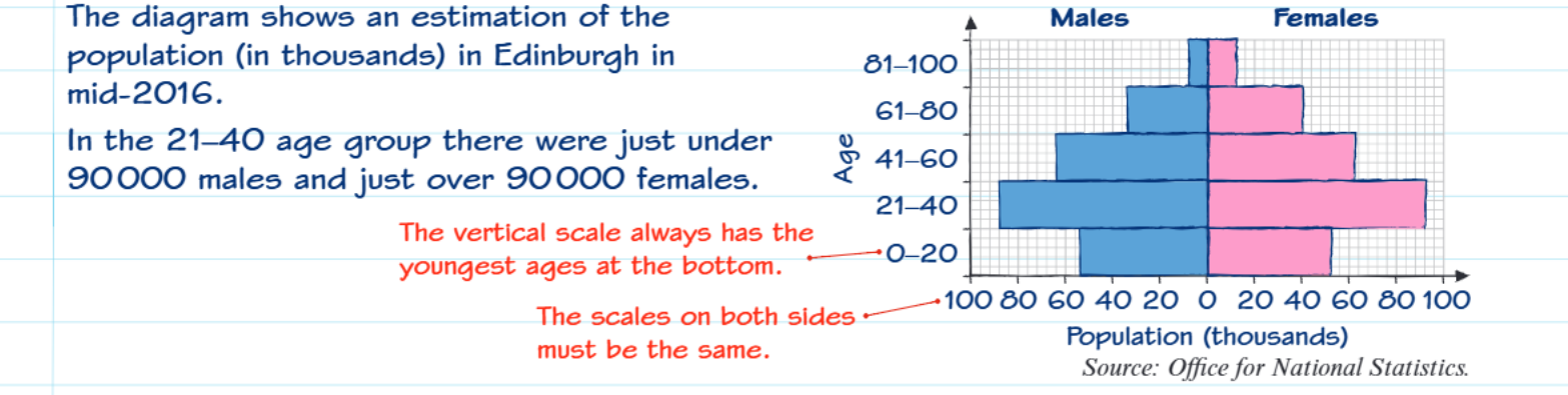
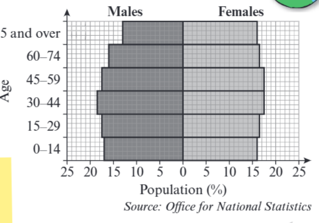
Layout and orientation: Unlike regular bar charts, population pyramids use horizontal bars arranged in a specific way. The chart is split down the middle, with males represented on the left side and females on the right side.
Age groups: The vertical axis shows different age groups, and here's a crucial point to remember - the youngest ages are always positioned at the bottom of the chart, just like the base of a real pyramid. As you move up the chart, the age groups get older.
Scale requirements: Both sides of the pyramid must use exactly the same scale. This is essential for making fair and accurate comparisons between male and female populations. If the scales differ, the visual comparison becomes misleading and invalid.
The pyramid shape typically occurs because birth rates are generally higher than death rates at younger ages, creating wider bars at the bottom and narrower bars at the top as populations age.
How to read population pyramids
When reading population pyramids, you need to understand what the horizontal bars represent. The length of each bar shows either the actual number of people or the percentage of the total population in that age group.
To find information about specific age groups, you locate the relevant age band on the vertical axis, then read across to see the corresponding values on the horizontal axis.
Always check the horizontal axis labels carefully - some pyramids show absolute numbers (often in thousands), while others show percentages of the total population. This affects how you interpret and calculate your answers.
Worked examples with step-by-step solutions
Let's work through some typical exam questions using population pyramid data:
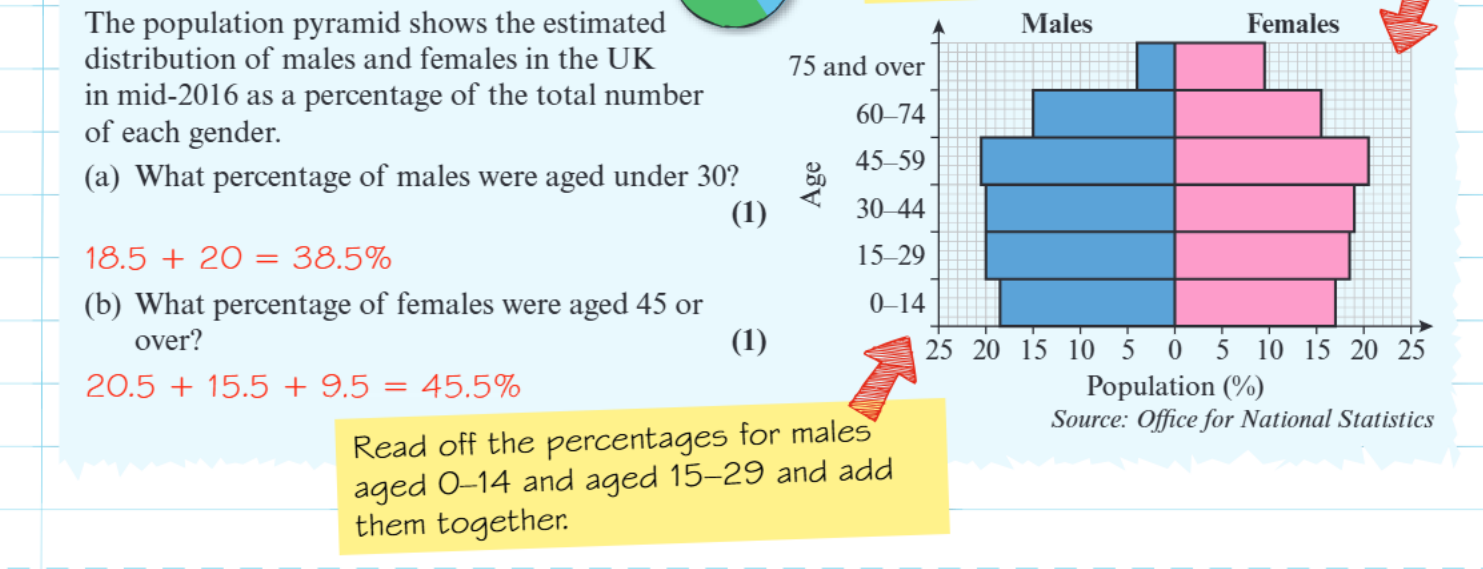
Worked Example: Finding percentage of males under 30
Question: What percentage of males were aged under 30?
Step 1: Identify which age groups are "under 30"
- This includes males aged 0-14 and males aged 15-29
Step 2: Read the percentages from the chart
- Males aged 0-14: 18.5%
- Males aged 15-29: 20%
Step 3: Add the percentages together 18.5 + 20 = 38.5%
Answer: 38.5% of males were aged under 30
Worked Example: Finding percentage of females aged 45 or over
Question: What percentage of females were aged 45 or over?
Step 1: Identify which age groups are "45 or over"
- This includes females aged 45-59, 60-74, and 75 and over
Step 2: Read the percentages from the chart
- Females aged 45-59: 20.5%
- Females aged 60-74: 15.5%
- Females aged 75 and over: 9.5%
Step 3: Add all the percentages together 20.5 + 15.5 + 9.5 = 45.5%
Answer: 45.5% of females were aged 45 or over
Exam tips and common mistakes
Common Pitfalls to Avoid:
- Reading the wrong side: Always check whether the question asks about males (left side) or females (right side)
- Missing age groups: When questions ask for ranges like "under 30" or "over 45", make sure you include all relevant age bands
- Scale confusion: Pay attention to whether the data is shown as actual numbers (thousands) or percentages
- Addition errors: Double-check your arithmetic when adding multiple age groups together
Key Points to Remember:
- Population pyramids show age structure with males on the left, females on the right
- Youngest ages are always at the bottom of the vertical scale
- Both sides must use the same scale for fair comparison
- When calculating ranges, identify all relevant age groups before adding
- Read values carefully from the horizontal axis - check if it's numbers or percentages