Tables (AQA GCSE Statistics): Revision Notes
Tables
Tables are one of the most common ways to present numerical data in an organised format. They display information in rows and columns, making it easy to compare different values and spot patterns. Learning to read tables accurately is a crucial skill for your GCSE maths exam.
Understanding table structure
Every table has a specific structure that helps organise information clearly. The key components include column headers (which tell you what each column represents), row labels (which identify what each row shows), and the data cells where the actual numbers are displayed.
When you first look at any table, take a moment to understand what it's showing. Look at the title, check what the rows and columns represent, and most importantly, identify the units being used.
Reading units and scale carefully
One of the most important aspects of reading tables is paying attention to the units. Numbers can be presented in different scales, and missing this detail can lead to serious errors in your calculations and interpretations.

For example, if a table shows figures in millions, a value of 29.69 actually represents 29,690,000. Always check whether numbers are given as actual values, thousands, millions, or percentages before you start working with them.
Rounding is also common in tables. Values might be rounded to the nearest thousand, ten thousand, or even hundred thousand to make the data easier to read. This can sometimes create small inconsistencies, so be aware that totals might not always add up exactly due to rounding.
Extracting specific information
To find a specific piece of information in a table, you need to locate where the appropriate row and column intersect. This is like finding coordinates on a grid - first identify the correct row, then the correct column, and read the value where they meet.
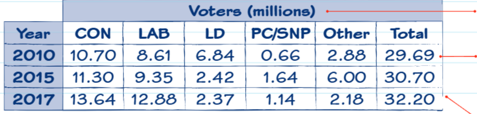
Let's look at this voting data table. If you wanted to find how many people voted Labour in 2015, you would find the 2015 row, then look across to the LAB column. The intersection shows 9.35 (which, remember, represents 9.35 million voters).
Identifying trends and patterns
Tables often show data over time, allowing you to identify trends. A trend describes the general direction that data is moving - it could be increasing (going up), decreasing (going down), or remaining relatively flat (staying roughly the same).
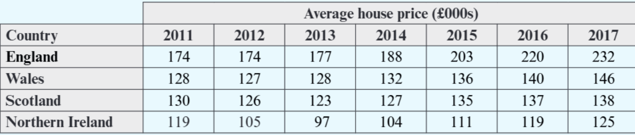
This house price table demonstrates different types of trends. England shows a clear upward trend from £174,000 in 2011 to £232,000 in 2017. Northern Ireland shows a more complex pattern - prices dropped initially then recovered, while Wales shows a generally upward trend but with some variation.
When describing trends, be specific about the time period and mention any notable changes or exceptions to the general pattern.
Worked example: Step-by-step table analysis
Worked Example: Finding House Prices
Let's work through a complete example using the house price data. The question asks for the average house price in Scotland in January 2014.
Step 1: Identify the correct row - find "Scotland" in the Country column.
Step 2: Identify the correct column - find "2014" in the year headers.
Step 3: Read the intersection - where Scotland row meets 2014 column shows £127,000.
Step 4: Check the units - the table header shows "Average house price (£000s)", so £127 in the table represents £127,000.
For trend questions, you need to look at multiple values and describe the pattern. The trend in Wales from 2011 to 2017 shows prices starting at £128,000, remaining relatively stable through 2013, then increasing steadily from 2014 onwards to reach £146,000 by 2017.
Comparative analysis between countries
Tables often allow you to compare data between different categories or regions. When making comparisons, it's helpful to identify the highest and lowest values, and any significant differences between groups.
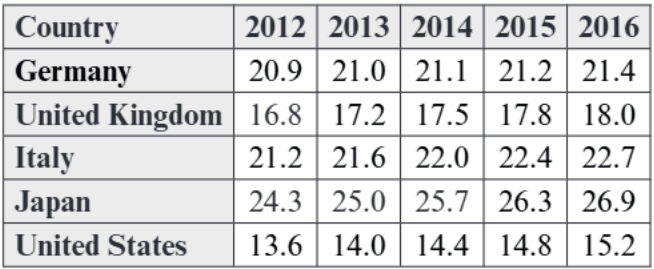
This population statistics table shows the percentage of people aged 65 or over in five countries. You can easily compare countries by looking across each row, or track changes in a single country by looking down each column. Japan consistently shows the highest percentages, while the United States shows the lowest throughout the period.
Common exam techniques and mistakes to avoid
Always read the question carefully and identify exactly what information you need to extract.
Common mistakes to avoid:
- Not checking units properly and giving answers in the wrong scale
- Reading from the wrong row or column
- Confusing trends (describing an increase as a decrease)
- Not being specific enough when describing patterns
For trend questions, avoid vague descriptions like "it changes" - instead, be specific about whether values increase, decrease, or remain stable, and mention the time periods involved.
When dealing with small changes between consecutive years, be careful about claiming there's a trend - small fluctuations might not indicate a meaningful pattern.
Remember!
Key Points to Remember:
- Always check the units before reading any values from a table - figures might be in thousands, millions, or percentages
- Use the row and column headers to navigate to the exact piece of information you need
- When describing trends, be specific about time periods and mention the direction of change (increasing, decreasing, or stable)
- Round your final answers appropriately, but be aware that tables often contain pre-rounded figures
- Take time to understand what the table is showing before attempting to answer questions about it