Graphical skills 2 (Edexcel GCSE Geography A): Revision Notes
Graphical skills 2
Understanding how to interpret and create different types of specialised graphs and diagrams is essential for geographical analysis. This section covers triangular graphs, radial displays, and proportional symbols - each serving specific purposes in presenting geographical data effectively.
Triangular graphs
Triangular graphs, also known as ternary diagrams, are specialised charts designed to display data that consists of three components which together total 100%. These graphs are particularly useful in geography for showing employment structures, where you might want to compare the proportions of primary, secondary, and tertiary industry employment across different regions.
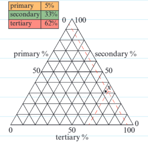
The structure of a triangular graph features three axes arranged in a triangular formation, with each axis representing one of the three components. Each axis is divided into percentage scales that run from 0 to 100, and the three percentages for any data point must always add up to exactly 100%. This makes triangular graphs perfect for compositional data where you need to show how three related categories combine to form a complete whole.
Critical Rule: The three percentages for any data point must always add up to exactly 100%. This is fundamental to the accuracy of triangular graphs and cannot be overlooked.
When constructing a triangular graph, the technical process involves drawing lines at 60-degree angles to create the triangular grid system. The intersection point where the three component lines meet indicates the exact proportional breakdown of your data.
Worked Example: Plotting Employment Data
If you're plotting employment data showing:
- 5% primary employment
- 33% secondary employment
- 62% tertiary employment
Step 1: Verify the total = 5% + 33% + 62% = 100% ✓ Step 2: Find where these three values intersect on the triangular grid Step 3: Mark the intersection point as your data point
Reading triangular graphs requires following the grid lines from each axis towards the centre. Each data point represents a unique combination of the three components, making it easy to compare different locations or time periods on the same diagram. This visual representation makes it much easier to spot patterns and relationships than looking at tables of percentage data.
Radial graphs, radar graphs and wind rose diagrams
These three related types of circular diagrams each serve different analytical purposes, though they share the common feature of radiating outward from a central point.
Radial graphs
Radial graphs display one variable plotted against either compass direction or time periods. The data radiates outward from a central point, with the distance from the centre representing the magnitude of the measured variable. These graphs are particularly effective for showing directional data, such as the number of people travelling to a shopping centre from different compass directions, or for displaying cyclical patterns over time periods like months or seasons.
Key Advantage: Radial graphs can show both the direction and magnitude of data simultaneously, making them excellent for spatial analysis. They can also be adapted to display bipolar data, where values extend both inward and outward from the central point.
Radar graphs
Radar graphs, sometimes called spider diagrams, are designed to handle multivariate data by plotting multiple different categories on separate axes that all radiate from a central point. Each axis represents a different variable or category, and the data points are connected to form a polygon shape. This creates a visual 'fingerprint' that makes it easy to compare different locations, time periods, or cases across multiple criteria simultaneously.
These graphs are excellent for showing the relative strengths and weaknesses across different categories. For example, you might use a radar graph to compare different coastal management strategies by plotting their effectiveness across categories like cost, environmental impact, and long-term sustainability.
Wind rose diagrams
Wind rose diagrams are specialised circular charts that display wind direction patterns and speeds over a specific time period. The diagram shows both the frequency of winds from each compass direction and the speed categories of those winds using different colours or shading patterns.
Reading Wind Rose Diagrams: The length of each 'arm' extending from the centre indicates how frequently winds blow from that particular direction, while the colour coding shows the distribution of wind speeds.
This makes wind rose diagrams invaluable for understanding local climate patterns, planning renewable energy projects, or assessing environmental conditions for development proposals.
Proportional symbols
Proportional symbols represent a powerful cartographic technique where the size of symbols plotted on maps corresponds directly to the magnitude of the data being represented. Most commonly, circles are used as the proportional symbol, though squares, bars, or other shapes can also be employed depending on the type of data and the message you want to convey.
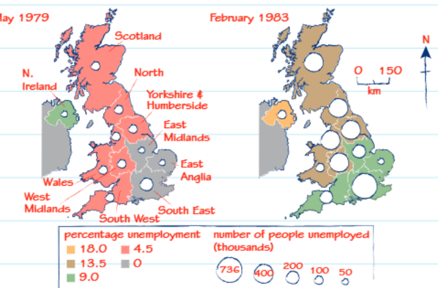
The key principle behind proportional symbols is that larger values are represented by larger symbols, creating an immediate visual impression of the relative magnitude of data across different locations. However, creating effective proportional symbol maps requires careful attention to scale and accuracy.
Scale Accuracy is Critical: The relationship between symbol size and data value must be mathematically consistent, and getting this scale correct can be technically challenging. Incorrect scaling will misrepresent your data and lead to false interpretations.
One of the main advantages of proportional symbols is their ability to show both the location and magnitude of data simultaneously. This dual function makes them particularly valuable for geographical analysis, as you can instantly see not just where something is happening, but also how significant it is compared to other locations.
Combined Mapping Techniques: The UK unemployment map example demonstrates how proportional symbols can be combined with other mapping techniques. Coloured regions show unemployment rates as percentages, while the white circles of varying sizes indicate the absolute numbers of unemployed people. This combination provides a much richer understanding than either technique could achieve alone.
When interpreting proportional symbol maps, it's important to pay attention to both the absolute size of symbols and their relative sizes compared to other locations. The largest symbols indicate the areas with the highest values, but you should also consider the underlying population or economic base that might influence these patterns.
Key Points to Remember:
- Triangular graphs are perfect for displaying three-component data that totals 100%, commonly used for employment structure analysis
- Radial graphs show one variable against direction or time, while radar graphs handle multiple variables simultaneously on separate axes
- Wind rose diagrams specifically show wind direction frequency and speed patterns over time periods
- Proportional symbols on maps use size to represent data magnitude, with larger symbols indicating higher values
- Getting the scale correct is crucial for proportional symbols to accurately represent the data relationships