Types of map and scale (Edexcel GCSE Geography A): Revision Notes
Types of map and scale
Understanding different types of maps and how to work with map scales is essential for geographical analysis. Maps serve various purposes and come in many different forms, each designed to show specific types of information about our world.
Different types of maps
Maps can be categorised based on what information they display and how they present geographical data. Each type serves a particular purpose and uses specific techniques to communicate information effectively.
Satellite images and maps
Satellite imagery provides real-time views of Earth's surface from space. These images are particularly valuable for monitoring weather patterns, natural disasters, and environmental changes.
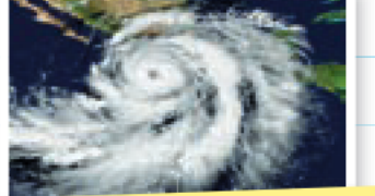
Satellite maps show actual photographs or processed images taken from satellites orbiting Earth. They're especially useful for tracking weather systems like hurricanes, monitoring deforestation, or observing urban development over time.
Satellite maps are invaluable for real-time monitoring because they provide up-to-date information about changing conditions on Earth's surface. This makes them particularly useful for disaster management, environmental monitoring, and tracking rapid changes in land use.
Political maps
Political maps focus on showing human-made boundaries and divisions. They clearly display country borders, state boundaries, and administrative regions.
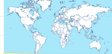
These maps often include additional information like major cities, capital cities, and sometimes transportation networks or communication links between different regions.
Political maps are essential for understanding governance, administration, and human organisation of space. They help us visualise how humans have divided and organised territory for administrative and political purposes.
Distribution and vegetation maps
Distribution maps show how specific features or phenomena are spread across different areas. Vegetation maps are a common example, showing where different types of plant life occur.
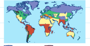
These thematic maps use different colours or symbols to represent various categories. For example, a vegetation map might show the location of rainforests, grasslands, deserts, and other ecosystem types across the globe.
Distribution maps are also called thematic maps because they focus on a specific theme or topic. They can show the distribution of anything from population density to rainfall patterns, making them versatile tools for geographical analysis.
Relief maps
Relief maps are designed to show the height and shape of the land surface. They use colour coding or shading to represent different elevation levels, making it easy to identify mountains, valleys, plains, and other landforms.
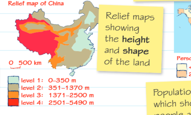
The example shows how different colours represent elevation ranges: sea level areas in light colours, medium elevations in warmer tones, and the highest elevations (like mountain ranges) in the darkest colours. Relief maps help us understand how terrain affects things like population distribution, climate patterns, and transportation routes.
Relief maps are crucial for understanding the relationship between physical geography and human activities. Areas of high elevation often have lower population densities, different climate patterns, and present challenges for transportation and agriculture.
Population distribution maps
These maps show how people are spread across different areas, using colour coding or symbols to represent population density (the number of people per square kilometre).
Population distribution maps help geographers understand settlement patterns, identify areas of high and low population density, and analyse the relationship between physical geography and human settlement.
Understanding map scales
Map scale is fundamental to reading and interpreting maps accurately. It tells us the mathematical relationship between distances on a map and the corresponding distances in the real world.
Critical concept: A map's scale tells you how much smaller the area shown on the map is compared to the area in real life. This relationship is usually expressed as a ratio, such as 1:25000 or 1:50000.
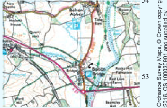
Ordnance Survey map scales
Ordnance Survey (OS) maps are detailed topographical maps commonly used in the UK. Understanding their scales is crucial for fieldwork and navigation.
Worked Example: OS Map Scale Calculations
For 1:25000 scale maps:
- 1 centimetre on the map = 25000 centimetres in real life
- Converting: 25000 cm = 250 metres
- Therefore: 1 cm on map = 250m in reality
For 1:50000 scale maps:
- 1 centimetre on the map = 50000 centimetres in real life
- Converting: 50000 cm = 500 metres
- Therefore: 1 cm on map = 500m in reality
Remember: The smaller the second number in the ratio, the more detailed the map. Therefore, 1:25000 maps show more detail than 1:50000 maps because they represent a smaller area at a larger scale.
Isoline maps
Isolines are a special type of map feature that connects points of equal value. The word "isoline" comes from "iso" meaning equal, so these lines literally connect places with the same measurement.
Understanding Isolines: Isolines are lines that join points of equal value, such as height, depth or air pressure. They help show gradual changes across geographical areas and make patterns visible that might otherwise be difficult to see.
Common types of isoline maps include:
- Contour lines: Connect points of equal height above sea level
- Bathymetric maps: Show ocean depth using lines connecting points of equal depth below sea level
- Air pressure maps: Connect areas with the same atmospheric pressure
- Temperature maps: Link areas with identical temperatures
Ordnance Survey maps use contour lines extensively to show the shape and steepness of the land. Where contour lines are close together, the land is steep; where they're far apart, the land is relatively flat.
Practical map skills
Working with maps requires practical skills in measurement, interpretation, and navigation. Understanding grid references, measuring distances using scales, and interpreting symbols are all essential abilities.
When working with any map, always check the scale first to understand what distances and areas you're looking at. Practice converting between map measurements and real-world distances using the scale information provided.
Practical tip: Always familiarise yourself with the map's legend and scale before attempting any measurements or interpretations. This will help you avoid common mistakes and ensure accurate analysis.
Key Points to Remember:
- Different map types serve specific purposes: satellite images for real-time observation, political maps for boundaries, relief maps for elevation, and distribution maps for showing patterns
- Map scale tells you the relationship between map distance and real distance - the smaller the ratio number, the more detailed the map
- For OS maps: 1:25000 means 1cm = 250m in real life; 1:50000 means 1cm = 500m in real life
- Isolines connect points of equal value and help show gradual changes across an area
- Always check the map scale and legend before interpreting any geographical information