Numerical and Statistical Skills (OCR GCSE Geography B (Geography for Enquiring Minds)): Revision Notes
Numerical and Statistical Skills
Introduction
Working with numerical data is a fundamental skill for geographers, particularly when conducting fieldwork and drawing conclusions. Understanding how to handle data properly enables you to identify trends, recognise patterns, and make predictions about future developments. This is essential for geographical investigation and analysis.
Measures of central tendency
Central tendency refers to statistical measures that identify the typical or central value within a dataset. These measures help geographers understand what is 'normal' or 'average' in their data.
Median
The median represents the middle value when numbers are arranged in order from smallest to largest. To find the median, you must first organise your data numerically, then locate the value in the central position.
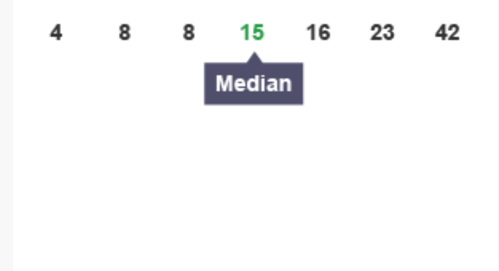
How to calculate the median:
- Arrange all values in ascending order
- If there is an odd number of values, the median is the middle number
- If there is an even number of values, the median is the average of the two middle numbers
The median is useful because it is not affected by extremely high or low values (outliers) in your dataset, making it a reliable measure when your data contains unusual values.
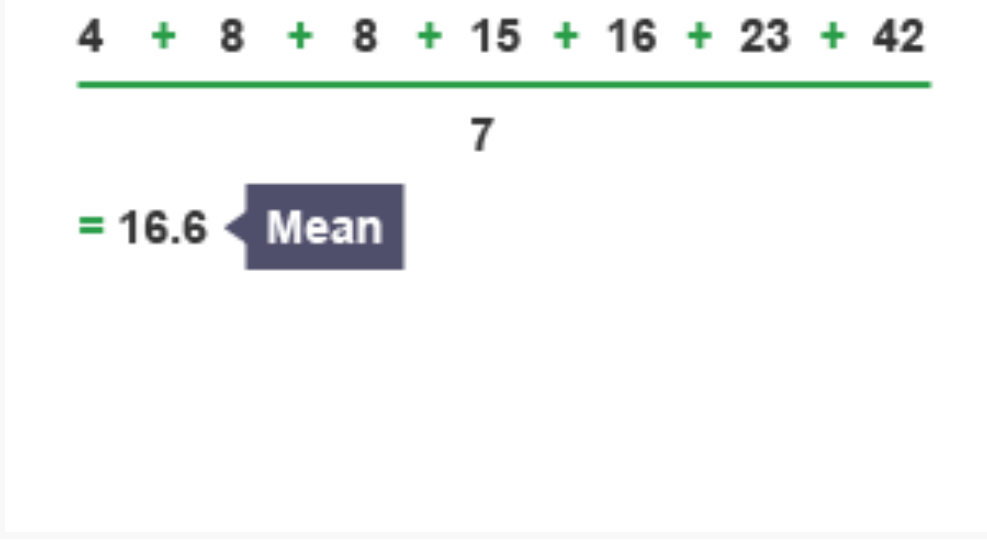
Mean
The mean is commonly referred to as the 'average' and represents the sum of all values divided by the number of values in the dataset.
Formula for calculating the mean:
Worked Example: Calculating the Mean
For the dataset: 4, 8, 8, 15, 16, 23, 42
Sum =
Mean =
The mean uses all values in the calculation, so it can be affected by extreme values. Be aware of this limitation when interpreting your results.
Mode
The mode identifies the value that appears most frequently in a dataset. This measure is particularly useful when dealing with categorical data or when you need to identify the most common occurrence.
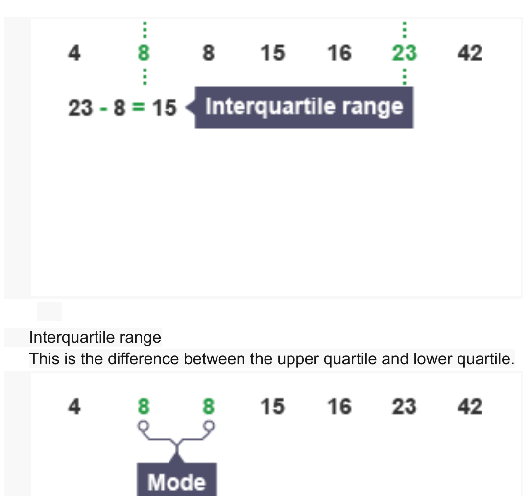
In the dataset shown (4, 8, 8, 15, 16, 23, 42), the number 8 appears twice, making it the mode as it occurs more frequently than any other value.
A dataset can have more than one mode (bimodal or multimodal) if multiple values occur with equal highest frequency. Some datasets may have no mode if all values appear only once.
Modal class
When data is grouped into classes or categories, the modal class is the category with the highest frequency. This is particularly useful when working with grouped frequency tables.
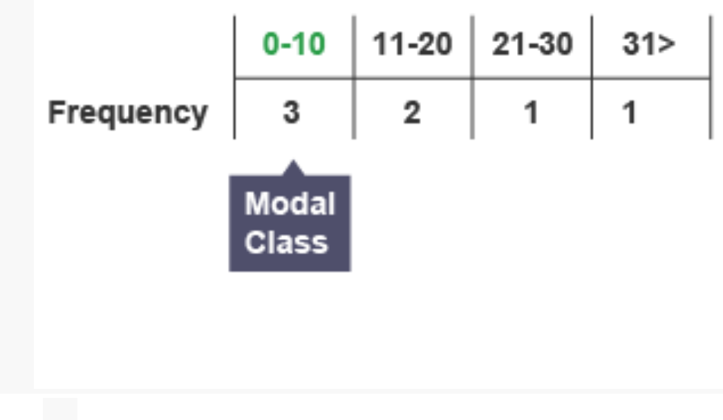
In the frequency table shown, the class interval 0-10 contains the highest frequency (3 observations), making it the modal class.
Measures of spread
Measures of spread describe how data is distributed and how much variation exists within a dataset. Understanding spread is crucial for interpreting the reliability and variability of geographical data.
Range
The range measures the spread of data by calculating the difference between the largest and smallest values in the dataset.
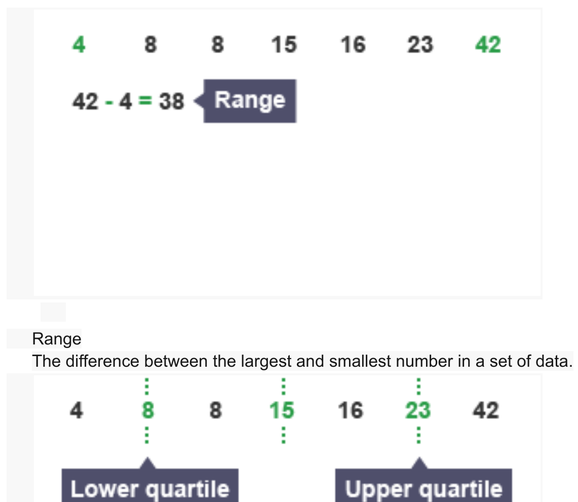
Formula for calculating range:
Worked Example: Calculating the Range
For the dataset: 4, 8, 8, 15, 16, 23, 42
Range =
The range is easy to calculate but can be misleading if there are extreme outliers in your data, as it only considers the two most extreme values.
Quartiles
Quartiles divide an ordered dataset into four equal parts, providing information about the distribution of values. Understanding quartiles helps you analyse how data is spread across the range.
The three quartile values are:
- Lower quartile (Q1): The value that separates the lowest 25% of data from the rest
- Median (Q2): The middle value that separates the lower 50% from the upper 50%
- Upper quartile (Q3): The value that separates the lowest 75% of data from the highest 25%
Interquartile range (IQR)
The interquartile range measures the spread of the middle 50% of the data, providing a more robust measure of spread than the range because it excludes extreme values.
Formula for calculating IQR:
Worked Example: Calculating the IQR
From the dataset: 4, 8, 8, 15, 16, 23, 42
The IQR is particularly useful in geography for identifying the typical spread of your data whilst ignoring extreme values that might distort your analysis.
Percentage calculations
Calculating percentage changes is essential for comparing data collected at different times or locations. These calculations help geographers quantify changes and make meaningful comparisons.
Percentage increase
Percentage increase calculations show how much a value has grown relative to its original size. This is useful for analysing changes such as river channel width downstream or population growth.
Method for calculating percentage increase:
- Calculate the difference between the new value and the original value (increase)
- Divide the increase by the original value
- Multiply the result by 100
Formula:
Worked Example: Percentage Increase
Robin population in woodland:
- December count: 15 robins
- January count: 23 robins
Increase =
Percentage increase =
Always identify the original (starting) value correctly, as this forms the denominator in your calculation. Using the wrong baseline will produce incorrect results.
Percentage decrease
Percentage decrease calculations show how much a value has reduced relative to its original size. This is useful for analysing reductions such as particle size in rivers downstream or population decline.
Method for calculating percentage decrease:
- Calculate the difference between the original value and the new value (decrease)
- Divide the decrease by the original value
- Multiply the result by 100
Formula:
Worked Example: Percentage Decrease
Robin population in woodland:
- February count: 22 robins
- March count: 12 robins
Decrease =
Percentage decrease =
When calculating percentage change, ensure you identify whether the change is an increase or decrease before selecting the appropriate formula.
Percentiles
Percentiles divide a dataset into 100 equal parts, providing a very detailed way of understanding where a particular value sits within the overall distribution. Whilst quartiles divide data into quarters, percentiles offer much finer divisions.
Understanding percentiles:
If a value is in the 90th percentile, this means that 90% of all values in the dataset are equal to or less than this value, whilst 10% are greater.
Geographical application:
Percentiles are commonly used in various contexts. For example, when measuring baby growth, a midwife might report that a baby is in the 90th percentile for weight, meaning that out of 100 babies of the same age, 90 would weigh the same or less, whilst only 10 would weigh more.
Remember that percentiles and quartiles are related - the 25th percentile equals Q1, the 50th percentile equals the median (Q2), and the 75th percentile equals Q3.
Identifying relationships in data
Analysing relationships between different variables is crucial for understanding geographical patterns and processes. Recognising how variables relate to each other allows you to make predictions and test hypotheses about geographical phenomena.
Scatter graphs
Scatter graphs provide a visual representation of the relationship between two variables. Each point on the graph represents a pair of values, allowing you to see whether there is a pattern or correlation between the variables.
Common geographical applications:
- Number of tourists versus number of tourist facilities
- River discharge versus sediment load
- Distance from CBD versus land values
- Height versus weight
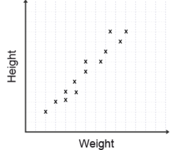
The scatter graph shown displays data points marked with 'x' symbols, plotting height against weight. Each point represents an individual observation with both a height and weight value.
Line of best fit
A line of best fit (also called a trend line) can be drawn through the scatter graph points to show the general relationship between the two variables. When drawing this line, aim to have approximately equal numbers of points above and below the line, with the line passing as close as possible to all points.
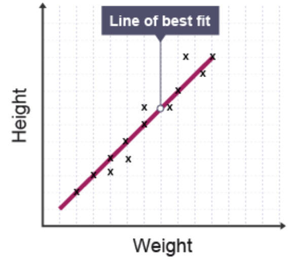
When drawing a line of best fit, use a ruler and ensure the line extends across the full range of your data. Don't just connect the first and last points - the line should reflect the overall trend of all the data.
Understanding correlation
Correlation describes the strength and direction of the relationship between two variables shown on a scatter graph.
Strong correlation occurs when data points cluster tightly around the line of best fit. This indicates a close relationship between the variables - as one changes, the other changes in a predictable way.
Weak correlation occurs when data points are scattered widely from the line of best fit. This suggests the variables are not closely related - a change in one variable does not reliably predict a change in the other.
Types of correlation:
- Positive correlation: As one variable increases, the other also increases (upward-sloping line)
- Negative correlation: As one variable increases, the other decreases (downward-sloping line)
- No correlation: No clear relationship exists between the variables (scattered points with no pattern)
Always describe both the direction (positive/negative) and strength (strong/weak) of correlation in your answers.
Interpolation
Interpolation involves finding a value within the existing data range using the line of best fit. This technique allows you to estimate values that were not directly measured or plotted in your original data collection.
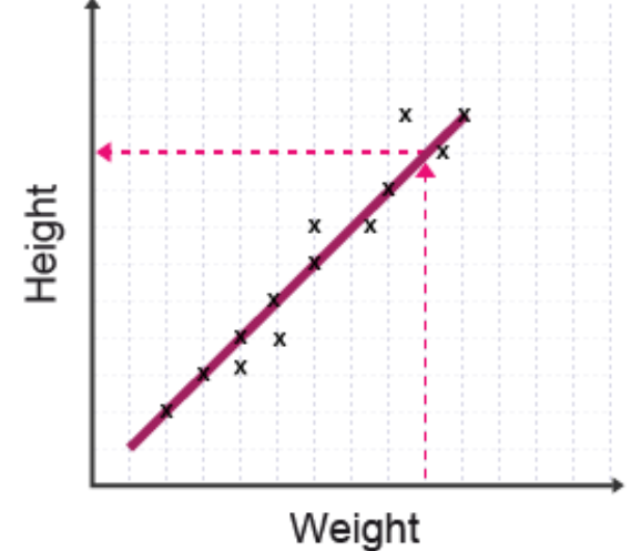
The diagram shows how to read a value from the line of best fit using horizontal and vertical reference lines (shown in dashed pink). This process reads from one axis, across to the line of best fit, then to the other axis.
How to interpolate:
- Locate the known value on one axis
- Draw a line from this point to intersect the line of best fit
- From the intersection point, draw a line to the other axis
- Read the interpolated value
Interpolation is generally reliable because you are estimating within the range of your collected data, where the relationship has been demonstrated.
Extrapolation
Extrapolation involves extending the line of best fit beyond the range of collected data to predict values outside your dataset. This technique allows you to make predictions about what might happen beyond your observations.
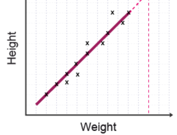
The diagram shows the line of best fit being extended beyond the data points (shown by the dashed extension line) to predict values outside the measured range.
Important considerations:
Extrapolation may provide uncertain or unreliable results because you are assuming the relationship continues in the same way beyond your data range. Many geographical relationships change at extreme values, meaning extrapolated predictions may be inaccurate.
When asked to evaluate extrapolation in an exam, always mention that it involves greater uncertainty than interpolation because you are predicting beyond known data. External factors or changing relationships might affect the accuracy of extrapolated values.
Remember!
Key Points to Remember:
- Central tendency measures (mean, median, mode) identify typical values, whilst measures of spread (range, IQR) show how data is distributed
- Mean is calculated by summing all values and dividing by the count, but can be affected by extreme values; median is the middle value and is more robust to outliers
- Percentage change is calculated using the formula: , remembering to always divide by the original value
- Scatter graphs reveal relationships between variables; a line of best fit should have roughly equal points above and below it
- Interpolation (finding values within the data range) is more reliable than extrapolation (predicting beyond the data range), which involves greater uncertainty
Key terms: Mean, median, mode, modal class, range, quartiles, interquartile range, percentiles, scatter graph, correlation, line of best fit, interpolation, extrapolation
Critical skills for exams:
- Always show your working in calculations to gain method marks even if your final answer is incorrect
- When describing scatter graphs, state both the direction and strength of correlation
- For percentage calculations, identify the original value carefully as this is your denominator
- Remember that extrapolation is less reliable than interpolation because it extends beyond known data