Bar Charts (Junior Cert Mathematics): Revision Notes
Bar Charts
What is a Bar Chart?
A bar chart is a way to show information using bars. Each bar represents a different category or group, and the height (or length) of the bar tells us how much or how many belong to that category.
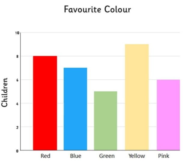
Think of it like this: Imagine you're counting how many children have a certain favourite colour. A bar chart helps you show everyone's favourite colour in a way that's easy to see and compare.
Why Do We Use Bar Charts?
Bar charts are great because:
- They're Easy to Understand: You can quickly see which categories have more or less just by looking at the bars.
- They Help You Compare: By looking at the bars, you can easily compare different groups or categories to see which one is bigger or smaller.
Parts of a Bar Chart
Let's break down what you see on a bar chart:
- Bars: These are the rectangles that show how much there is of something. The taller (or longer) the bar, the more there is.
- Labels: Each bar has a label that tells you what it represents. The bottom line () tells you what the different bars represent (like types of music or number of goals), and the side line () shows the numbers (how many or how much).
- Even Scale: The numbers on the side () should go up evenly. For example, they might go up by , , or . This helps make sure everything is measured fairly.
How to Read a Bar Chart
Reading a bar chart is like reading a story. Each bar tells you something about the data:
- Look at the Labels: Check what each bar represents. Is it showing different types of something, like goals scored or people in different age groups?
- Look at the Height: The height of the bar shows you the number or amount. The taller the bar, the bigger the number.
- Compare the Bars: See which bars are taller and which are shorter. This tells you which categories have more or less.
Making a Bar Chart
When you make a bar chart, here's what you need to do:
- Collect Your Data: Figure out what you're comparing. For example, how many goals were scored in different matches.
- Draw the Axes: Draw two lines () – one along the bottom () for the categories and one up the side () for the numbers.
- Choose a Scale: Decide how you're going to count up the numbers on the side. Make sure the scale goes up evenly (like , etc.).
- Draw the Bars: Draw one bar for each category, with the height showing the number for that category.
- Label Everything: Make sure to label your bars and the axes so it's clear what everything represents.
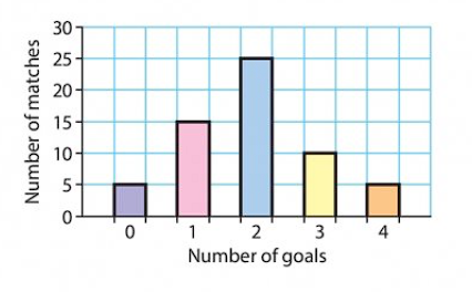
Worked Example: Football Matches and Goals
Let's go through an example of a typical bar chart question step by step. We'll look at a bar chart that shows how many goals were scored in a series of football matches.
The Problem:
Look at the bar chart that shows the number of goals scored in different matches. We need to answer these questions:
- How many matches were played?
- How many goals were scored in total?
- What was the average (mean) number of goals scored per match?
Step 1: Count the Matches
First, let's count how many matches were played. Look at the bar chart and add up the numbers for each bar:
- For goals: matches
- For goal: matches
- For goals: matches
- For goals: matches
- For goals: matches Now, add these numbers together:
Step 2: Count the Total Goals
Next, we'll figure out how many goals were scored in total. Multiply the number of goals by the number of matches for each bar and then add them up:
- For goals:
- For goal:
- For goals:
- For goals:
- For goals: Now, add these together:
Step 3: Find the Average (Mean) Number of Goals
Finally, we'll find the average number of goals per match. To do this, divide the total number of goals by the total number of matches:
Conclusion
By following these steps, we were able to determine the total number of matches, the total number of goals scored, and the average number of goals per match. Bar charts make this process easier by clearly showing the data visually, allowing us to analyse it step by step.