Histograms (Junior Cert Mathematics): Revision Notes
Histograms
A histogram is a type of bar graph that shows how data is distributed across different ranges or intervals. Unlike regular bar charts, where each bar represents a different category, in a histogram, each bar represents a range of values, known as a class interval.
Think of it like this: Imagine you're counting how many cars drive past a school at different speeds. Instead of counting each individual speed, you group the speeds into ranges (like etc.) and then see how many cars fall into each range. A histogram helps you show this information visually.
Why Use Histograms?
Histograms are useful because:
- They Show Data Distribution: You can see how the data is spread out across different ranges or intervals.
- They're Great for Continuous Data: Histograms are perfect for showing data that changes over a range, like speed, time, or age.
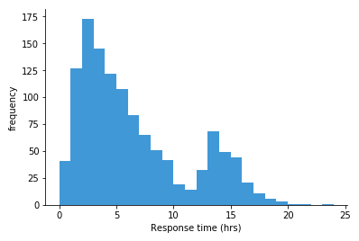
- Below is an example histogram showing how fast ambulances were able to respond to an emergency call:
Parts of a Histogram
Let's break down what you see on a histogram:
- Bars: Each bar represents a range of data (called a class interval). The height of the bar shows how many data points fall into that range.
- (Horizontal Axis): This axis shows the different ranges or intervals (e.g., speed intervals).
- (Vertical Axis): This axis shows the frequency, or how many data points are in each range.
How to Read a Histogram
Reading a histogram is like reading a bar chart, but instead of individual categories, you're looking at ranges of data:
- Look at the : Check the ranges or intervals that are being represented (e.g., ).
- Check the Height of Each Bar: The height of the bar shows how many data points fall within that range.
- Compare the Bars: See which ranges have more or fewer data points based on the height of the bars.
Making a Histogram
When you make a histogram, here's what you need to do:
- Collect Your Data: Organise your data into ranges or intervals. For example, group speeds into ranges like etc.
- Draw the Axes:
- Draw the to represent the ranges of data (e.g., speed intervals).
- Draw the to represent the frequency (how many data points are in each range).
- Draw the Bars: For each range on the , draw a bar whose height matches the frequency on the . Make sure there are no gaps between the bars.
- Label Everything: Label the axes and title your histogram so it's clear what the data represents.
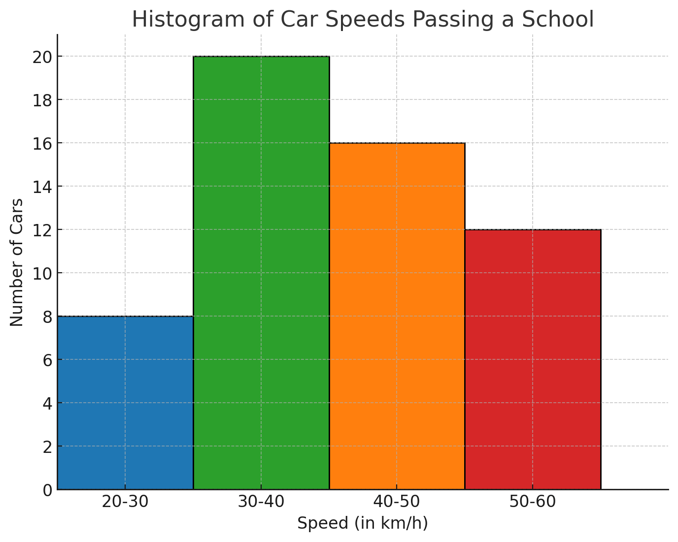
Worked Example: Speeds of Cars Passing a School
Let's go through an example where we create a histogram showing the speeds of cars passing a school.
The Problem:
A Garda officer recorded the speeds of cars passing a school as follows:
| Speed (in | Number of Cars |
|---|---|
We need to draw a histogram to illustrate this data.
Step 1: Organise the Data
The data is already grouped into ranges () with the number of cars counted for each range.
Step 2: Draw the Axes
- : Label the with the speed intervals .
- : Label the with the frequency, which in this case is the number of cars. Choose a scale that fits the data, such as to , going up by .
Step 3: Draw the Bars
- For the range , draw a bar up to on the .
- For the range , draw a bar up to on the .
- For the range , draw a bar up to on the .
- For the range , draw a bar up to on the . Important: Make sure the bars touch each other with no gaps in between, as this shows the continuous nature of the data.
Step 4: Label the Histogram
- Title: Give the histogram a title, such as "Speeds of Cars Passing a School."
- Axes Labels: Ensure the is labelled with "Speed (in )" and the with "Number of Cars."
Interpreting the Histogram
Once the histogram is drawn, you can quickly see:
- Most Common Speed Range: The range has the tallest bar, meaning most cars were driving within this speed range.
- Least Common Speed Range: The range has the shortest bar, meaning fewer cars were driving within this speed range.
Conclusion
Histograms are a powerful tool for showing how data is distributed across different ranges. By following the steps above, you can create and interpret histograms, which will help you better understand data in areas like speeds, ages, or any other continuous data.
Remember: Practice drawing and reading histograms, and soon it will become second nature!