Line Plots (Junior Cert Mathematics): Revision Notes
Line Plots
What is a Line Plot?
A line plot (also known as a dot plot) is a simple way to display data along a number line. It shows the frequency of data points along a number line, using symbols like "" or dots to represent how many times each value occurs.
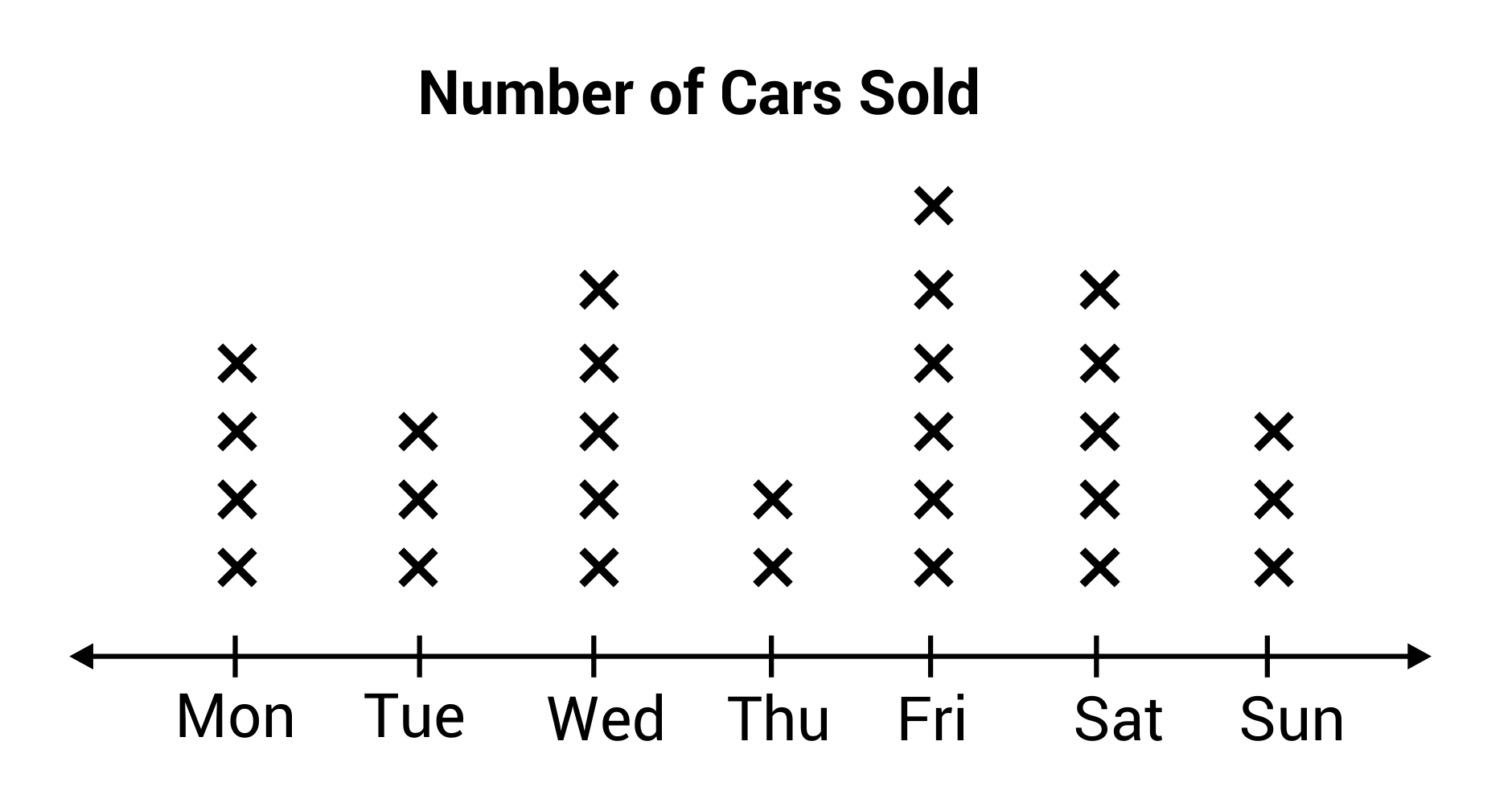
Below is a line plot showing the number of cars sold by a dealership on each day of the week:
Parts of a Line Plot
Let's break down what you see on a line plot:
- Number Line: The horizontal line that shows the different values (e.g., scores, measurements).
- Marks ( or ): These are placed above each value on the number line to show how many times each value occurs.
- Labels: The line should be labelled to show what the values represent (e.g., scores, types of shoes).
How to Read a Line Plot
Reading a line plot is like counting the ""s or dots above each number:
- Look at the Number Line: See what each value on the line represents.
- Count the Marks: Count how many ""s or dots are above each value. This tells you how many times that value occurs.
- Compare Frequencies: See which values occur most often by checking where the most ""s or dots are.
Why Use Line Plots?
Line plots are useful because:
- They Show Frequency Clearly: You can quickly see which values are most common and how often they occur.
- They're Easy to Create and Read: Line plots are simple and straightforward, making them perfect for showing data like test scores, measurements, or counts.
Making a Line Plot
When you make a line plot, here's what you need to do:
- Collect Your Data: Determine the values you're plotting (e.g., scores, sizes, counts).
- Draw the Number Line: Draw a horizontal line and mark the values you're comparing along the line.
- Plot the Marks: For each value, place an "" or dot above it for each time that value occurs.
- Label Everything: Make sure your plot is clearly labelled so it's easy to understand.
Worked Example: Student Scores in a Maths Exam
Let's go through an example where we analyse a line plot showing the scores of students in a Maths exam.
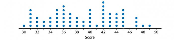
The Problem:
The line plot shows the scores (out of ) for a group of students in a Maths exam. We need to answer the following questions:
- Which score was the most common?
- How many students scored ?
- How many students scored or more?
Step 1: Analyse the Line Plot
First, look at the line plot to understand the data:
- The horizontal axis (number line) shows the possible scores ( to ).
- The dots above each score show how many students achieved that score.
Step 2: Answer Each Question
- Which score was the most common?
- Look for the score with the most dots above it. The score with the highest number of dots is the most common.
- For example, if has the most dots, then is the most common score.
- How many students scored ?
- Count the number of dots above on the line plot.
- For example, if there are dots above , then students scored .
- How many students scored or more?
- Look at the dots above , and , and count them all.
- For example, if there are dots above , dots above , and dot above , you would add them up: students scored or more.
Conclusion
Line plots are a great way to display data when you want to show how often different values occur. They're simple to create and easy to read, making them useful for a variety of data sets, such as test scores, measurements, or counts. By practising reading and making line plots, you'll become more comfortable with this type of data visualisation.