Colour (Leaving Cert DCG): Revision Notes
Colour
Colour is a powerful tool in freehand drawing that brings sketches to life and helps communicate design ideas effectively. Understanding how colours work together and how to apply them using different media is essential for creating compelling visual presentations.

Primary colours
The foundation of all colour work begins with understanding primary colours. Red, yellow, and blue form the basis of the colour system and cannot be created by mixing other colours together. These three colours are shown on a colour wheel, which is a visual tool that helps us understand colour relationships.
All other colours can be created by mixing these primary colours in different combinations. When you mix two primary colours together, you create secondary colours:
Colour Mixing Examples:
- Yellow + red = orange
- Yellow + blue = green
- Blue + red = violet
By mixing primary colours with secondary colours, you can create tertiary colours, giving you an even wider range of options for your drawings.
It's important to remember that black and white are neutral colours. When you mix them with other colours, they change the tone - black makes colours darker while white makes them lighter.
Application of colour
Different colouring media each have their own unique characteristics and are suited to different types of drawing work. Understanding these differences helps you choose the right medium for your specific needs.
Watercolour
Watercolours work best for covering large areas and creating smooth colour washes. They're particularly useful when applied over a finished pencil drawing, as they can add colour without hiding the underlying detail.
Watercolour Characteristics:
- Excellent for covering large areas quickly
- Create smooth colour washes
- Work well over finished pencil drawings
- Don't hide underlying detail
- Not suitable for intricate detail work with lots of colour changes
Felt-tipped pens
Felt-tipped pens are excellent for block shading and creating areas of solid, vibrant colour. They're particularly effective when you need strong, consistent colours that stand out.
Critical Limitation: Because felt-tip pens cannot be erased once applied, any mistakes become permanent. Plan your work carefully before applying colour.
The range of colours available is usually good, but variations in tone can be difficult to achieve with this medium.
Coloured pens and biros
These tools can be used very effectively for sketching work using cross-hatching and similar drawing techniques. The key advantage is that you cannot erase the marks in the same way as with pencil work, which gives your drawings a more permanent and confident feel.
Biro pens provide a more permanent result for sketches and won't smudge when handled. By using very light pressure initially, you can build up the drawing gradually, with the benefit that sketches finished with ink retain their quality over time.
Biro Pen Characteristics:
- Cannot vary line thickness as easily as pencils
- Good range of colours available
- Don't lend themselves to mixing colours
- Permanent results that don't smudge
- Build quality over time
Colouring pencils
Colouring pencils offer one of the most versatile means of applying colour to sketches and diagrams. They come in a wide range of colours and can be mixed by applying one layer over another.
Colouring Pencil Advantages:
- Wide range of colours available
- Can be mixed by layering
- Variable line widths through different sharpening techniques
- Mistakes can be erased
- Can build sketches from start to finish
- Excellent for enhancing existing pencil work
Tone and texture
When creating realistic drawings, it's crucial to understand how to use hatching, stippling, or scribbling techniques to build up tonal values. These methods help describe a material's surface texture and create visual interest in your work.
The relationship between tone and texture is constant - they work together when trying to produce realistic effects.
You can describe different surface qualities through your choice of shading techniques:
- Smooth surfaces: Large-scale strokes and gentle tonal changes work best
- Rough surfaces: Small-scale strokes create a fine-grained effect
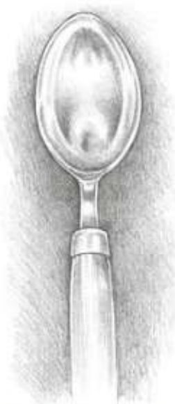
- Shiny surfaces: Polished surfaces depend on light reflexion to show their texture, so use sharp contrasts between light and dark areas
- Dull surfaces: These appear less sharp and can cast shadow patterns on themselves, avoiding harsh textural qualities
Understanding how light affects different materials helps you choose the right combination of techniques to achieve realistic results in your drawings.
Key Points to Remember:
- Primary colours (red, yellow, blue) form the foundation of all colour mixing
- Secondary colours are created by mixing two primary colours together
- Different media have unique characteristics - choose the right tool for your specific drawing needs
- Watercolours work best for large areas and washes over finished drawings
- Tone and texture work together to create realistic surface effects through various shading techniques