How to Draw Graphs in Science (Grade 10 NSC Matric Life Sciences): Revision Notes
How to Draw Graphs in Science
Understanding how to create and interpret different types of graphs is a fundamental skill in Life Sciences. Graphs help us visualise data patterns and communicate scientific findings clearly. This guide will teach you when and how to use different graph types effectively.
Data visualisation is one of the most powerful tools in science. A well-constructed graph can reveal patterns and relationships that might be hidden in rows of numbers, making complex scientific concepts accessible to both researchers and the general public.
Understanding coordinate systems and variables
Before creating any graph, you need to understand the basic coordinate system. Every graph has two main parts called axes that meet at a point called the origin.
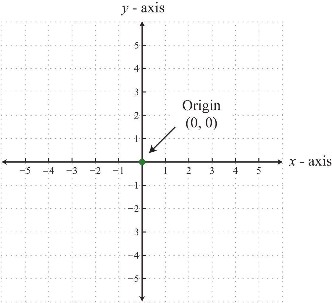
The horizontal line is called the x-axis and shows the independent variable. This is the variable that you control or change in an experiment. The vertical line is called the y-axis and shows the dependent variable. This is the variable that responds to changes in the independent variable.
Common Mistake to Avoid: Many students confuse which variable goes on which axis. Remember: the independent variable (the one YOU control) always goes on the x-axis, and the dependent variable (the one that responds) goes on the y-axis. Think "I control the x, and y depends on x."
For example, if you're measuring how plant height changes over time, time would be your independent variable (x-axis) because you control when you take measurements. Plant height would be your dependent variable (y-axis) because it depends on the time that has passed.
Line graphs
Line graphs are your go-to choice when you want to show how one numerical variable changes in response to another numerical variable over time or in a continuous manner.
When to use line graphs
You should choose a line graph when:
- Both your independent and dependent variables can be measured using numbers
- The relationship between variables is continuous (meaning there are no gaps in the data)
- You want to show trends or patterns over time
Essential features of line graphs
Creating an effective line graph requires attention to several important details:
Choosing appropriate scales: Your scale should use most of the available space on your axes. Work out the range of your data by finding the highest and lowest values, then choose intervals that are easy to read like 1s, 2s, 5s, or 10s. Avoid awkward intervals like 7s or 14s that make the graph difficult to interpret.
Consistent scaling: Once you choose your scale intervals, keep them the same along the entire axis. This ensures accurate representation of your data.
Clear axis labels: Each axis must include a descriptive label explaining what is being measured, along with the units in brackets. For example: "Temperature (°C)", "Time (days)", or "Height (cm)".
Professional Tip: Always include units in your axis labels. A graph showing "Temperature" without units is scientifically meaningless - are we talking about Celsius, Fahrenheit, or Kelvin? Units provide essential context for interpreting your data.
Plotting data points: Mark each data point with a clear symbol such as a cross, circle, or dot that is large enough to see easily. Each point represents a specific x and y coordinate from your data.
Connecting the points: Draw straight lines between consecutive data points. If your points form a clear straight line pattern, you can use a ruler. When points follow a curved pattern, draw a smooth curve that best fits through the data.
Starting position: Only start your line at the origin (0,0) if you have actual data for that point. Otherwise, begin your line at the first data point you collected.
Title and legend: Include a clear, descriptive title that explains the relationship being shown. If you have multiple data sets on one graph, use different symbols for each set and include a legend to identify them.
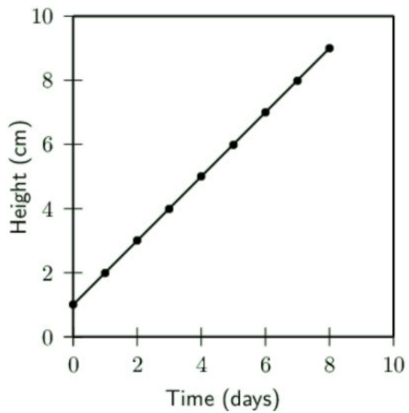
The example above demonstrates these principles by showing plant growth over time. Notice how the points are clearly marked and connected with straight lines, creating a clear growth pattern.
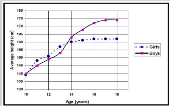
This more complex example compares height growth between boys and girls during adolescence. The different line styles and legend help distinguish between the two groups while showing their different growth patterns.
Bar graphs
Bar graphs work best when you want to compare different categories or groups where the independent variable represents distinct, separate items rather than continuous measurements.
When to use bar graphs
Choose bar graphs when:
- Your independent variable consists of separate categories (like different types of transport, food preferences, or blood groups)
- The categories are not numerical or cannot be arranged in numerical order
- You want to compare quantities between different groups
Essential features of bar graphs
Separate bars: Unlike histograms, the bars in a bar graph must not touch each other because each represents a completely different category.
Uniform bar width: All bars should have exactly the same width and be spaced equally apart from each other. This ensures fair visual comparison between categories.
Orientation flexibility: Bar graphs can be drawn vertically (bars going up) or horizontally (bars going sideways), depending on your preference and space available.
Clear title: Place a descriptive title below the graph explaining what data is being presented.
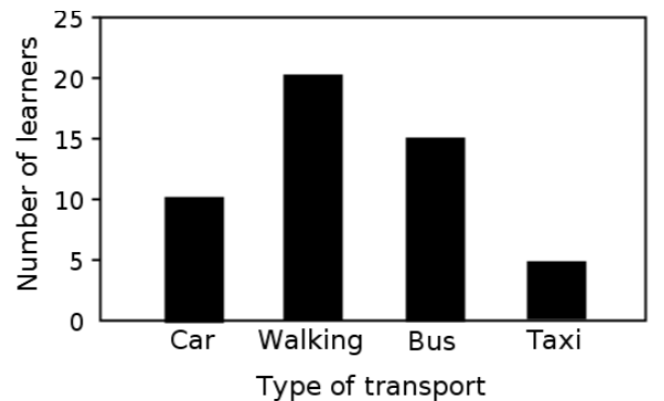
This example shows different types of transport used by learners. Notice how each bar represents a distinct category, and the bars are separated to show they represent different items.
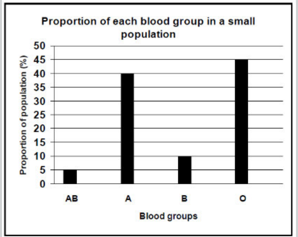
This bar graph displays blood group distribution in a population. The separate bars make it easy to compare the proportions of each blood group type.
Histograms
Histograms are specifically designed for showing the distribution of continuous numerical data that has been grouped into ranges or intervals.
When to use histograms
Use histograms when:
- Your independent variable represents continuous numerical data organised into ranges (like 0-9, 10-19, 20-29)
- You want to show the frequency or number of observations in each range
- You're displaying data about ages, test scores, measurements, or other continuous variables
Essential features of histograms
Touching bars: Unlike bar graphs, the bars in histograms must touch each other because the data ranges connect to each other continuously.
Non-overlapping ranges: Your numerical categories must not overlap. For example, use 0-10, 10-20, 20-30 (not 0-10, 9-19, 18-28). This prevents confusion about where specific data points belong.
Consistent intervals: Keep your range intervals the same size throughout. If you start with 10-year ranges, maintain 10-year ranges for all categories.
Proper labelling: Include axis labels and a descriptive title placed below the graph.
Key Difference from Bar Graphs: Remember that histogram bars touch because the data is continuous (like age ranges), while bar graph bars are separated because the data represents distinct categories (like different sports). This visual difference immediately tells viewers what type of data they're looking at.
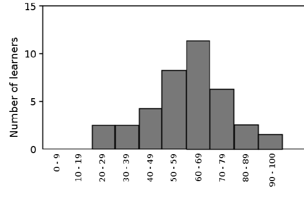
This histogram shows the age distribution of learners in a programme. The touching bars indicate that age is continuous data, and the distribution shows most learners are in their 60s.
Pie charts
Pie charts excel at showing how different parts contribute to a complete whole, displaying data as percentages or proportions of the total.
When to use pie charts
Pie charts are ideal when:
- You want to show percentages as portions of a complete circle
- Your data represents parts of a whole that add up to 100%
- You need to display proportional relationships visually
- You have a manageable number of categories (usually fewer than 8)
Essential features and calculations
Understanding the concept: Think of a pie chart as a circular cake divided into slices. The entire circle represents 100% of your data, a half circle represents 50%, a quarter circle represents 25%, and so on.
Worked Example: Creating a Pie Chart for Species Distribution
Let's work through creating a pie chart showing species distribution in an ecosystem:
Step 1: Count and record your data
- Insects: 17 types
- Plants: 16 types
- Birds: 9 types
- Amphibians: 8 types
- Total: 50 types
Step 2: Calculate percentages Using the formula: Percentage =
- Insects:
- Plants:
- Birds:
- Amphibians:
Step 3: Calculate slice angles Using the formula:
- Insects:
- Plants:
- Birds:
- Amphibians:
Step-by-step construction process:
- Count and record: Count the number of items in each category and create a data table
- Calculate totals: Work out the total number of items across all categories
- Calculate percentages: For each category, use the formula: (category value ÷ total) × 100
- Calculate slice angles: Convert percentages to degrees using: angle = (percentage × 360°) ÷ 100
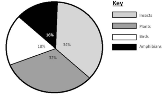
Here's a worked example showing species distribution in an ecosystem:
| Species | Number of types | Percentage | Slice angle |
|---|---|---|---|
| Insects | 17 | 34% | 122.4° |
| Plants | 16 | 32% | 115.2° |
| Birds | 9 | 18% | 65° |
| Amphibians | 8 | 16% | 57.6° |
Drawing the pie chart:
- Use a compass to draw a perfect circle
- Use a protractor to measure angles accurately
- Start with the largest slice at the 12 o'clock position
- Measure angles in a clockwise direction
- Shade or colour each slice differently
- Label each slice with its percentage
- Include a key explaining what each colour represents
Converting between tables and graphs
A crucial skill in science is being able to transform data between different formats. You might need to create a table from a graph or draw a graph from table data.
Key considerations for conversion
Identify variables correctly: When converting from graphs to tables, the independent variable (x-axis) should form the first column of your table. The dependent variable (y-axis) values go in subsequent columns.
Choose appropriate graph types: Look at your data characteristics:
- Use line graphs for continuous numerical relationships
- Use bar graphs for categorical comparisons
- Use histograms for continuous data in ranges
- Use pie charts for proportional data adding to 100%
Maintain accuracy: When reading values from graphs, be as precise as possible and double-check your readings.
Practice examples
The takeaway restaurant preference data shows categorical information perfect for a bar graph:
| Takeaway restaurant | Learners (%) |
|---|---|
| Kauai | 40 |
| Anat Falafel | 15 |
| Nandos | 25 |
| Burger King | 20 |
This data would create a bar graph because the restaurants are separate categories, not continuous numerical data.
Key Points to Remember:
-
Choose graph types carefully - Line graphs for continuous data, bar graphs for categories, histograms for ranges, pie charts for proportions
-
Label everything clearly - Include axis labels with units, descriptive titles, and legends when needed
-
Use appropriate scales - Make your graphs easy to read with sensible intervals and use most of the available space
-
Follow specific rules - Bar graph bars don't touch, histogram bars do touch, pie charts must total 100%
-
Practice conversions - Being able to move between tables and graphs is essential for data analysis in science