Organising Data (Grade 11 NSC Matric Mathematical Literacy): Revision Notes
Organising Data
Organising data is a crucial skill in mathematical literacy that helps us make sense of large amounts of information. When we collect data, it often appears messy and difficult to understand. By organising data properly, we can identify patterns, make comparisons, and draw meaningful conclusions.
Data organisation transforms raw information into meaningful insights. This skill becomes increasingly important as we encounter larger and more complex datasets in our studies and daily life.
Two main methods of organising data
Data can be organised in two different ways:
- Sorting data - arranging information in a particular order
- Creating frequency tables - summarising how often different values appear, often using class intervals
Both methods help us transform raw, unorganised data into clear, understandable information that we can analyse and interpret.
These two methods often work together. We might first sort our data to understand its range, then create frequency tables to summarise patterns and trends.
Sorting and arranging data
Sorting data means putting information in a specific order to make it easier to understand and analyse.
When working with numbers, we can sort from:
- Smallest to largest (ascending order)
- Largest to smallest (descending order)
When working with categories (like types of fruit), we can arrange them:
- Alphabetically
- By frequency of occurrence
Sorting according to two criteria
The most important skill in Grade 11 is learning to sort data using two criteria simultaneously. This means we first separate the data by one characteristic, then arrange it by another characteristic within each group.
Two-criteria sorting is essential for advanced data analysis. Master this concept as it forms the foundation for more complex statistical work in higher grades.
For example, if we have height and weight data for both males and females, we can:
- First criterion: Separate all the females from all the males
- Second criterion: Sort the heights within each gender group from shortest to tallest
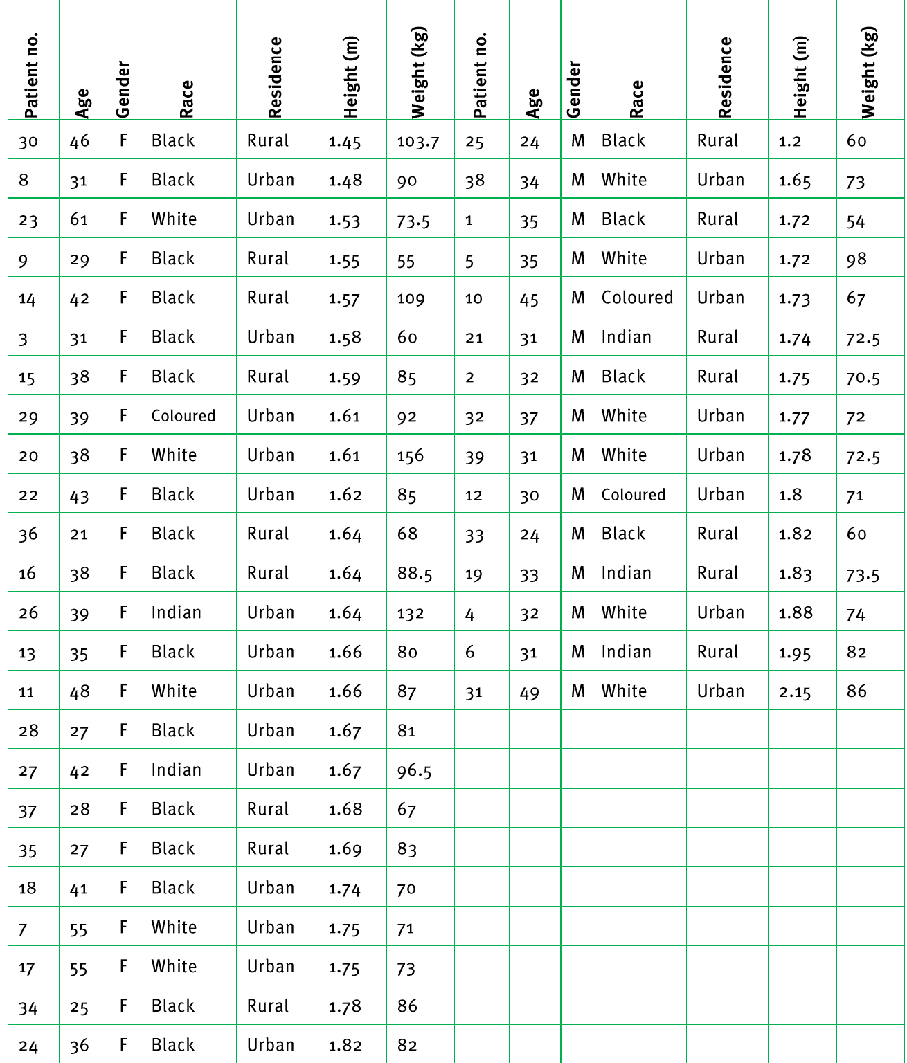
This raw data table shows how information looks before it's organised. Notice how difficult it is to spot patterns or make comparisons.
Worked example: Sorting by gender and height
Worked Example: Two-Criteria Sorting
Let's look at how the same data appears after being sorted according to two criteria - gender and height:
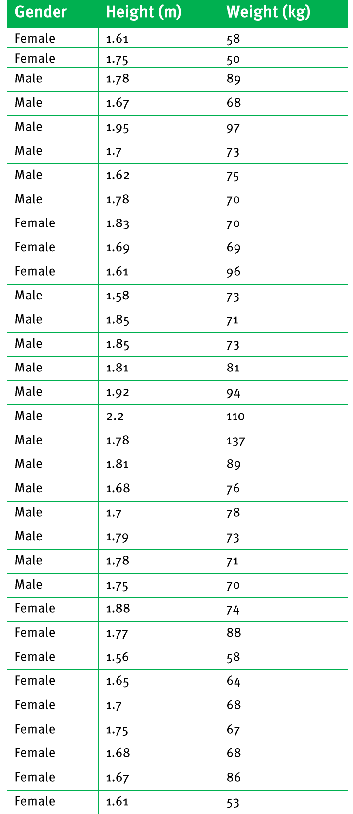
What we can observe:
- All females are grouped together, sorted by height from shortest to tallest
- All males are grouped together, also sorted by height from shortest to tallest
- Patterns become much easier to identify and compare
Frequency tables and tallies
What is a frequency value?
A frequency value is a number that tells us how often a particular piece of data appears in our dataset.
Frequency tables help us:
- Summarise large amounts of data
- Compare different categories easily
- Identify the most and least common values
- Spot patterns and trends
Using class intervals
When we have large datasets with many different values, we use class intervals to group the data into manageable categories. Class intervals are ranges that group similar values together.
Class intervals are particularly useful when dealing with continuous data (like height, weight, or time) where exact values might vary widely but patterns exist within ranges.
For example, instead of listing every individual height measurement, we can group heights into ranges:
- 1.5 - 1.59 m
- 1.6 - 1.69 m
- 1.7 - 1.79 m
This makes the data much easier to work with and understand.
Worked example 1: Basic frequency table
Worked Example: Creating a Basic Frequency Table
Here's how we create a frequency table using class intervals for height data:
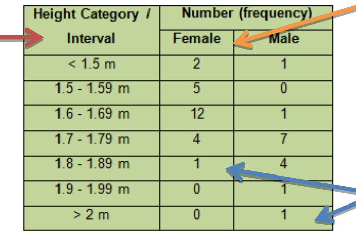
Table components:
- Height categories in the left column (our class intervals)
- Number of females in each height range
- Number of males in each height range
The frequency values tell us exactly how many people fall into each height category for both genders.
Worked example 2: Adding percentage values
To make comparisons between groups easier, we often add percentage columns to our frequency tables:
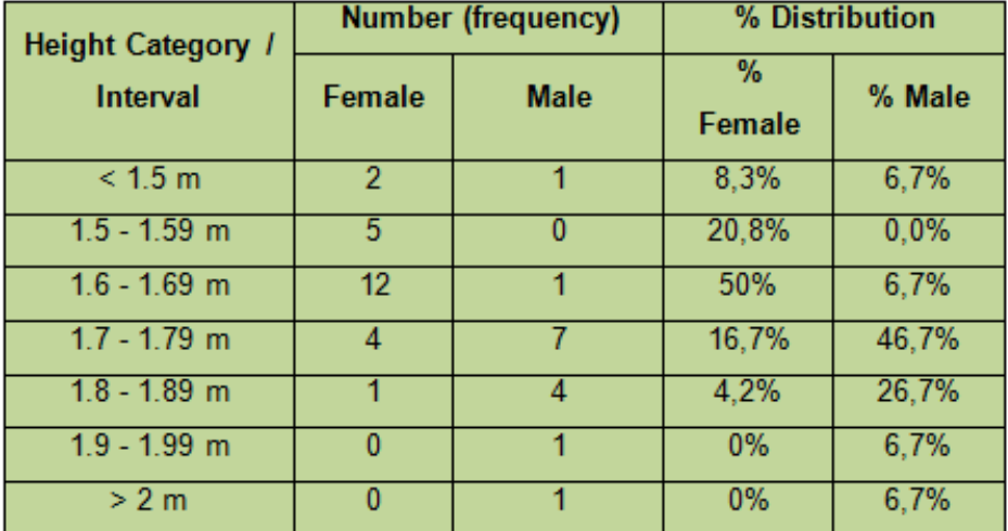
Calculating percentages in frequency tables
When we add percentages to frequency tables, we can compare groups more accurately. Here's how to calculate percentages:
Worked Example: Calculating Percentages in Frequency Tables
Step 1: Count the total number in each group
- Total females = 24
- Total males = 15
Step 2: Calculate the percentage for each category For females in the "<1.5 m" category:
- Number of females in this category = 2
- Percentage =
Step 3: Repeat for all categories
The percentage tells us what proportion of each gender group falls into each height category, making it much easier to compare the distributions.
Why use percentages?
Including percentage values is particularly important when:
- The two groups have different total numbers of people
- We want to make fair comparisons between groups
- We need to identify patterns that aren't obvious from frequency numbers alone
Percentages convert everything to the same scale (out of 100), making comparisons accurate and reliable. This is crucial when comparing groups of different sizes.
Worked example 3: Complete frequency table with percentages
Worked Example: Complete Analysis with Percentages
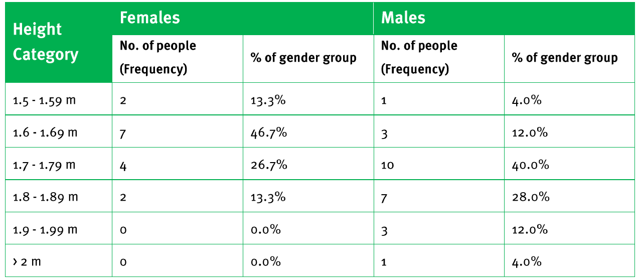
This complete frequency table shows both the raw frequencies and percentages, allowing us to see that:
- 50% of females fall in the 1.6-1.69m height range
- Males have a more spread out height distribution
- No females in the dataset are taller than 1.8m
Creating frequency tables for weight data
The same principles apply when organising weight data. The approach remains consistent regardless of the type of measurement data we're working with.
Worked Example: Weight Distribution Analysis
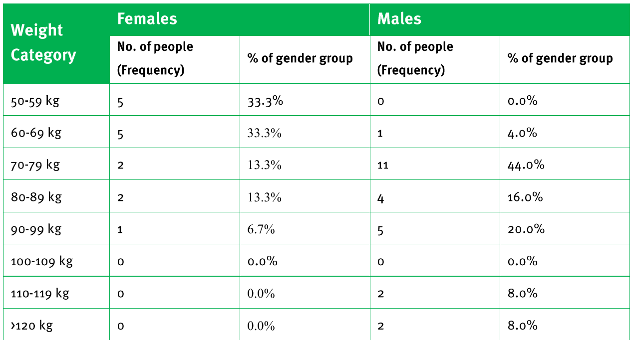
This weight distribution table reveals:
- 66.6% of females weigh between 50-69 kg
- The highest concentration of males (44%) is in the 70-79 kg range
- Different weight distribution patterns between genders
Exam tips
- Always read the question carefully to identify what criteria you need to sort by
- When creating frequency tables, make sure your class intervals don't overlap
- Include percentage calculations when comparing different groups
- Check that your frequencies add up to the total number of data points
- Use clear headings and labels in your tables
Key Points to Remember:
- Sorting data means arranging information in a specific order to make patterns easier to see
- Two criteria sorting involves first grouping by one characteristic, then ordering by another within each group
- Frequency values show how often each piece of data appears in the dataset
- Class intervals group similar values together to make large datasets manageable
- Percentage values in frequency tables allow fair comparisons between groups with different total sizes